Beginner’s Guide to Building a Butterfly Chart in Tableau for Clinical Insights
- Sindhurathi Mathivanan
- Sep 29, 2025
- 8 min read
Sprint-2:Butterfly Chart from Scratch: Visualizing Age and Gender Patterns in Sepsis Data
Butterfly chart is a great way to compare the data for groups with same categories and we will get the visualization side by side or in mirrored way of visualization but it highlights the data in parallel way. Butterfly chart is also called as Tornado chart or Bikini Chart.
Let’s get into the visualization of Segregation of sepsis and non-sepsis patients according to age group and gender using Butterfly Chart.

Step-1:
We have to open the new book from tableau public and load our dataset. Here I have connected the SepsisDataset which is downloaded from Kaggle link.

We are going to do the calculations to obtain the counts of patients on various factors. So, we need to calculate the Total Patients Count from the 1.5 Million Patient records. To create a Calculated field, as soon as you loaded the dataset, click the sheet1 down below on tableau public book and right click dropdown arrow which is next to filter in the Data tab as pictured down below.

Create a calculated field named as ‘Total Patients Count’ and add this calculation.
Total Patients Count:

Step-2:
Now, We are going to calculate the male and female patients count. Create a calculated field named as ‘Male Count’ and ‘Female Count’ and add this calculation.
Male Count:

Female Count:

Step-3:
We need an age group as base for segregation of patients. So, create a calculated field named as ‘Age Group’ or ‘Age Group- Split as 10’ which I used for my visualization and add this calculation.
Age Group- Split as 10’:

Step-4:
Follow the screenshots exactly to get the butterfly visualization.
1.Drag and drop the calculated field ‘Age Group-Split as 10’ to rows.

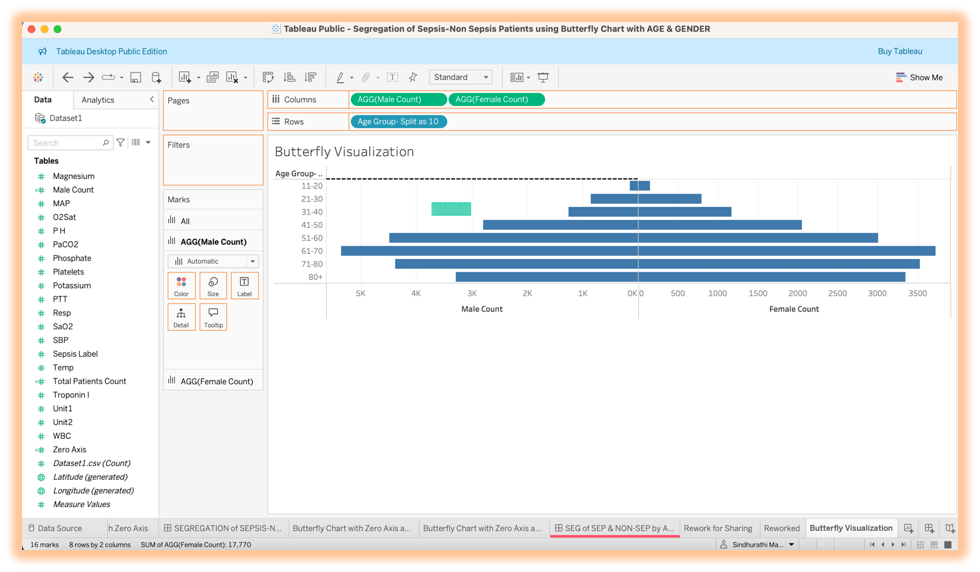
2.Drag and drop the calculated field ‘Male Count’ and We get to visualize a normal bar chart states the Male Patients count according to age group level which is one (Left) side of the wings for butterfly visualization.

3.Creating another bar chart for female patients count which will be another (Right) side of the wings for butterfly visualization. Drag and drop the calculated field ‘Female Count’ next to the ‘Male Count’ to get the representation.

4.We can see the bar charts are not looking like wings of butterfly. So, we have to right click the 1st bar chart like down below and chose the ‘reversed’ option in Edit Axis popup window. This will change the bar chart to left side wings of the butterfly visualization.


5.Now, you get the both sides of the butterfly visualization which represents the male and female patients count according to age group.

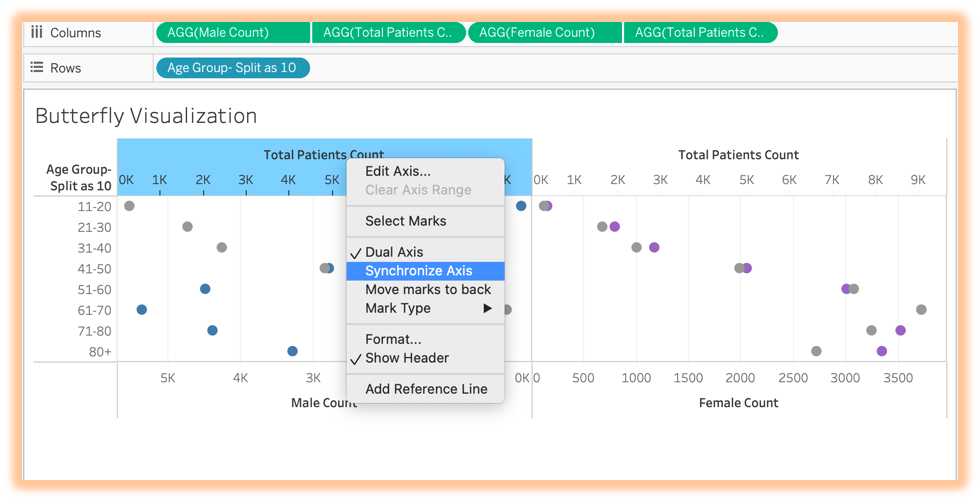
6.We need to segregate the male and female patients count from total patients count according to the age group. For that, drag and drop the calculated field named as ‘Total Patients Count’ on the left side(inside) of the bar chart representation of the ‘Male Count’ (Not on the columns shelf).

7. Drag and Drop the calculated field named as ‘Total Patients Count’ on the right-side(inside) of the bar chart representation of the ‘Female Count’ (Not on the columns shelf). Now we see circles on both sides instead of the bar in the visualization.

8.We have to change the circles to bar on the ‘Marks’ section. Before that, we need to do ‘Synchronize Axis’ for ‘Total Patients Count’ and ‘Male Count’ for clear visualization to avoid cluster. We have to do the same ‘Synchronize Axis’ of ‘Total Patients Count’ for ‘Female Count’ side also.
Before ‘Synchronize Axis’:

After ‘Synchronize Axis’:

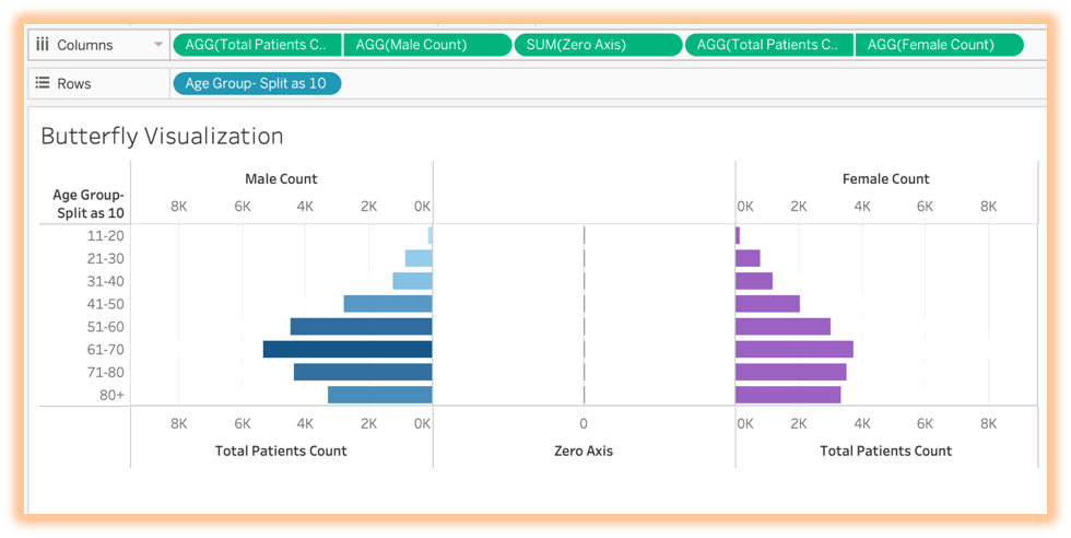
9.Next step is changing those circles to bar on ‘Mark’ Section for each count. We can see the circles of the ‘Male Count’ changed to bar representation. Now we have to do the same for 2 of ‘Total Patients Count’ and ‘Female Count’ as well.
Male Count Bar Representation:

Total Patients Count (Left Side) and Female Count Bar Representations:

Total Patients Count (Right-Side) Bar Representation:

10.We have to change the color of the butterfly representation according to the gender. For ‘Male Count’ which is a left side will be blue color and for the ‘Female Count’ which is right-side will be purple color.
In order obtain this, we have to swap the position of the ‘Male Count’ and ‘Total Patients Count’ in columns shelf as pictured down below.

Now the position got swapped but the wings weren’t in right position.

11.We have to do chose ‘Reversed’ option on the edit axis of the ‘Total Patients Count’.

We will see the left side wings are in right position now. But the color of the wings is in gray color.

12.We are going to drag and drop the ‘Male Count’ on the color of the AGG (Male Count) on Marks Section. Here we got the blue wings of the butterfly which represents the ‘Male Count’ for each age group range in the ‘Total Patients Count’.

13.Next Step is to obtain the purple color for the ‘Female Count’ on right-side of the representation. In order to obtain that, we have to swap the ‘Total Patients Count’ and ‘Female Count’ on the rows shelf as pictured down below.

14. We got the purple wings of the butterfly visualization represents the ‘Female Count’ in each age group range in total patients count.

15. We are going to hide the gray color of the butterfly as of now for better representation by choosing white color on both AGG(Total Patients Count) for both sides.


16. Butterfly Representation looks like pyramid as of now. Imagine the real butterfly, it has body in the center and wings in the both sides which makes it beautiful. In order to obtain that Imagination, we have to do few other steps. Let jump on to it.
We have to create the ‘Zero Axis’ calculated field for the center.
Zero Axis:

17. Drag and drop in the center of rows shelf like shown down below.

We have created the body-center part for the butterfly visualization.
18.We have to change the SUM (Zero Axis) to ‘Text’ representation on the ‘Mark’ Section to bring the ‘Age Group’ Range in the center as a body of butterfly representation. Changing it to ‘Text’ representation first.

19. Drag and drop the ‘Age Range-Split as 10’ in the ‘Text’ of the SUM (Zero Axis) in the ‘Mark’ Section.

20. We have to do formatting steps to bring out the best butterfly visualization. We need to follow few more steps to achieve that visualization.
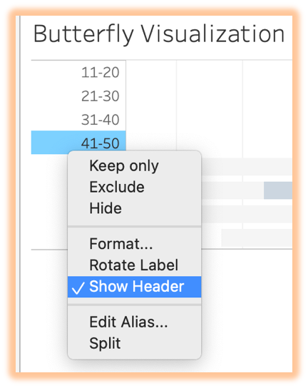
Removing the header and field labels on left side, top and bottom on both sides:
1.Disable the ‘Show Header’ like shown below.

2.Choose the ‘Hide Field Labels for Rows’. After that, disable ‘Show Header’.

3.Change the view from ‘Standard’ to ‘Entire View’.


4.Sorting it from the Elderly Age Group Range to Children. Don’t not choose the descending order in the tool bar which we use for funnel or bar representation. See the picture down below for the reason which displayed in label. It will sort in higher patients count to lower patients count irrespective of age range. The age range order won’t be in proper descending order like (80+,71-80,61-70,...,11-20). It will represent in different way.

5. In order to avoid the confusion of the previous step, we need to do ‘Sort’ option of the ‘Age Group-Split as 10’ in ‘Mark’ Section. Right click the ‘Age Group-Split as 10’ in ‘Mark’ Section and choose ‘Descending’ option.


6. We got the Descending order of the Age Group range butterfly visualization from (80+ to 11-20).

7.We have to do further formatting for the background and font style, color and size to bring out the butterfly visualization more appealing. Right click the wings side and choose format.

8.Choose ‘None’ for all the lines and borders in Sheet option and this will reflect in the row and columns as well. But make sure ‘None’ is chosen on everything.


9. Choose ‘Tableau Bold’ as Font and 10 as common Font Size on worksheet tab and it will reflect on rows and columns. But you need change the font size for title to 15 for the Heading of the worksheet or sheet name.


10. The Butterfly Visualization is almost ready. First level of formatting steps are done. But We have to do one more main step for the segregation.

21.Applying sepsis and non-sepsis status to segregate the male and female patients to represent the count under sepsis status. We need to create a calculated field named as ‘Sepsis-
Non Sepsis Status’.
Sepsis-Non Sepsis Status:

22. Hope you remember we applied a white color for the AGG (Total Patients Count). Now we are going to change that color to blue by dragging and dropping the ‘Male Count’ on color of the AGG (Total Patients Count) on the left wings side.

23. In order to obtain the Sepsis and Non-Sepsis Male patients count and status, we are going to drag and drop the ‘Sepsis- Non Sepsis Status’ on the color of the ‘AGG (Male Count)’ on the left side of the wings.

24. We have to do the same process for the ‘Female Count’ side as well. Drag and drop the ‘Female Count’ on the color of the ‘AGG (Total Patients Count)’ on the right wings side.

25.We need to change it to purple color since it turned to be blue. For that, Click the ‘Color’ of the AGG (Total Patients Count) which belongs to right wings side and edit color and prompt will be like shown below and choose the purple color and click okay.

26. Right wings turned to purple color to represent the female and its count for each age group range.

27. Drag and drop the ‘Sepsis- Non Sepsis Status’ on the color of the ‘AGG (Female Count)’ for the right-side wings and it will represent the female patients count according to each age group range and according to sepsis status also.

We are visualizing the Butterfly which has blue (Male) wings and purple (Female) wings and including green (Non-Sepsis) and red (Sepsis) colors and represents the Patients Count according to the Age Group range and Sepsis Status as well.

[Note: Further Formatting has been done to the visualization for better representation and for easy understanding also]
Insights from Butterfly Visualization:
We can determine which group and gender of patients are getting affected with sepsis and which group level and gender we need to give priority from the visualized data.
As we see, both the side of the wings represents about total patients according to the age groups. But blue wings on left side states about the total male patients for the respective age group whereas the purple wings on right-side states about the total female patients for the respective age group.
We have to concentrate more on improving the sepsis treatment care for patients above 50+ age group and considering the gender factor, Male are more prone to sepsis when compared to female.
When it comes to 20 below age group which has children and young adults are safe and out of danger from sepsis as per the visualization.
Please do visit my blog to get more insights about segregation of sepsis and non-sepsis patients according to age group and gender.
I want to take a moment to thank my tutors, organizers and my team members for helping me through this process and fine tuning the beautiful visualization. I would like to thank you hipstervizninja and DataScience RoadMap for helping me to create this beautiful visualization.
Thank you for journeying through the visuals and narratives I’ve created.
Sprint‑3 is on the way — where we decode BUN, Creatinine, eGFRc, and Magnesium’s role in patient outcomes.
You're welcome to explore more insights on my Tableau Public profile.
References:
Sepsis Information:
Butterfly Chart:

