Data Storytelling - With the Right Chart
- anju george
- May 23, 2025
- 3 min read


In todays's data saturated world,it's not enough to simply present numbers-we need to create stories that could create an impact. This is where data storytelling comes in.If the data is wrapped in wrong visuals,it wouldn't be able to deliver the best insights
Choosing the right chart is very important. This right chart highlights the patterns,simplifies the complexicities and shows the audience the important facts. The wrong chart on the other hand,causes confusion,misinterpret the data and the valuable insights that we are trying to convey may get missed.
In this blog,we will explore how right charts transform raw data into powerful stories and how you can use these charts to create a powerful impact
Types of charts and their purpose
1) Bar Chart
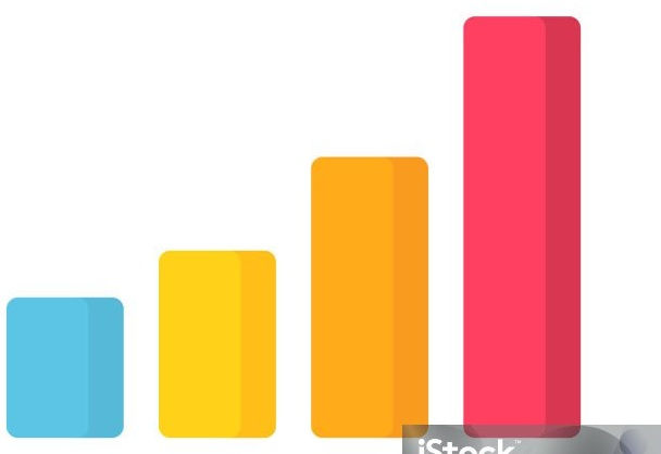
A bar chart is a graphical representation of data that uses rectangular bars of varying heights or lengths to represent data values
Purpose - to show trends and comparison in data
Example:
To compare the sales of different categories,a bar chart can be used. It will clearly show which category had the largest Sale
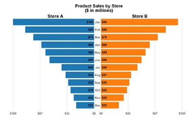
2) Line chart
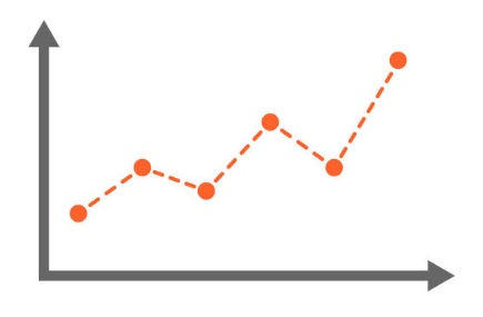
Purpose - Compare data over different periods
When to use - When working on time series data
3)Pareto chart
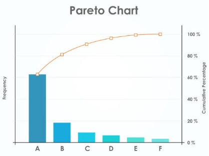
Pareto chart is a type of bar chart combined with line graph base on the Pareto principle (80/20 rule)
-the idea 80% of effects comes from 20% of causes ie small number of causes accounts for larger percentage of the effect
Here the individual values are represented in decending order by bars and cumulative total is represented by the line
Purpose:
It helps to identify the most frequent or important factorscontributing to a problem
Its particularly useful when you have many potential causes and wants to focus on a vital few that are most significant
4) Scatterplot Chart
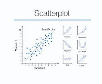
Scatterplot shows the trend or relationship between different measures
Purpose:
To display what happens to one variable when another variable is changed
They are used in fields like market research,scientific studies and even personal finance to examine how one variable might influence another
For instance we might use a scteerplot to see if there's relatinship between temperature and icecream sales
5)Pie chart
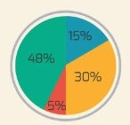
Pie chart helps organize and show data as a percentage of a whole
This visualization uses a circle to represent the whole and slices of the circle or "pie" to represent the specific categories that compose the whole
Purpose:
To show the contribution of a measure over different measures in a dimension
Use the pie chart if:
your dimensions have only limited number of categories
When one category outweighs the other by a significant margin
6)Histogram
Histogram is a chart that shows the distribution of a continuos numeric variable by grouping values into bins.
Purpose
It is used to see how the data is spread out(normal,skewed,bimodal,etc)
Can be used to identify the outliers
Can be used to compare the frequency of certain value range
9) Butterfly Chart/Tornado Chart
A butterfly chart is a dual horizontal bar chart that displays two related data side by side
Purpose
It gives a quick glance of difference between two groups with same parameters
An eg would be displaying the population density in Male vs Female across different age groups
10) Gnatt Chart
Gnatt chart is a type of bar chart that visualizes a project schedule
It shows the tasks or activities over time along wth their start and end dates
Purpose:
Used to identify the time taken for different categories
Conclusion
In a world overflowing with data,simply displaying the numbers is not enough.To convey the correct insights and inflence the decisions the right chart must be chosen
Whether it is a bar chart to compare the data,scatterplot to show the relation or Pareto chart to identify the key contibutors each vof the charts plays a very important role in shaping the narrative.Thr right chart turns raw data into meaningful data which further helps in conveying the correct insights and make the right decisions while the wrong dta causes confusion and important insights and patterns are missed.
By mastering the art of data storytelling through proper chart selection,we move beyond just presenting information- we create visual stories that persuade, inform and inspire

