Waffle Charts in Tableau: A Delicious Way to Visualize Data
- Subasini Clattus
- May 26, 2025
- 3 min read
Tableau is a powerful data visualization and business intelligence (BI) tool that enables users to explore and analyze data through interactive, shareable dashboards and reports. While Tableau doesn’t offer a built-in waffle chart, you can still create one using a custom dataset and a few simple steps.
What is a Waffle Chart?
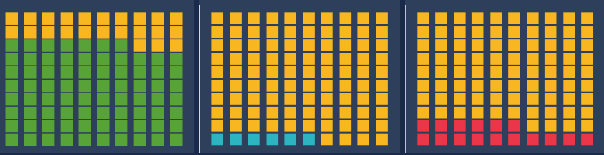
A waffle chart is a grid-based visualization used to show parts of a whole, often displayed as a 10x10 grid (100 squares), where each square represents 1% of the total. It’s a clean, compact alternative to pie charts, ideal for displaying percentages in a visually engaging way.
Waffle charts can be created using a grid template and calculated fields to color in the appropriate number of squares based on a percentage value.
Why Use a Waffle Chart?
Waffle charts are especially effective when:
Easy to interpret – The 10x10 grid intuitively maps to percentages.
More precise than pie charts – Especially for small differences between categories.
Dashboard-friendly – Clean visuals that fit well into KPI dashboards.
Great for storytelling – Perfect for emphasizing categories like completed tasks, survey responses, or goal progress.
When to Use (or Avoid) a Waffle Chart
Use a waffle chart when:
You need to show part-to-whole relationships (e.g., appointment outcomes, market share, survey results).
You’re visualizing categorical data as percentages.
You want to enhance dashboard appeal with a more visual representation.
You're comparing values that sum to 100%.
Avoid waffle charts when:
There are too many categories, making the chart cluttered.
Your data doesn’t represent a whole (i.e., raw counts, independent values).
You require precise numerical comparisons—a bar or table might be more appropriate.
How to create a waffle chart?
To build a waffle chart in Tableau, you’ll need two datasets:
A grid template (usually created in Excel).
Your actual data source (e.g., Ambulatory Visit data).
Step 1: Prepare the Grid Template in Excel
Your Excel file (ex : Waffle Template.xlsx) should include the following columns:
Row - Indicates the row position in the 10x10 grid. The values start at 1 and increase every 10 rows (e.g., the first 10 rows have Row = 1, the next 10 have Row = 2, up to Row = 10).
Column - Indicates the column position in the grid. The values repeat from 1 to 10 for every set of 10 rows.
Percentage - Cumulative percentage value ranging from 1% to 100%, used to determine which cells should be filled based on your actual data percentage. This structure allows you to map a percentage value (e.g., 63%) onto a visual grid by coloring in the first 63 cells.
This approach forms the foundation of a waffle chart, where each cell represent 1% of the whole.

Step 2: Load Data into Tableau
Open Tableau and connect to your primary dataset (e.g., Ambulatory Visit).
In the Data Source tab, load the Excel file (ex : waffle_template.xlsx)

Step 3: Build the Waffle Grid
Drag Column to the Columns shelf.
Drag Row to the Rows shelf.
In the Analysis menu, uncheck Aggregate Measures.
In the Marks card, change the chart type to Square and increase the size.

Step 4: Create Calculated Fields
In the primary dataset (e.g., Ambulatory Visit):
Create a calculated field (ex. @Completed_Visit)
SUM([Completed_visit])/[Total_Visit]
In the waffle grid (Excel dataset):
Create another calculated field (ex. Completed_Color):
[AmbulatoryVisits (QualityDataset)].@Completed_Visit]>=sum([Percentage])
Step 5: Finalize the Chart
Drag Completed_Color to the Color shelf.
Remove Headers and Grid Lines for a clean look.
Drag @Completed_Visit to Detail.
Right-click a mark, select Annotate > Mark, and display the actual value.
Repeat the process for No-Show and Cancelled visit percentages using additional calculated fields.


You’ll end up with a set of clean, visually engaging waffle charts, each showing the breakdown of ambulatory visits by Completed, No-Show, and Cancelled statuses. These charts provide a quick snapshot of performance and are excellent for dashboards and executive reporting.

