Visualizing Performance with a Thermometer Chart in Tableau
- Savithapriya Thinakaran
- Jan 13
- 4 min read
Introduction
Today I learned that data visualization can trigger unexpected side effects.
Especially while creating a thermometer chart tweaking the fill level, aligning the reference line, and choosing just the right gradient color my brain quietly switches from performance metrics to weather forecasts and fever checks. Suddenly, every KPI feels like it’s running a temperature test. That’s my heated struggle 🌡️
Temperature jokes aside, let’s talk about my work “The Thermometer Chart.”

A thermometer chart is a creative and intuitive way to show progress toward a goal or compare percentage-based metrics across categories. It mimics the look of a real thermometer, where the filled portion visually represents how much of a target has been achieved.
In this blog, you’ll learn how to create a thermometer-style chart in Tableau like the one shown above, where percentages are displayed for multiple countries using gradient-filled thermometers.
When it comes to comparing progress across countries, clarity and impact matter. That’s why thermometer charts, simple, intuitive visuals, show how close each item is to a goal are a powerful choice. In this post, we’ll walk through how to build a multi country thermometer chart in Tableau, like the one comparing Australia, Canada, France, UK, and USA.
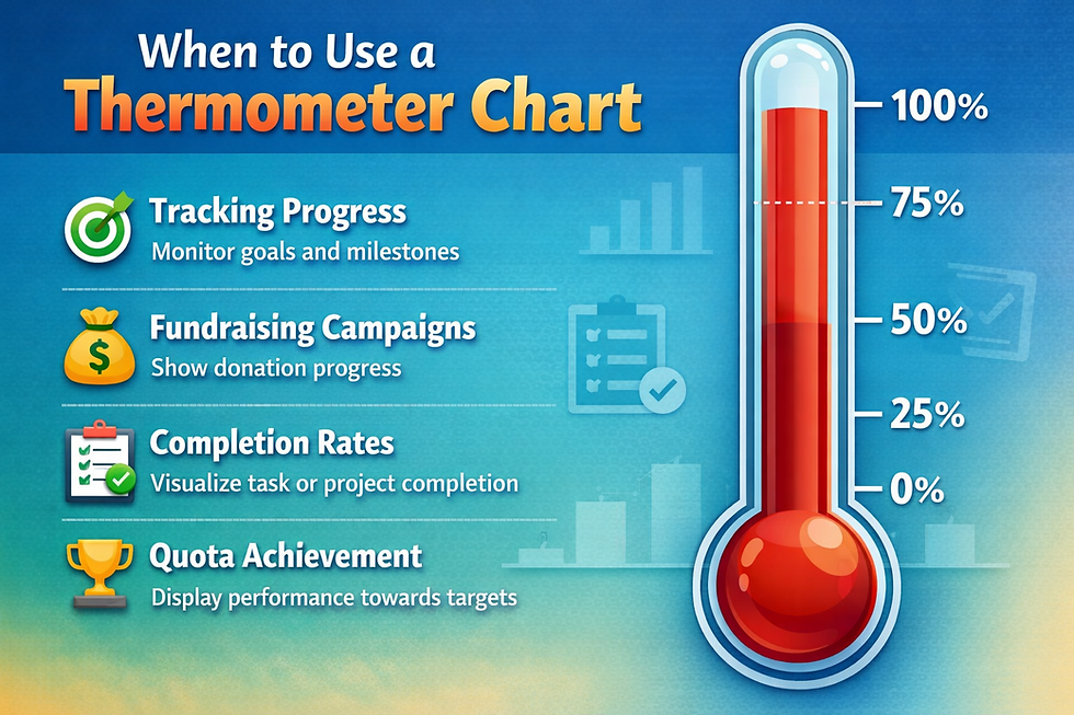
Use a thermometer chart when you want to:
Show progress toward a goal or target
Display percentage-based metrics
Compare performance across categories (Product, Country, Department)
Create a clean, modern KPI visualization
Sales target vs achievement
Profit or margin attainment
Project completion percentage
Performance scorecards.
Step-by-Step: Build a Thermometer Chart in Tableau
Step 1: Connect to Your Data
Open Tableau
Connect to your data source (Excel, CSV, database, etc.)
Sample Dataset Used
For this guide, a simple dataset is used:
I created own Data set with two fields. This dataset contains country-level values represented as ratios or percentages. Each row shows a country and a corresponding numeric value that indicates the level of performance.
Understanding the Values:
The Value column is expressed in decimal format, which can also be interpreted as a percentage
1.0 = 100%
0.5 = 50%
0.0 = 0%
Country-wise Interpretation
USA (0.9) - Indicates a very high value (90%), suggesting strong performance or near-complete achievement compared to other countries.
UK (0.7) - Represents a high value (70%), showing solid performance but still below the USA.
Canada (0.5) - A moderate value (50%), indicating average or mid-level performance.
Australia (0.4) - Slightly below average (40%), suggesting room for improvement.
France (0.3) - The lowest value (30%), indicating comparatively low performance or adoption.
Key Insights from the Dataset
The USA leads significantly among the listed countries.
There is a wide performance gap between the highest (USA) and lowest (France).
Most countries fall within the mid-range (0.4–0.7).
The dataset is ideal for showing comparative analysis across regions.
Step 2: Create an Index Field
Create a calculated field called Index:

This helps control the vertical structure of the thermometer.
Step 3: Create the Thermometer Bars
Drag Country to Columns.
Create path 1 to 101 and join with data.
Create path pin and path pin size is 1.
Drag index and path pin to row.
Go under row, in path pin select compute using by path pin.
Set mark type to line.
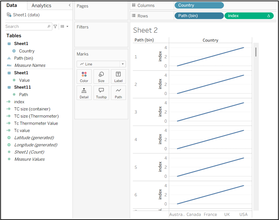
Drag path bin to path.
In index right click go to compute using path bin.
Create calculated field called Tc value:

Create next calculated field called TC Thermometer value.

Drag Tc Thermometer value to Rows shelf.
In TC Thermometer value write click go to compute using select path bin.

Step 4: Create the Thermometer Shape
To draw the thermometer stem and bulb.
Create a calculated field for the Tc size (container):

Create calculated field for the Tc size (Thermometer)

Under marks index column change color to grey.
Drag TC size (container) to size and increase the size.
Now click on TC Thermometer value under marks.
Drag TC size (Thermometer) to size and increase the size.
Use Dual Axis and synchronize

Step 5: Add the Background Thermometer
Change the background Thermometer color to light Grey.
Apply a red-to-light-red gradient on Color.
Under marks Tc Thermometer value select value to Label.
Change the alignment to center of the Thermometer.
Increase line Size to give a thermometer-like appearance.
Put Tc size to size under mark.
This creates the illusion of liquid inside a thermometer tube.

Step 6: Add Percentage Labels
Drag the value field to Label.
Format it as a percentage.
Place it near the bulb area.
Increase font size and bold for readability.
Drag TC Thermometer value to color under marks and go to compute using select path bin.

Step 7: Add Country Labels
Place Country on the Columns shelf.
Format labels at the bottom for clarity.
Formatting Tips
Remove gridlines and borders for a clean look.
Hide headers and axis.
Use rounded line caps to simulate a thermometer bulb.
Keep color intensity consistent across values.
Final Result
You now have a clean, visually engaging Thermometer chart showing percentage values for each country. This chart is especially effective on dashboards where visual impact and quick explanation matter.
Conclusion
By the time I finished the chart, I had:
A shiny thermometer chart showing exactly which KPIs were hot, warm, or chilling 🥵❄️
And a sudden urge to grab a cold drink… or maybe a fever thermometer for my laptop.
An unexpectedly steamy side effect of building a Thermometer Chart 🔥
Data analysts face many challenges.
Some are brain-bending.
Some are mind-twisting.
And some are… melting under the pressure 😂🥵..

