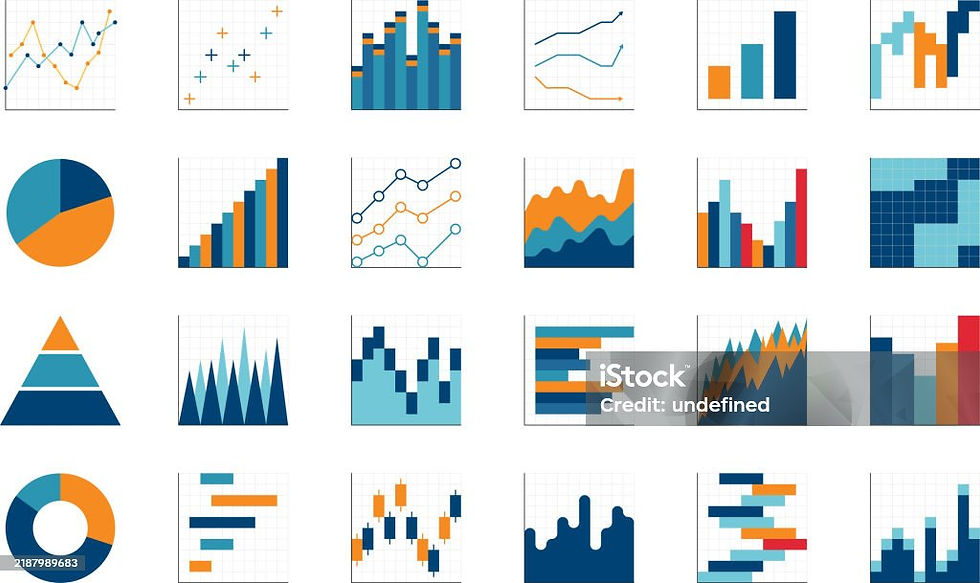
Visualizing Data: Why it matters in Business
- kriti verma

- Jul 7, 2025
- 2 min read

Picture this:
A large conference table.
Managers with stacks of binders and printed reports.
A whiteboard listing main categories.
Overhead projectors showing transparencies.
Rounds of coffee and cigarettes (very Mad Men).
Today:
Data pipelines ingest information in real time.
Dashboards show trends and forecasts instantly.
Scenario modeling takes seconds.
Visualization clarifies insights for everyone.
Decisions are data-backed, not just gut feel.
For most people charts are just pretty pictures. But in Data science, they are storytelling tools.

Why Visualization Matters:
Faster Understanding
Humans are visual by nature. We process images 60,000 times faster than text.
When you look at a charts, you can instantly see:
Trends
Outliers
Patterns
Imagine Reading a table of 1000 sales transactions vs. glazing at a line chart showing revenue climbing or dropping. Visualization lets decision-makers understand complex information in seconds.
Better Decision-Making
Managers, stakeholders, business leaders are constantly answering questions like:
Which products are performing the best?
Which regions are underperforming?
Where can we optimize the costs?

Data visualization through charts provides clear visuals:
Highlights what matters.
Show cause-effect relationship.
Help prioritize actions.
This leads to data-driven decisions rather than guesses or assumptions.
Improved communication
A good chart tells a story everyone understands, regardless of technical skills. This:
Builds alignment across teams.
Makes presentations more persuasive.
Helps stakeholders see the big pictures.
Saving Time
Instead of digging through endless rows and columns of data:
Dashboards and visuals summarize information automatically.
This free teams to spend time taking action rather than just preparing reports.
Motivating Teams and Tracking Efforts
Visual KPIs and progress report charts:
Keep everyone aware of goals.
Create accountability.
Make performance tracking transparent.
Identifying Patterns and Insights
Visualization helps uncover:
Seasonality (e.g., sales peaks every December)
Correlations (e.g.,more advertising leads to higher sales)
Anomalies (e.g., sudden drop in website traffic)
Without visualization, these insights stay hidden in spreadsheets.

Reducing Errors
Tables of raw data can be misread or miscalculated. Visualization makes inconsistencies obvious.
Example: A bar chart quickly reveals a number that's way off trend or a Heatmap showing missing or anomalous data.
Tools you can use for Data Visualization:
Tableau
Power BI
Python (Matplotlib, Seaborn, Plotly)
Excel (for basic charts)
Flourish or Canva (for infographics)
In a nutshell Data Visualization turns raw data into actionable business intelligence. It:
Clarifies
Speeds up understanding
Builds trust
Drives better decision
To put it simply, good data visualization turns information into insight –and insight into action. In a world flooded with data, visualization is the key to clarity and confident decision making. That’s why it has become an essential tool for every successful business today.

