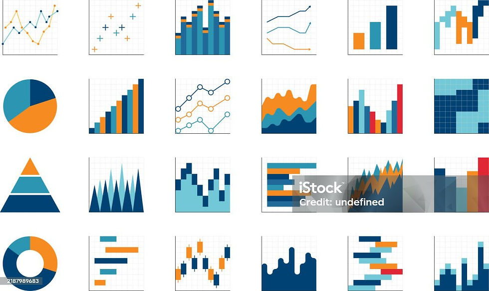
Tableau-Which chart should I pick?
- Grace Gole
- Jul 26, 2025
- 2 min read

Introduction:
I do not have prior background or experience in ‘data analysis’ as it is commonly defined. However, as a chemical engineer I have analyzed engineering data using tools like Excel-making scatter plots, line and bar graphs for the most part and occasionally pie charts.
I am a beginner in Tableau. If you are too, you might often wonder which chart best conveys your point in a simple, effective and yet visually appealing way. Tableau provides a range of pre-built chart options, while others may require custom creation.
To get you started - I have put together some recommendations based on my understanding and the charts I have learnt so far:
1. Showcasing Trends Over Time:
Hands down line charts top the list! They are highly effective for demonstrating trends across time.
Alternatively, a circle mark chart with an added trend line can illustrate data direction over a period. If there are additional dimensions such as sub-category or region, area charts and segmented bar charts are excellent choices.
2. Proportional Relationships:
When illustrating proportional relationships—such as percentage sales by category or region—donut charts are my go-to choice! You might also consider using a more advanced option like a radial chart!
For hierarchical data flows (e.g., sales by categories and sub-categories), sunburst charts, tree maps, or sankey charts are all suitable.
3. Comparing Measurements Across Multiple Dimensions:
I prefer the funnel chart when comparing measure sizes relative to two or three dimensions, followed by bar chart and bubble chart.
4. Analyzing Correlations Between Two Measures:
Scatter plots are ideal for identifying correlations between two measures.
For comparing two measures within a shared dimension, butterfly or tornado charts do the job beautifully!
5. Data Distributions:
Histograms and box and whisker plots are recommended for displaying distributions.
Conclusion:
There is rarely a single definitive chart for a specific analytical task. Key questions such as: What is the objective of your analysis? Who is the intended audience? What is the significance of your findings? —can guide you in selecting the appropriate chart to effectively communicate your message.
While this list is not exhaustive, it gives you a sneak peek at some possible choices. You can call it a 'cheat sheet' if you will.

