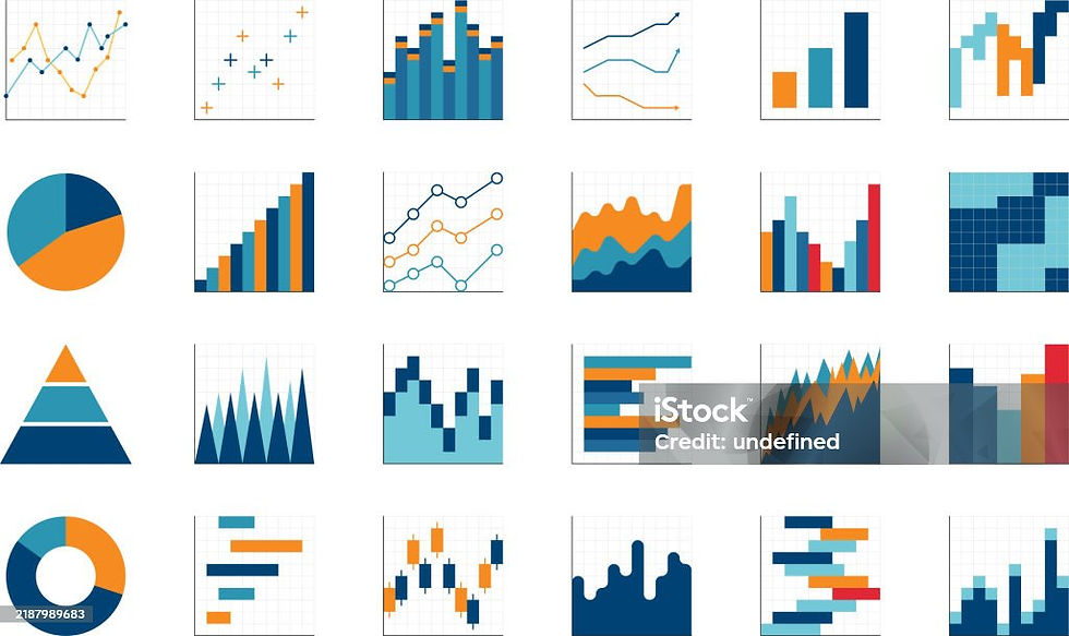
Starting From Scratch: My Honest Starting Point with Tableau

I’ll be real with you, when I opened Tableau for the first time and was introduced to what we actually do in it, my brain did a full reset.
I vaguely remembered doing bar charts and donut charts back in school. I knew they existed. But what they actually represent? What problem they solve? Completely blank. And there’s no shame in admitting that I had to start from Level 1, and I’m saying that with full honesty and zero embarrassment.
The first thing I did was break down my silly questions and start writing them down. So that’s exactly what I did. I opened a notepad and listed out everything that confused me as I played around with the Tableau canvas:
• When do I use which chart?
• What is a Dimension?
• What is a Measure?
• What is a Calculated Field?
Simple questions. Beginner questions. I went looking for answers to understand, and this blog series is the result of that research, written the way I understood it.
Let’s start with the one that tripped me up first: which chart do I even pick?
Every Great Visualization Starts with a Question
Let’s break down the most common chart types.
Bar Chart (Comparing Values Across Categories)
The Bar Chart is one of the most versatile and widely used charts in Tableau. If your goal is to compare values across different categories — like sales by region or revenue by product — then this is your starting point. All you need is one or more dimensions and a single measure.

Line Chart (Showing Trends Over Time)
When time is involved, the Line Chart takes center stage. It’s perfect for tracking how a metric changes — whether that’s monthly revenue, daily website visits, or quarterly growth. You will need a date or time dimension paired with one or more measures.

Pie Chart or Treemap (Comparing Parts to a Whole)
Sometimes the story isn’t about change — it’s about proportion. A Pie Chart is ideal when you have a small number of categories and want to show how each contributes to the total. Keep your dimension simple and stick to one measure for best results.

When the number of categories grows, the Treemap becomes a smarter choice. It handles multiple dimensions and one measure, making it easier to visualize many parts of a whole without the chart looking cluttered.

Map (Analyzing Geographical Data)
If your data has a location element — like country, state, city, or postal code — then a Map chart instantly adds context that a table never could. Pair your geographic dimension with one or more measures, and Tableau will plot the story right on the map.

Scatter Plot (Exploring Relationships or Correlations)
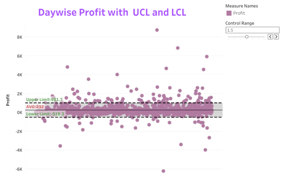
Want to know if two variables are related? The Scatter Plot is built for exactly that. By plotting two measures on the X and Y axes, you can quickly spot patterns, clusters, or outliers. Adding an optional dimension lets you color-code the points for even deeper insight.
Histogram (Analyzing Data Distribution or Frequency)
When you want to understand how your data is spread (are most values clustered in one range or spread out evenly?) then the Histogram gives you a clear picture. It works with just a single measure, making it one of the simpler charts to set up.

Box and Whisker Plot (Spotting Statistical Summaries and Outliers)
For a more detailed statistical view, the Box and Whisker Plot goes beyond averages. It reveals the median, quartiles, and outliers all in one chart. You will need one dimension and one or more measures to bring this one to life.

Gantt Chart (Displaying Timelines or Project Schedules)
Planning a project or tracking task timelines? The Gantt Chart was made for this. With one dimension and one or more date or measure fields, it maps out who is doing what and when, making it a favorite for project managers and operations teams.

Area Chart (Visualizing Trends and Cumulative Changes Over Time)
An Area Chart is used to track overall trends over time while emphasizing the magnitude and volume of the data. It is ideal for visualizing cumulative values and highlighting how data changes over a continuous period. A basic Area Chart requires exactly one dimension and one measure.

Packed Bubble Chart (Comparing Categories by Size and Magnitude)
A Packed Bubble Chart is used to compare quantitative values across different categories using the size of circles. It provides an engaging and visually appealing way to highlight the relative magnitude of each category, making it easy to identify larger and smaller values at a glance.

Quick Reference: Chart Selection Guide
Goal / Question | Best Chart | Ideal Data |
Compare values across categories | Bar Chart | 1+ Dimensions, 1 Measure |
Show trends over time | Line Chart | 1 Date Dimension, 1+ Measures |
Compare parts to a whole (few) | Pie Chart | 1 Dimension, 1 Measure |
Compare many parts to a whole | Treemap | 1+ Dimensions, 1 Measure |
Analyze geographical data | Map | Geographic Dimension, 1+ Measures |
Explore relationships/correlations | Scatter Plot | 2 Measures, 0-1 Dimensions |
Analyze data distribution/frequency | Histogram | 1 Measure |
Statistical summaries and outliers | Box-and-Whisker | 1 Dimension, 1+ Measures |
Display timelines/project schedules | Gantt Chart | 1 Dimension, 1+ Dates/Measures |
Show trends over time with emphasis on volume/magnitude | Area Chart | 1 Date Dimension, 1+ Measures |
Compare relative size of many items in a non-hierarchical, clustered view | Packed Bubble Chart | 1+ Dimensions, 1+ Measures |
Which chart to use was only the first “silly question” on my notepad. The other three — what is a Dimension, what is a Measure, and what is a Calculated Field took a lot longer to answer. So before wrapping up, here’s the honest, beginner level breakdown I eventually pieced together.
Dimensions vs. Measures(The Blue and Green Divide)
The first thing you’ll notice in Tableau is that every field in your Data pane is colored either blue or green.
Dimensions (blue) are your qualitative, descriptive fields the “who, what, where, when” of your data. Things like Patient Name, Primary Diagnosis, Visit Type, Admission Date, and Reason for Visit. Dimensions slice your data into categories. They answer, “by what?” A dimension doesn’t get added up; it gets grouped by.
Measures (green) are your quantitative, numeric fields the “how much” or “how many.” Things like Length of Stay, Number of Visits, Readmission Count, and Cost. Measures are meant to be aggregated like summed, averaged, counted. When you drag a measure onto a view, Tableau automatically wraps it in an aggregation like SUM() or AVG() unless you tell it otherwise.
Here’s the simplest way I finally remembered the difference: dimensions break your view apart; measures fill it in. One gotcha that tripped me up for a while: a field’s color isn’t set in stone. Tableau lets you right-click any field and convert it between dimension and measure, so don’t be afraid to switch it if a chart looks weird.
Calculated Fields (When Your Data Doesn’t Already Say What You Need)
Calculated fields are what you build when the answer you want isn’t sitting in a column already. It needs to be computed from one or more existing fields. Some calculated fields I’ve built recently, translated into plain English:
• Control_BP — a yes/no field checking whether a patient’s blood pressure falls under a controlled threshold, built using IF logic on top of a parameter.
Eg: FLOAT(
IF (IFNULL([Blood Pressure Diastolic],[BPD Parameter]) <= [BPD Parameter])
AND (IFNULL([Blood Pressure Systolic],[BPS Parameter]) <= [BPS Parameter])
AND [Visit Status] = 'Completed'
THEN 1
END
)
• A DATEDIFF calculation — for scheduling lag, subtracting a scheduled date from a completed date to get the number of days between them.
Eg: To find the number of days between order date and shipment date
DATEDIFF('day',[Order Date],[Ship Date])
The pattern across all of these is the same: if you find yourself wishing a column existed that doesn’t, that’s your cue to open the calculated field editor. Tableau won’t invent Length of Stay if you never had an Admission Date and Discharge Date to subtract but it will happily let you build that subtraction yourself.
Parameters (A Bonus Concept That Ties in Here)
Parameters weren’t on my original notepad list, but they turned out to be closely related, so I’m including them here. A parameter is a variable you create yourself — it doesn’t come from your dataset at all. It’s a standalone value that a person viewing your dashboard can control, and you reference it inside a calculated field.
A concrete example from my own dashboard work: I built a BPD/BPS Parameter for a blood pressure control dashboard, so the person viewing it could toggle between diastolic and systolic readings without me building two separate dashboards. So, the mental model I use now is a dimension or measure is something your data already has, while a parameter is something you’re inventing to let someone interact with your view.
How It All Fits Together
Dimensions and measures are the raw material already in your dataset. A parameter is a control you build so a viewer can change what they’re looking at. A calculated field combines dimensions, measures, and sometimes a parameter into a brand-new field — which then behaves like just another dimension or measure once it’s built. If you take away one thing: every time you drag a field or write a calculation, ask yourself “is this something my data already has, or something I’m creating?” That single question sorts almost everything into the right bucket.
Final Thoughts
Tableau gives you a powerful toolkit, but the tool only works as well as the thinking behind it. Start with your question, identify your data structure, and let that guide your chart choice. Over time, you’ll find that selecting the right visualization becomes one of the most intuitive and satisfying parts of the analytics process.
And if you’re anything like me starting from scratch with a notepad full of “silly questions” just know that writing them down was the best decision I made.