Level Up Visuals: Easy Tableau Charts with a Creative Twist
- Smruti Satyanarayana
- May 21, 2025
- 4 min read
In this post, we will explore a handful of unique yet easy-to-build Tableau charts that can instantly elevate our visual storytelling—no complex calculations or custom extensions required. Whether a beginner or just looking to freshen things up, these creative twists are the perfect place to start.
The first step in Tableau is connecting to our data. For this post let’s use the ‘Superstore Sales’ dataset. Now let’s start by creating our first unique visualization.
📊 Chart Type: Bump Chart
Purpose: Show how ranks change over time (e.g., sales rank of product categories per year).
Step 1: Create a calculated field for Rank
Go to the Data pane, right-click and select Create Calculated Field.
Name it Sales Rank and enter:
RANK_UNIQUE(SUM([Sales]))
This ranks each category based on total sales.


Step 2: Drag fields to the view
Drag Order Date to Columns – right-click and choose Year.
Drag Category to Rows.
Drag the new calculated field Sales Rank to Rows (next to Category).
Tableau will default to a Line chart.
Drag Category to Color to separate lines by category.


Step 3: Reverse the y-axis to show top rank at the top
Right-click the Sales Rank axis and choose Edit Axis.
Check the Reversed box so that Rank 1 is at the top.


Step 4: (Optional) Add dots to each point
Drag Category to Detail (if not already there).
Click and drag the Sales Rank pill slightly to the right on the same shelf, then drop it.
We will now see two Sales Rank pills on the Rows shelf.
Tableau creates two separate axes (we will see two vertical Y-axes on the view).
Click on the second Marks card (for the second Y-axis).
Change the Marks type to Circle.
Ensure Category is on Detail and add Color if needed.


Step 5: Combine using Dual Axis:
Right-click the second Y-axis → select Dual Axis.
Right-click Y-axis → select Synchronize Axis.


Step 6: Clean up:
Right-click one of the Y-axes → Uncheck "Show Header" to hide.
Adjust size, color, or add labels as needed.


✅ Result:
A clean Bump Chart showing how each product category’s sales rank changes over the years.
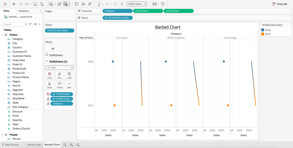
📊 Chart Type: Barbell (DNA) Chart
Purpose: Compare two values side-by-side (e.g., sales in two regions, years, or customer segments) with a connecting line for visual emphasis.
Let’s compare Sales by Category for 2016 vs. 2017.
Step 1: Create a Year field
Drag Order Date to Filters, choose Years, and select 2016 and 2017.
Drag Order Date to Columns, right-click and select Year (Discrete).


Step 2: Set up the basic bar chart
Drag Category to Rows.
Drag Sales to Columns.
Drag Order Date (Year) to Color.
Now we will see a side-by-side bar chart comparing 2016 and 2017 sales by category.


Step 3: Pivot the chart for a DNA layout
Swap the axis: Drag Category to Columns and Order Date to Rows.
Now we have a vertical layout, but we need to turn bars into dots and connect them.


Step 4: Change the mark type to Circle
In the Marks dropdown, select Circle.
Drag Order Date (Year) to Detail on the Marks card.
Drag Category to Detail (if it's not already there).


Step 5: Duplicate the axis for a connecting line
Click and drag the Sales slightly to the right on the same shelf in Columns, then drop it.
We will now see two Sales pills on the Columns shelf.
Tableau creates two separate axes.
Click on the second Marks card (for the second X-axis).
Change the Marks type to Line.
On that Line mark:
Drag Order Date (Year) to Detail.
Drag Category to Detail.


Step 6: Combine into Dual Axis
Right-click on the second Sales axis → Dual Axis.
Right-click again → Synchronize Axis.
Hide one of the axes for a cleaner look.


Step 7: Final polish
Format the circles and lines (e.g., change line color, adjust circle size).
Sort categories if needed.
Add labels if desired.


✅ Result:
A sleek Barbell Chart showing a clear comparison between 2016 and 2017 sales across each product category, with lines connecting the two values like a DNA strand.
📊 Chart Type: Trellis Chart (Small Multiples)
Purpose: Compare monthly Sales trends across multiple Regions in a consistent, side-by-side layout.
Step 1: Place Region in Detail
Drag Region to the Detail shelf on the Marks card.
This is important so that Tableau knows to calculate INDEX() per Region.


Step 2: Create calculated fields for grid layout
We will now tell Tableau how to lay out the small multiples in a grid by assigning each chart to a specific row and column position.
Create Column Index
Select Analysis → Create Calculated Field → call it Trellis Column and enter:
(INDEX() - 1) % 2
Create Row Index
Create another calculated field → call it Trellis Row and enter:
INT((INDEX() - 1) / 2)
This sets up a 2 x 2 grid for 4 regions.


Step 3: Add Trellis Fields to View
Drag Trellis Column to Columns
Drag Trellis Row to Rows


Step 4: Configure Table Calculations
Click the dropdown arrow on each pill (Trellis Column and Trellis Row) → Edit Table Calculation.
Use Specific Dimensions
Check only Region


Step 5: Add Sales Trend
Drag Order Date (Month - Continuous) to Columns
Drag Sales to Rows
Add Region to Label


Step 6: Clean up the view
Remove grid lines.
Add labels or titles if desired.
Hide Headers: Right-click Row and Column headers → uncheck Show Header
Format: Clean up colors, tooltips, and gridlines for a polished look


✅ Result:
A beautiful grid of line charts, one for each region, showing their sales trends over time—making it easy to:
Spot patterns or anomalies
(e.g., Is sales seasonality stronger in the West than in the South?)
Compare trends, not just totals
(e.g., Are some regions peaking in different months?)
While line charts and bar graphs often steal the spotlight, bump charts, barbell charts, and trellis charts offer unique and insightful ways to visualize data. Each of these charts brings a fresh perspective—whether it's tracking rank changes over time, highlighting differences between two points, or breaking down trends across categories.
They're not only visually engaging but also surprisingly easy to create. By incorporating these lesser-known charts into our toolbox, we can tell more compelling data stories and uncover patterns that might otherwise go unnoticed.
Thank you for reading!

