How to create interactive Boxplot in Tableau & Python
- prichaseofc
- Apr 15, 2025
- 8 min read
Imagine you're sitting on an enormous pile of data, wishing you could instantly spot trends, outliers, or weird patterns?
Whether you're exploring customer order costs or analyzing delivery time, a boxplot can tell a powerful story—with just one glance: spread, center, outliers, and more…
In this blog, I’ll Walk you through the easiest ways to create boxplots using both Tableau (no code!) and Python (with just a few lines of magic 🧙♂️).
But wait, you don’t have to settle for static visuals. We can make these boxplots more engaging and interactive that let you filter, hover, explore, and uncover insights in real time.
So, let’s get started!!
Before we dive into building interactive boxplots, let’s take a moment to understand what they actually are—and why they’re such powerful tools for data analysis.
What is boxplot?
A boxplot, or a box-and-whisker plot is a statistical chart that visualizes the distribution of numerical data, spread and skewness through five key summary statistics.
The five-number summary includes,
1. Minimum value (Q0) : the lowest data point in the data set (excluding any outliers).
2. First quartile (Q1) : lower quartile (25th percentile), it is the median of the lower half of the dataset.
3. Median (Q2) : The middle value (50th percentile) in the data set i.e. the box where around 50 percent of the data points fall.
4. Third quartile (Q3) : upper quartile (75th percentile), it is the median of the upper half of the dataset.
5. Maximum value (Q4) : the highest data point in the data set (excluding any outliers).
Boxplots are simple, powerful and useful in data analysis because they provide a clear visual summary of a dataset's distribution, showing the central tendency, spread, and outliers. The symmetry of the box can help identify skewness in the data. Boxplots highlight outliers and are particularly valuable for large datasets, where calculating and displaying individual values would be cumbersome. They are even more useful when comparing distributions between members of a category in the data.
Box Plot is shown below.

Great!!! now that we have a clear understanding of boxplots and their importance, let's create a static boxplot first in both Tableau and Python and then will modify it to make it interactive.
Quick overview on dataset (Food Hub Dataset)
The Food hub is a food aggregator company which provides online food delivery services through their smartphone app. The data contains information about approx. 2k different online orders from 178 restaurants providing varieties of flavorful good foods from 14 different cuisines.
In Tableau:
Scenario: We want to check how “cost of the order” affects the “rating” of the restaurants.
Steps to be followed:
1. Connect to the given data source (food hub here).
2. In order to create a Boxplot, we need one categorical (Rating) and one measure (cost of the order) quantitative value.

3. Drag the “Cost Of The Order” (measure) to the row.
By default, tableau will create a Bar plot and also show the measure as an aggregate functions (Sum, Median, Average, Count etc.).

So in order to create a boxplot, we need to do few adjustments.
a) Go to Analysis tab, and unchecked the “Aggregate measure” (shown below). Now we can see that the measure are not aggregated any more and data points for various points are displayed as circles.

b) Now right click on axis to add reference line, and Goto boxplot and make following changes. Select the “Hide underlying marks(except outliers)”.
You can play with formatting - for different color/style /border etc.
next Click ‘ok’.


4. Drag the “Rating” to the row and to color in Marks.
Note: In figure 1, since we have checked the “Hide underlying marks(except outliers)” under edit Add reference line in boxplot section. We cannot see the individual data points and the rating colors(shown below)

But if you want to see the points in different color for different rating (change the “automatic” to “circle” and adjust the “size “under Marks section. Secondly unchecked the “Hide underlying marks(except outliers)” under edit Add reference line in boxplot section.(See below).


So, now our Boxplot in Tableau is created for customer ratings with respect to cost of the order.
Let’s do some modification in above boxplot to make it Interactive by adding filters on “rating” and adding new dimension “cuisine type”.
Steps to make the boxplot Interactive.
1. Drag the “Cuisine Type” to label.
2. Drag the “rating” and “Cuisine Type” under filter.
Right click on rating and Cuisine type under filter section to show filters on the upper right corner side of sheet.

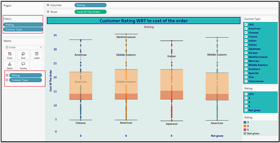
Now by applying dynamic filter on rating and cuisine type, you can instantly explore how the Cost of the Order varies—making the analysis interactive and insightful in real time.

For example, here on this dashboard cost of the order will be display only for rating =”3” and cuisine type =” American”. (shown below)

Applied new Filter: rating=’5’ and cuisine_type=’Indian’


Let's walk through creating a boxplot using Python for the same scenario, where we want to visualize the distribution of Cost of the Order with Rating. We'll use Seaborn, Matplotlib and plotly for interactive boxplot.
Using Python:
Matplotlib is a library in Python that enables users to generate visualizations like histograms, scatter plots, bar charts, pie charts and much more. It offers extensive control over the appearance of plots, including axes, titles, labels, and colors.
Seaborn is a visualization library that is built on top of Matplotlib. It provides data visualizations that are typically more aesthetic and statistically sophisticated. It simplifies the process of making complex plots (as compared to matplotlib) like boxplots, heatmaps, and regression plots, with better default aesthetics and fewer lines of code.
Plotly, on the other hand, is a powerful library for creating interactive, web-based visualizations. It allows users to hover over data points, zoom in and out, and filter data dynamically, making it ideal for creating rich, interactive dashboards and plots without writing extensive code.
Steps to be followed for creating Simple boxplot.
1. Open a Jupyter notebook and import the necessary python libraries for data manipulations and data visualization.
Data manipulation - numpy & pandas.
Data visualization - matplotlib and seaborn and plotly
Python Code:

Load the dataset and get an overview of the dataset (note here, the file is in csv form)

You can perform some basic checks to get an overview of datasets using head()[display 1st 5 rows] , tail() [display last 5 rows], info() [information about columns datatypes and missing values].
Example: head() function
Displaying the first 5 rows of the dataset using head() function

Plot boxplots using python for our analysis of rating with respect to cost of the order.
The code below is used to visualize the relationship between the rating given by customers and the cost of the orders.

Here is the simple explanation of the what each line of code does,a. plt.figure(figsize=(10, 3)) -->> This line is used here to create a plot with specified size [here (10,3)]. The width is 10 inches (x -axis) and the height is 3 (y- axis) inches.b. plt.title('Rating vs Cost of the order') -->> This line will set the title of the plot. Here it’s set to –('Rating vs Cost of the order'). sns.boxplot(data= df, x = 'rating', y = 'cost_of_the_order', hue='rating', showmeans=True) -->> This line creates a box plot using Seaborn.
where, data=df -->> The data is a Data Frame named “df”x='rating' -->> The x-axis will represent the rating.y='cost_of_the_order' -->> The y-axis will show the cost of the order.hue='rating' -->> This adds different colors based on the rating values, which helps to distinguish between different ratings.showmeans=True -->> This shows the mean (average) of the data points in each box if set to True.plt.show(): -->> this line displays the plot on the screen.Note: You can also use various formatting options (labeling x, y axis etc.) here to beautify the plot or add any other details.Figure below shows the boxplot created using python libraries.

We can also display how rating is affected by cost of the order and cuisine type.

Similar to above code instead of adding rating as hue, we have added cuisine type as hue (additional filter) to filter by cuisine type.
Plt.legend will set the legend outside the plot to the right (1,1), we can adjust this value or location of legend (center, upper left etc.) according to our need.

Now let’s make this boxplot interactive using plotly.
Python code

Here is the simple explanation of the what each line of code does,
a. fig= px.box() -->> This line will take inputs for creating boxplot.
b. df is the data frame, x=rating(dimension), y= cost of the order (measure) along y-axis,
c. color = rating (separated by different colors based on rating),
d. points = 'all' means it will display all the data points,
e. labels = if specify it will customize x and y label on the plot accordingly (i.e. user defined label name)
f. color_discrete_sequence=px.colors.qualitative.Set2) -->> to customize the color palette of categorical data (similar to hue in Seaborn).
g. color_discrete_sequence -->> sets the color sequence for discrete (categorical) variables.
h. px.colors.qualitative.Set2: -->> This is one of Plotly’s predefined qualitative color palettes. It provides a visually distinct set of colors.
i. fig.update_traces(boxmean=True) --> show means for each box.
px.box() doesn’t have a boxmean parameter directly in the function call, to Show mean in box, so we have to modifies the traces (visual elements) in the plot, boxmean=True to display the mean as a small dot in each box.
j. fig.write_html("rating_vs_costOfOrder_boxplot.html") -->> Export as interactive HTML, Plotly allows us to save interactive HTML versions of your figures to your local disk.
This interactive feature makes python more flexible, deeper control and advanced manipulations.

With filter condition: rating=5

Conclusion:
Through this blog we were able to conclude the following,
1. Boxplots are powerful tools for quickly spotting data spread, center, and outliers—perfect for comparing ex. groups like ratings or cuisines or restaurant performances.
2. Tableau makes it easy to create static and interactive boxplots with just a few clicks (Built-in features for interactivity (filters, tooltips, highlights) —with no coding needed.
3. Python (with Seaborn & Plotly) with advanced coding techniques (complex calculations), offers more control and flexibility on plots and are great for customization and adding interactivity (filters/zoom) and integration with ML models.
4. Using filters, we can add interactivity to our plots, which helps users explore the data dynamically, focus on specific segments, and gain deeper insights without modifying the underlying dataset.
Whether in Tableau or Python, interactive filtering enhances data storytelling and supports better decision-making. While Tableau makes it easy to create boxplots with a few clicks and are great for quick dashboards, business insights (non-technical stakeholders), Python on the other hand offers deep customization and automation — making it ideal for developers or analysts who need control over every detail of the visualization.
dashboard link: https://public.tableau.com/app/profile/priyanka.nigam1098/viz/InteractiveBoxplot_Demo/FoodHubInteractiveBoxplot
With this we came to end of this blog, If you found it helpful or learned something new, feel free to like, share, or drop a comment.
Happy learning!!

