From Terminal Output to Interactive Insights: How I Built My First Dashboard using Python, Jupyter, and a Sprinkle of HTML
- Shital Pilare
- 3 days ago
- 5 min read


When I started my journey into Python, I had a very specific image in my head of what "coding" looked like. I imagined Matrix-style green text raining down a black screen. I imagined complex algorithms and instantaneous results.
And, to be honest, the reality wasn't far off—at first.
I fell in love with Jupyter Notebooks. It was the perfect sandbox. I could write a chunk of code, press Shift + Enter, and boom—immediate feedback. I learned the basics of Pandas for data manipulation and felt like a wizard cleaning messy datasets. I learned to use Matplotlib to generate charts and felt like a data scientist.
Eventually, though, I hit a wall that none of the tutorials ever mentioned.
The Problem: The "Ugly" Truth of Data Analysis
I was working on a personal project—analyzing a dataset to find trends in daily productivity. I had done the hard work. My Python code was clean, my calculations were accurate, and my insights were genuinely interesting.
But when I looked at my notebook, it was… uninspiring.
It was a wall of code cells followed by raw text output. My "dashboard" was just a series of ugly Pandas dataframe prints that I had to scroll through endlessly. The charts were static images stuck in the middle of code blocks.
If I wanted to show this to a non-technical friend or a potential employer, I would have to say, "Ignore the code here, scroll down... no, too far... okay, look at this tiny number here."
I realized I had a gap in my skillset. I knew how to analyze data, but I didn't know how to present it effectively within my coding environment. I thought the only solution was to learn an entirely new enterprise tool like Tableau or a complex web framework like Django.
I was wrong. The solution was already in my browser.
It turns out, the bridge between my raw Python data and a beautiful presentation layer was right under my nose: Jupyter Notebook combined with basic HTML.
Here is the story of how I connected the dots.
The Lightbulb Moment : Jupyter is a Web Page
I had been using Jupyter Notebooks purely as a coding environment—a place to run cells and see immediate output.
The breakthrough happened when I realized what a Jupyter Notebook actually is. Under the hood, it’s essentially a web application. Every cell you look at is rendered using web technologies.
If Jupyter runs on the web, I realized it must understand the language of the web: HTML.
I discovered a magical little library tucked away in Python: from IPython.core.display import display, HTML
This line changed everything. It meant I wasn't restricted to just Python’s default text output. I could tell Python to generate HTML strings and feed them directly into the notebook's output area.
Suddenly, my notebook wasn't just a scratchpad for code; it was a canvas for a webpage.

The Journey : Building the Dashboard
My goal was simple: create a mini-dashboard that tracked some mock sales data. I wanted a clean header, some key metric "scorecards" at the top, and a styled data table below.
Here is how I approached it, broken down into three distinct layers.
Layer 1 : The Python Engine (The Brains) :
Before I worried about colors or fonts, I needed the data right. I used Pandas to load my CSV file, clean up missing values, and calculate the totals I needed.
At this stage, my notebook looked just like any other data analysis project—lots of dataframes and calculations. The engine was running, but it didn't have a chassis yet.
Layer 2 : The HTML Structure (The Skeleton) :
This was the hardest part of the learning curve, as I had to dust off my very basic HTML knowledge.
Instead of relying on Python to print a plain table, I started writing functions that returned HTML strings.
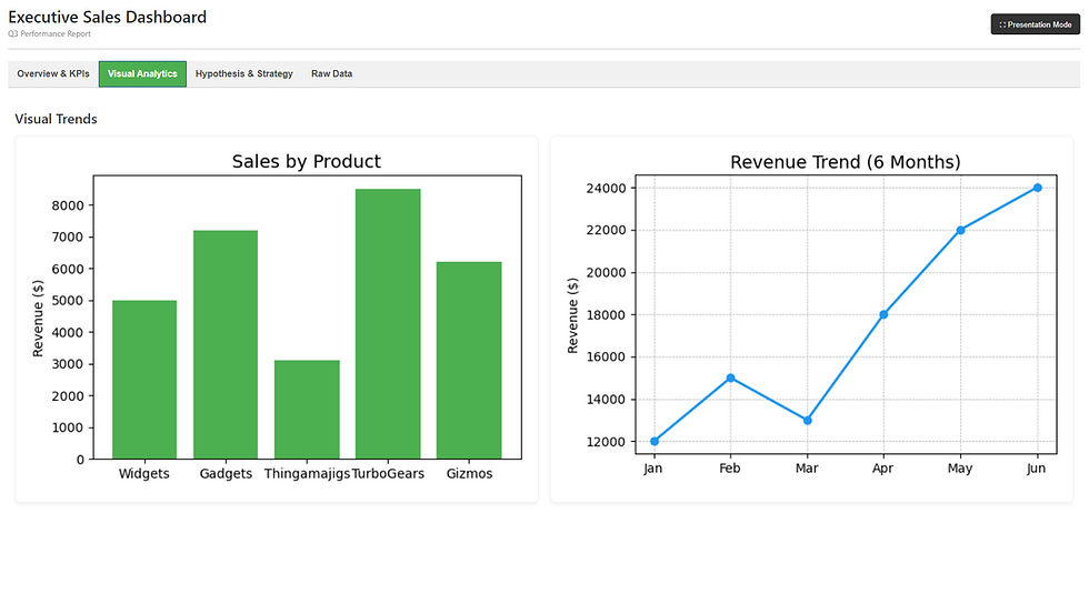
For example, instead of just printing a total sales number like $5000, I wrote Python code that generated this HTML string behind the scenes:
HTML CODE :
<div style="background-color: #4CAF50; color: white; padding: 20px; border-radius: 10px;">
    <h3>Total Sales</h3>
    <h1>$5,000</h1>
</div>
When I fed that string into the display(HTML(...)) function, Jupyter didn't show the code; it showed a beautiful green scorecard box.
OUTPUT :

Layer 3 : Bringing It Together in Jupyter (The Display) :
This is where the magic happened. I structured my final Jupyter Notebook cell to call these HTML-generating functions in order.
Call the function that generates the dashboard title HTML.
Call the functions that create the metric scorecard HTML, arranging them side-by-side using CSS flexbox (another thing I had to learn on the fly!).
Use Pandas' built-in .to_html() method—with some custom CSS styling applied—to render the main data table beautifully.
When I pressed "Run" on that final massive cell, it didn't look like code anymore. It looked like a web product.

Why This Approach is So Helpful for Learners
You might be asking: "Why go through this trouble? Why not just use Excel?"
That’s a fair question. But for me, learning to build dashboards this way was about more than just making things look pretty. It was a massive learning accelerant. Here is why:
It Teaches "Data Storytelling" :
When you just print raw data, you are lazy with your insights. You hope the user finds the pattern. When you build a dashboard, you have to make choices. You have to decide: What is the most important number here? What color should it be? Should it be at the top? It forced me to think like a product manager, not just a coder.
It bridges the gap between Backend and Frontend :
As a Python learner, it’s easy to get stuck in the backend logic. This project forced me to touch HTML and CSS. I learned how data structures in Python (dictionaries, lists) map to visual structures on a screen (tables, lists). That concept is fundamental if you ever want to get into web development.
It makes your Portfolio "Pop" :
I recently started sharing my GitHub repositories. A notebook full of code comments is boring. A notebook that opens with a rendered, colorful dashboard immediately grabs attention. It shows that you care about the end-user experience, which is a rare skill in entry-level data analysis.
Conclusion : The Best of Both Worlds
Learning Python is a journey of logic and syntax. But incorporating HTML into my Jupyter Notebooks brought a layer of creativity that I didn't expect.
It turned my "homework" into "projects."
If you are currently learning Python and feel like your outputs are a bit dry, I highly recommend spending a weekend learning the basics of HTML tags (div, h1, table) and using the IPython.display module.
It’s a small addition to your toolkit, but it makes a massive difference in how the world sees your work—and how you see it yourself.
Next Steps for You
Try it out: Open your current Jupyter Notebook, import display and HTML from IPython.core.display, and try to print "Hello World" in bold red text.
Challenge: Take your most recent data analysis and try to create a "Summary Header" that displays your top 3 findings in colored boxes.
Happy Coding!

