Creating Slide-Out Charts using Dynamic Zone Visibility in Tableau
Updated: Jul 9, 2025

What is Dynamic Zone Visibility?
Dynamic Zone Visibility is a feature which enables users to dynamically hide or reveal zones on a dashboard based on the value of a field or parameter. This is a useful feature to have to maintain a clear and uncluttered dashboard without compromising on the information being presented.
You can read more about Dynamic Zone Visibility and its different use cases on my previous blog - Dynamic Zone Visibility in Tableau.
In this blog post, I will be explaining the steps involved in creating Slide-Out Charts using Dynamic Zone Visibility in Tableau.
What is a Slide-Out Chart?
A Slide-Out Chart is a chart design where a specific section of a dashboard can be expanded or "slid out" to reveal more detailed information. This dashboard layout design can be useful in keeping the dashboard clean and uncluttered, while allowing users to drill down on data points to see more detailed information.
Creating a Dashboard with a Slide-Out Chart:
Following is an example illustrating how to create a dashboard with a Slide-Out Chart.
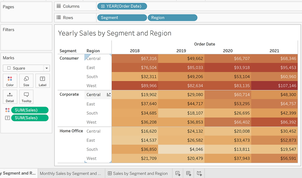
Using the Sample - Superstore data, we first create two charts - Yearly Sales by Segment and Region and Monthly Sales by Segment and Region.

Next we create a dashboard and place both charts on the dashboard within a vertical container.

Next we will create a Year field that gets the Year value from the Order Date and we will use this Year field to filter out Sales data relevant to the year in question. To do this, we can right-click on Order Date field in the Data tab: Order Date->Create->Custom Date-> Name: Year, Detail: Years.

Image 5 - by author 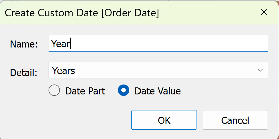
Image 6 - by author Next, we create a set from the Year field created in Step 3 above. To do this, we right-click on the Year field: Year->Create->Set. In the Dialog box that opens, we select all the Year values to add to the set and click OK.
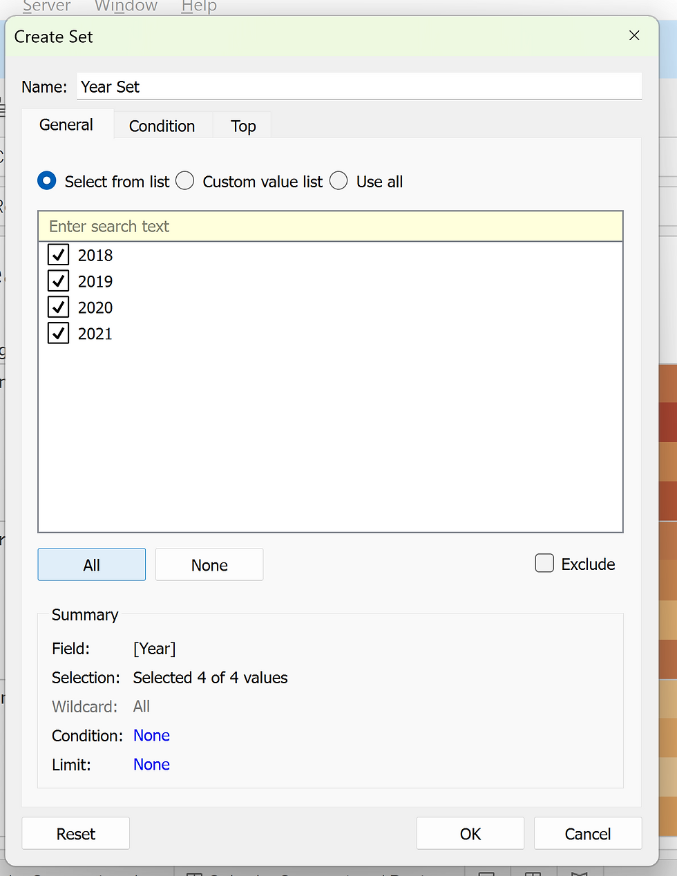
Image 7 - by author Next, we will add the Year and Year Set fields into the Details section of the Marks card on the Yearly Sales by Segment and Region chart.

Image 8 - by author Next, we need to create an action that selects the corresponding Year Set value when a data point on the Yearly Sales by Segment and Region chart is selected. To do this, the Year Set should be displayed by right-clicking on Year Set-> Show Set. Then, under the Worksheet menu->Actions, create a new Action with the following details:

Image 9 - by author This action ensures that when a Sales data point on the source sheet (Yearly Sales by Segment and Region) is selected, the year corresponding to that data point is added to the Year set and when no selection is made, all the values are removed from the Year Set. The action can be verified by selecting a data point, and ensuring Year Set is updated correctly as shown below:
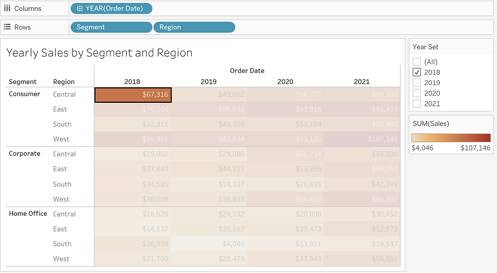
Image 10 - by author Next, in the Monthly Sales by Segment and Region chart, we add the Year Set into the Filter card to ensure that the Monthly Sales are filtered based on the Year selected in the Yearly Sales chart. We also add the Year field under the Details section of the Marks card.
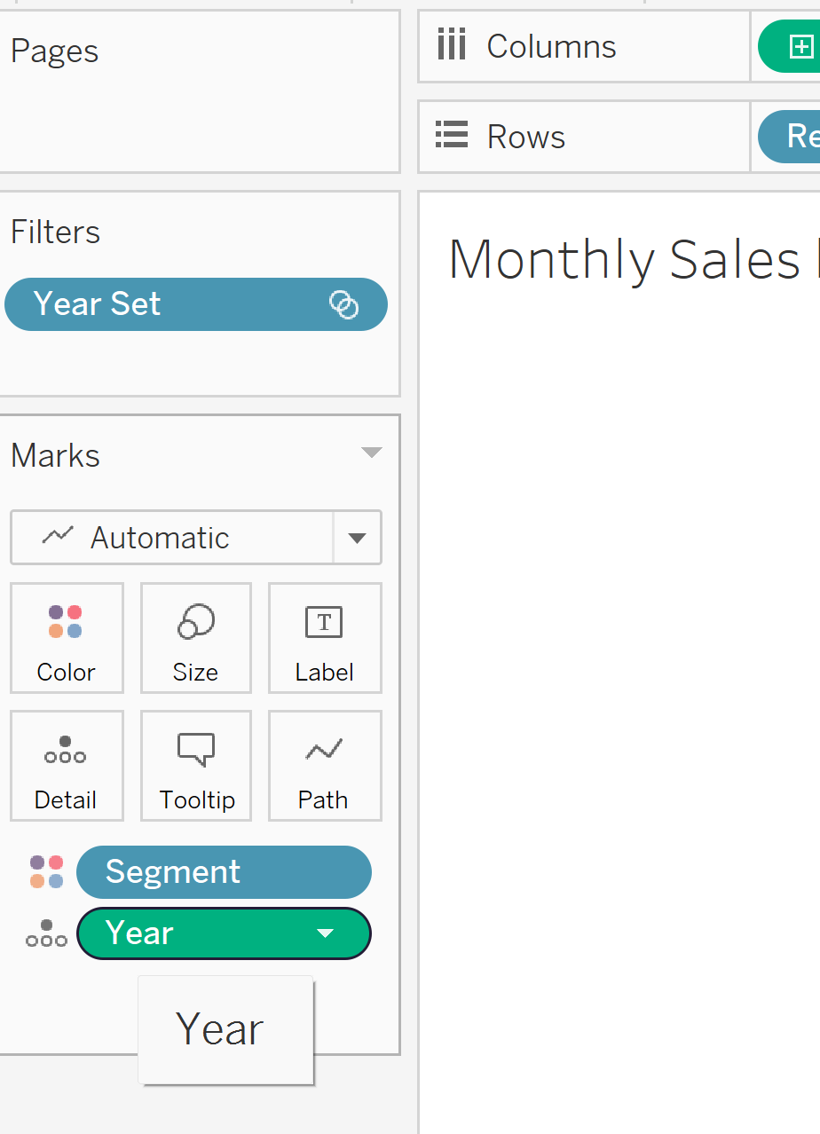
Image 11 - by author Next, we create a calculated field to control the visibility of the slide-out chart on the dashboard. The Calculated field must return True if at least 1 data point is selected and False if no data points are selected thus ensuring that if no data points are selected, then the slide-out chart will not be visible. The Calculation is also wrapped in an LOD using the Max function as the field controlling zone visibility expects an LOD expression to evaluate the zone visibility.

Image 12 - by author Next, select the slide-out chart on the dashboard and in the Dashboard Layout tab, check the Control Visibility Using value option. In the drop-down that appears below, select the calculated field created in step 7 above.
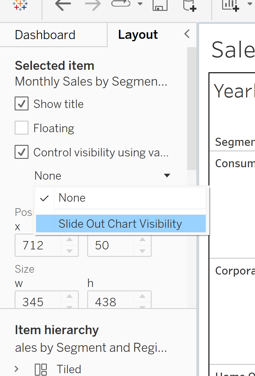
Image 13 - by author Next, we edit the Action created in Step 6 to apply to the dashboard. In the Dashboard menu, select Actions. Choose the Action created in Step 6 and click on Edit. Edit the Source sheet to the dashboard and click OK.
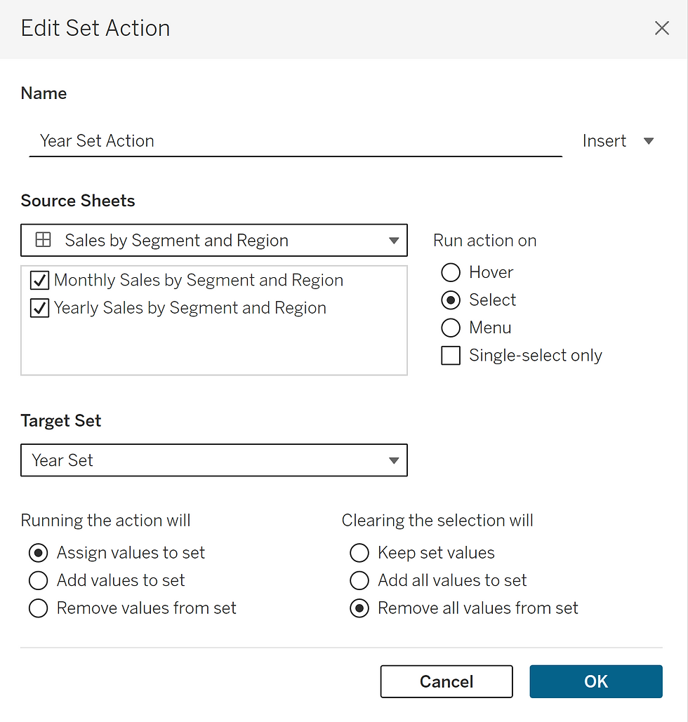
Image 14 - by author The dashboard with slide-out charts is now complete and can be tested by clicking on various data points to see if the appropriate slide out chart appears.

Image 15 - by author Conclusion:
I hope this blog helps users learn about slide-out charts and how they can be implemented. Dynamic Zone Visibility is a useful and versatile functionality in Tableau and this blog aims to highlight the ways in which it can be used to make dashboards sleek and streamlined.


