CoxComb Chart in Tableau
- Abitha Subramani
- Oct 8, 2025
- 2 min read

Updated: Oct 9, 2025

A Coxcomb chart, also known as a rose diagram, is a variation of a pie chart where each category is represented by a section of the circle with equal angles. The area of each section represents the value of the corresponding category.
This chart type was initially designed by Florence Nightingale in 1858.
Each segment of the Coxcomb chart represents a dimension/category (e.g., Age Label, Abnormal ranges). Each segment has the same angle, dividing the 360 degrees equally among the segments.
The chart uses "data densification" to create artificial points between the start and end of each segment, allowing smooth polygon shapes.
Mathematical foundation:
The angle for each segment = degrees where is number of segments.
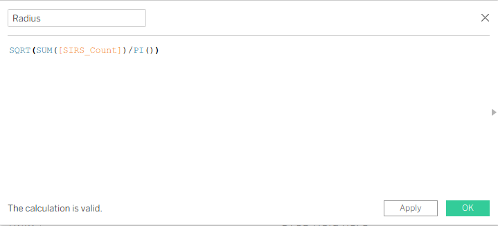
The radius for each segment is based on the square root of the area proportional to the sum of values (e.g., sales).
Coordinates for plotting points use circle equations: , where is radius and is angle.
Steps in Tableau:
Prepare and Join Data:
Connect your dataset containing categories (e.g., Age Label, Abnormal ranges) and measures (e.g., SIRS count).
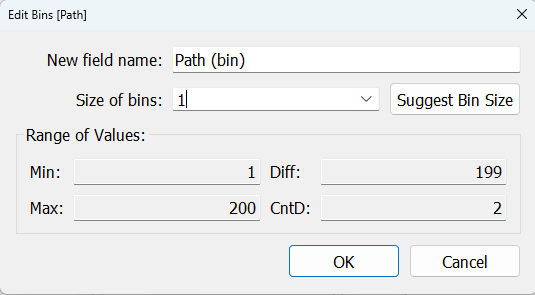
Create or bring in a data densification source with a path field (e.g., integers 1 to 200) to generate points for smooth polygon arcs.

Use a cross join (e.g., a join calculation with value 1 in both datasets) between your data and the path data to artificially create points per segment.

Create Calculated Fields:
For DataSet calculation field – need to calculate SIRS_Label for all the Abnormal ranges with SIRS total count.


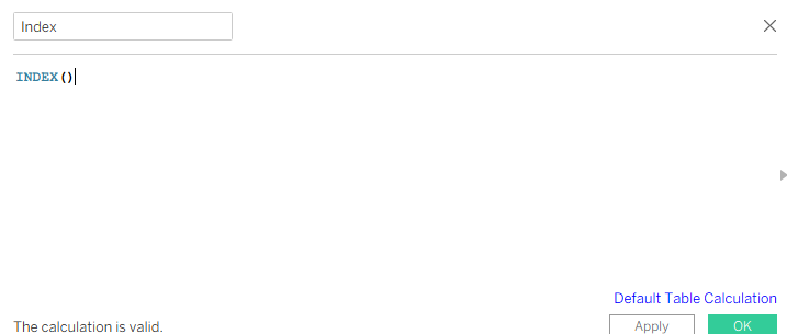
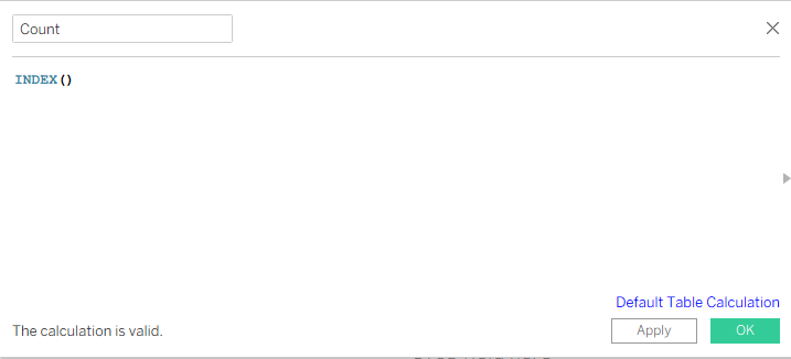
Index calculations to partition data within each segment and across data points.
Calculate the angle for each segment as , where is the number of segments.
Calculate radius based on area proportional to measure values, e.g., .
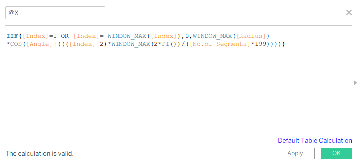
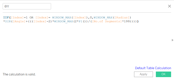
Compute X and Y coordinates using circle equations: , , considering the path index to interpolate points along arcs.


Build the Chart in Tableau:
Drag Path(bin) to Rows and expand with “Show missing items”.
Change Marks from ‘Automatic’ to ‘Polygon’.
Drag ‘Path (bin)’ from Rows to Path under Marks.


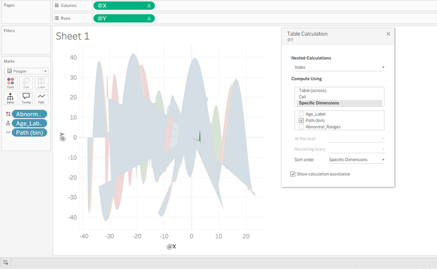
Drag Age_Label to Detail and Abnormal_Ranges to color.
Drag @X to Columns and @Y to Rows.
Go to @X and Edit table calculation.Under Nested calculation select @X then under ‘Specific dimensions’ select Path(bin).
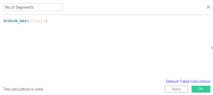
Similarly for Index select Path(bin), Count – Age_Label and for No.of segments – select both Age_Label & Path(bin).
Goto @Y and do the similar Nested calculation (as done in @X).
Drag Sum_SIRS Count to ‘Tool Tip’ under Marks and select compute by Path(bin).
Sort ‘Abnormal Ranges’ to’ Field’ and select ‘SIRS_Count’ under’ Field name’
Filter SIRS_Label by SIRS and eliminate null values under ‘Abnormal_Ranges’.


Format the Visualization:
Hide axes, gridlines, and headers for a cleaner look.
Adjust colors and borders if desired.
Add tooltips with relevant summarized values.
To display Age_Label, create dual axis and drag Age_label to Label and select ‘Allow labels to overlap’.

These steps create a Coxcomb chart where each segment has equal angle but radius proportional to the data value, visualized as a smooth polygon formed by densified points on the circle perimeter.
Thank You. Have a Great experience in Tableau :)

