Cloud Wars: How to build Word Clouds in Tableau vs. Power BI
- Anusha Paruchuru
- Dec 17, 2025
- 4 min read

Yes, another blog on how to prepare a visual, borinnggg!
But hear me out.
As you start building visuals, you often try to visualize data in the same basic charts. But we are often pushed to visualize the same old data in some new light. As I was racking my brain for a new way to visualize simple data, I stumbled upon the Word Cloud visual, which I had created during my primitive days and wondered why not give it a try. And to my surprise the feedback was completely positive.
So here I am narrating to you the problem statement that I faced and a simple answer that I came up with.
Problem Statement:
Visualize Observed Mortality by Primary Diagnosis - Treemap.
Of course, everyone’s go to visual would be a Treemap and yes, I too created a Treemap in the beginning.
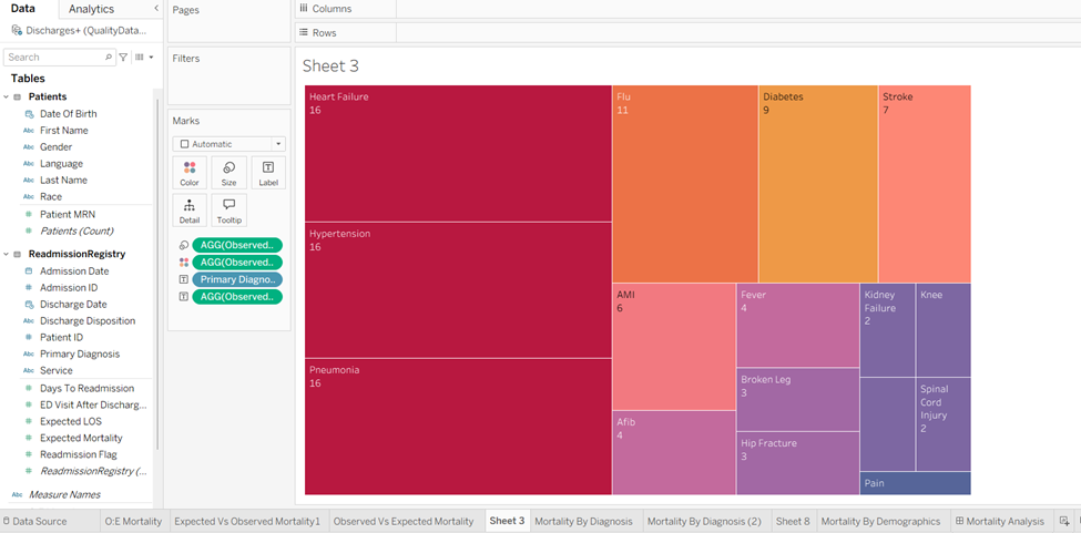
Treemap is useful and colorful chart which can visualize hierarchical data, great for structure and proportional analysis. But if you want a quick visual appeal with eye-catching summaries of text frequency for immediate impact, then Word Cloud should do the trick!
Word Cloud

A word cloud visual (also known as tag cloud or word collage) is a graphic that shows the frequency of words in a text, where the most common words appear larger and bolder, while less frequent words are smaller, quickly highlighting key themes and topics from data like reviews, documents, or social media. Its a simple way to get a snapshot of text, using word size, color and sometimes shape to show importance, making patterns easily digestible for audience.

We have seen many such pictures, paintings displaying a bunch of words in a cluster in a variety of places from restaurants to schools to offices. I thought it was modern art (LOL). But these cluster of words actually gives us a message, that’s what I understood when I made my first Word Cloud visual. So how to create one?
Steps to create a Word Cloud in Tableau:
I have used the Readmission Registry data from HC dataset from Kaggle.
1. Open Tableau, connect to Readmission Registry excel file. Drag ReadmissionRegistry and Patients data tables to create a dataset.
2. Here Patient ID from ReadmissionRegistry table and Patient MRN from Patient table are same, so we create a relationship using these two columns.

3. First, we create a Calculated field (Observed Mortality) where we calculate actual deaths that occurred after readmission of the patient.
Observed Mortality= COUNT(IF([Discharge Disposition]='Expired')THEN 1 END)
4. Next, we drag the dimension “Primary Diagnosis” into “Text” Marks card.

5. Then we drag the measure “Observed Mortality” into “Size” Marks card.
6. Again, drag the measure “Observed Mortality” into “Color” Marks section.

7. Now change the chart type from “Automatic” to “Text” in the Marks section.

Voila, you have created a Word Cloud.

In the above image the diagnosis with highest Observed mortality are projected in the biggest font size and darkest color followed by the next highest diagnosis and so on.
You can change the color palette according to your need by editing colors in the Legend present on the right side.
Now you would ask why would you create the same Word Cloud in Power BI? My answer is, it depends entirely on who the audience is, where the visual needs to live and what level of text preparation is desired. Another reason being the Word Cloud custom visual in Power BI has superior Built-in text analysis (Stop Words and Word Breaking) . Whereas in Tableau requires significant preprocessing like manually creating a list of stop words and use a filter or a Set to exclude them.
Steps to create Word Cloud in Power BI:
1. Open Power BI, select Excel workbook as data source and the select excel file Readmission Registry and Load the data directly no need to transform the data.

2. Word Cloud isn’t a standard, built-in visual in Power BI so you need to import the custom visual from the AppSource. Select “Get more Visuals” (ellipsis button … ) in the “Build” section. Search for Word Cloud and here I have used the Word Cloud visual by Microsoft Corporation.

After importing the visual it appears in the Build section below.
3. Select the visual and then adjust the size of the visual to fill up the canvas.

4. Here we will again create a new measure to calculate actual deaths occurred.
ObservedMortality =
CALCULATE ( COUNTROWS (ReadmissionRegistry),ReadmissionRegistry[DischargeDisposition] = "Expired" 
5. Next drag “Primary Diagnosis” into “Category” and “ObservedMortality” into “Values” section in Build Pane.


6. Here we can see a Word Cloud formed but the word “Failure” is considered as another entity in Power BI which needs to be addressed to give us correct output.

7. Select the visual and select Format. In the Format pane select “General” and under it toggle off “Word-Breaking”. Word breaking in a Power BI Word Cloud custom visual controls whether multi-word phrases (like "New York") appear as single items or get split into individual words ("New", "York"). But you might need Power Query to preprocess and clean text(split by spaces, removing punctuation or creating key phrases) before it even hits the visual for better control.

Now you have got a proper Word cloud with correct values similar to our Tableau counterpart. We can get similar look like the Tableau one by changing the rotation angle of the text.

8. We have an option to rotate the displayed text according to the desired look and feel. Here I wanted horizontal text similar to Tableau visual so simply toggle off the “Rotate Text” in the Format pane.
We have the option to edit colors as shown below and here is the final output.

Conclusion
So which tool wins the Cloud War?
The answer is: it depends entirely on your process and your platform.
Don't let the simplicity of the Word Cloud fool you. The success of the visualization relies not on the tool, but on the data preparation . Use Power BI for speed and built-in text cleaning. Use Tableau for advanced design control and deep integration with your custom data preparation pipeline. Choose the tool that aligns with your organization's workflow and you'll transform complex text data into clear, compelling insight.
Thank you for reading!

