Beginner’s Guide : Make Your Audience Understand Your Visualization at a Glance - Part II
In Part I, we covered the basics of creating intuitive visualizations by choosing the correct visualization, formatting it, and finally refining the data. Now let's focus on enhancing the visualizations to make the dashboard more interactive and engaging.
Interacting with the Visualization
Visualizations can be made interactive by adding filters and actions.
a) Filters
Adding appropriate filters plays a major role in providing useful insights.
Let’s consider the analysis of Sales based on Sub-Categories as an example and use the treemap to represent the visualization.

We can make the visualization interactive and more insightful by adding filters. For example, adding Category to the filters helps analyze the total Sales by Sub-Category within each Category. This provides a clear representation of the contribution of each Sub-Category in each Category.
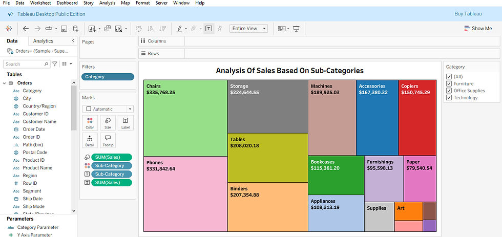
This is done by adding Category to the Filters shelf and selecting All to include all Categories.

The visualization below shows the analysis of Sales by Sub-Category for the Category - Furniture. After filtering the data to display only Furniture, the subcategory Chairs represents the highest sales.

The visualization below shows the analysis of Sales by Sub-Category for the Category - Office Supplies. After filtering the data to display only Office Supplies, the Sub-Category Storage represents the highest sales.

The visualization below shows the analysis of Sales by Sub-Category for the Category - Technology. After filtering the data to display only Technology, the Sub-Category Phones represents the highest sales.

We can also visualize the total Sales analysis of all Sub-Categories by adding Years to the Filter. This allows us to clearly see the contribution of each Sub-Category, Year-wise. This is done by adding Ship Date to the Filters shelf and selecting All to include all Years.

The visualization below shows the sales analysis of all Sub-Categories for the Year - 2021. After filtering the data to display only 2021, the Sub-Category Chairs represents the highest sales.

The visualization below shows the sales analysis of all Sub-Categories for the Year - 2024. After filtering the data to display only 2024, the Sub-Category Phones represents the highest sales.

b) Animations
Now, let’s consider the distribution of Sales, Year-wise based on Categories. Here, let’s use the circle chart to represent the visualization.

Although the above visualization conveys the information, the audience may not get a clear and concise representation of the data. Hence, we can enhance the visualization using the Animation option.

Animations can be added by placing Ship Date on the Pages shelf.

Enable the Show History, by clicking it. Then select All to Marks to show history for all data points. Select Both to display the Marks and Trails for all data points. You can also select either Mark or Trail to display only the mark or trail. While selecting Marks and Trails, format the color to highlight the History data points.

Key Performance Indicator (KPI)
KPI provides a quick summary of the most critical data points. It helps the audience interpret the data efficiently and enhances the dashboard by highlighting insights at a glance. By incorporating targets, previous-period comparisons or trend indicators, KPI cards enable the audience to assess the performance and make informed, quick decisions.
Let’s take the Total Sales as an example. The KPI can be displayed by adding the title and the measure value to the visualization. Additional data points can also be calculated using Calculated Fields and displayed as a KPI card for detailed assessment.
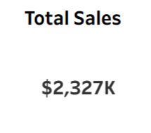
We can also enhance the KPI by classifying Total Sales based on Country as well as Region.


Incorporating images or icons into KPI cards enhances the overall visualization and allows the audience to quickly grasp the key metrics at a glance.


Exploring Advanced Charts
To enhance the visualization and make insights more engaging, we can also explore advanced charts such as Sunburst charts, Dendrograms, Radial charts, Waterfall charts, Jitter Plot charts, Waffle charts, Butterfly charts, Lollipop charts, Tornado charts and more.
Let’s take the analysis of Sales based on Categories and Sub-Categories as an example. The treemap chart below represents the data.

To further elevate the above visualization, the Sunburst chart is used here to provide a more engaging and insightful representation.
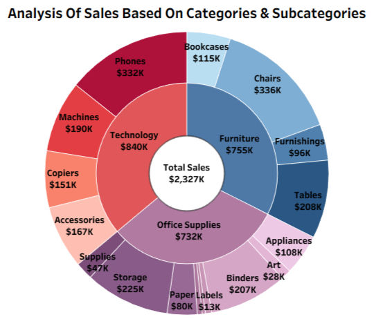
We can also utilize the custom visualization feature through Tableau Exchange to add visualizations such as the Sankey Chart, Radial Chart, Polar Area Chart, Tree Diagram, Beeswarm Chart, Network Chart, Radial Sankey Chart and more by adding the respective extension. While constructing an advanced chart may be challenging, adding advanced charts via the respective extension through Tableau Exchange is effortless.
Let’s take the analysis of profit based on Sub-Categories as an example. The bar chart below represents the data.

Let's elevate the visualization by using the respective extension for the Polar Area Chart.

The extension for the advanced chart can be added by following the effortless steps below. Select the Show Me
and click the Launch Viz Extension Dialog.

The list of available viz extensions will be displayed, and we can browse through them to choose the appropriate chart for visualizing the data.

The desired visualization can be selected by clicking the respective chart.

Then, by clicking Open and selecting OK, the desired extension will be added.

The instructions to create the respective visualization will be generated automatically in the worksheet, clearly. We have to add the appropriate Measure and Dimension to create the visualization. In this example, I dropped Sub-Category to Spokes, SUM(Profit) to Values and Category to Color to create the visualization.
Using advanced charts by adding extension may be exciting, but always make sure that the appropriate visualization is chosen, which conveys the representation to the audience precisely . While choosing the Radar Chart for the same data, we see that the data representation cannot be interpreted instantly.

Captions
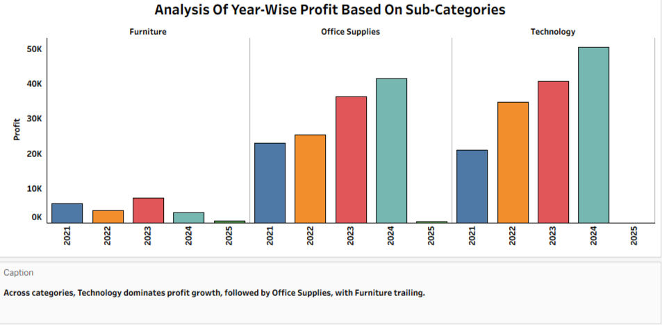
Captions can be added to provide the audience with context about the data used in the visualization. They help explain calculations or aggregations and can highlight key insights, trends, or comparisons, making the visualization more informative and easier to interpret.
In Tableau, automatic captions can be generated in the worksheet by clicking Worksheet --> Show Caption.

The automated caption can then be edited to include a customized summary of the visualization for the audience to make a correct decision.
Tips to elevate the dashboard's appearance
Choose direct, concise titles for each visualization and for the dashboard.
Present the critical data points as KPI indicators for quick interpretation.
Eliminate redundant data in the tooltip and keep only the relevant key data points.
Maintain consistent font type, font size, font color and font alignment for all titles, labels, axes, tooltips, captions and legends in the dashboard. Selecting the Tableau Bold font type, Black for the font color and Center for the font alignment significantly elevates the dashboard's appearance and makes the key data points stand out clearly.
Maintain the axis lines that display only the required Headers and remove unnecessary gridlines to reduce visual clutter and keep the audience focused on the data, while keeping the axis lines ensures better readability of the presented data.
Maintain consistent color coordination across all visuals in the dashboard to create a unified look and feel.
Remove unnecessary legends that are already clearly apparent in the data, and retain only the essential legends.
Thank you for reading! Start experimenting with filters, animations, KPIs and advanced charts and make sure to simplify your complex data and create dashboards that are visually appealing, interactive and easy for your audience to understand. Happy visualizing!


