Beginner’s Guide : Make Your Audience Understand Your Visualization at a Glance - Part I
Updated: Feb 3
Tableau provides beginners with a powerful platform to transform data into insightful and informative dashboards. The platform offers a wide range of built‑in visualization types and also supports custom viz extensions that expand what you can create, making it easier to build effective and expressive visualizations. However, creating a visualization is only the first step; what truly matters is ensuring that the audience can quickly interpret the data and understand the insights at a glance. In this blog, I’ll share a few simple yet effective tips to enhance your visualizations for greater clarity and impact.
To demonstrate these tips, I have used the Superstore dataset to illustrate the examples. The dataset can be downloaded here: https://www.kaggle.com/datasets/truongdai/tableau-sample-superstore
1. Visualizing the Data
Selecting the right visualization based on the data is essential for helping the audience grasp the insights at a glance.
First, let’s consider the analysis of sales performance across different ship modes. In this case, visualizations such as the pie chart, packed bubble chart, bar chart, funnel chart, donut chart, and advanced charts like the dendrogram or radial chart can be used to represent the comparison effectively and provide a clear overview of sales performance across each ship mode.


However, not all visualizations deliver the representation equally well. For instance, the line chart is primarily designed to highlight trend analysis over time, and therefore, it will not convey the categorical comparisons among the ship modes effectively in this scenario.

Similarly, the treemap is best suited for comparing hierarchical datasets with multiple sub-levels. Using it to represent only four categories may reduce clarity and may be irrelevant.

Now, let’s consider the analysis of sales based on subcategories. Here, a large number of subcategories need to be represented. Therefore, visualizations such as the bar chart, treemap and dendrogram can be used to achieve a precise and explicit representation.


However, using visualizations such as a pie chart, bubble chart or funnel chart to represent a wide range of subcategories can make the visualization cluttered and difficult to interpret. From the visualization below, it is not easy for the audience to identify the subcategories with the lowest sales.


2. Formatting the Visualization
After choosing the suitable visualization, the next step is to refine it through effective formatting.
Let’s again consider the analysis of sales based on sub-categories and visualize the data using a bar chart.

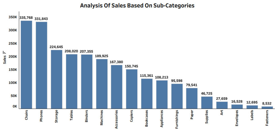
Although the above visualization represents the data, it may be difficult for the audience to analyze the information straight away since the categories aren't organized in any specific order. Hence, the visualization should be formatted by presenting the bars in either ascending or descending order according to the requirement. In this case, representing the bars in descending order is more effective because it represents the Sum(Sales) and displays the subcategories with the highest sales first. Thereby, looking at the visual, the audience can deduce that Chairs and Phones contribute the highest sales, with Fasteners contributing the least.
This can be done by clicking the Sort Descending icon.

3. Enhancing the Data
After choosing the suitable visualization and formatting it, the next step is to enhance the data presentation in a more distinct and meaningful way.
a) Formatting the Data
Let’s again take the analysis of sales performance across sub-categories, as an example and choose the treemap chart to visualize the data.

Now, rather than displaying large numeric values such as 335,768 for Chairs, since the data Sum(Sales) represents currency, it can be formatted as $336K. This immediately communicates that the values are in dollars and improves readability and clarity at first glance.

This can be achieved using the Format option available in the label of SUM(Sales).

By selecting Currency (Custom), setting decimal places to 0, and adjusting the display units to Thousands (K) based on the magnitude of the values, the values are truncated and the visualization becomes more precise and user-friendly.

In Tableau, the data can be displayed in Thousands (K), Millions (M), Billions (B), and Trillions (T) , depending on the magnitude of the data.
b) Percentage Of Total
Let’s take the analysis of sales performance across categories as an example and choose the pie chart to visualize the data. At first glance, the differences among the categories may not be immediately apparent, since the differences in values between the categories are minimal.

Instead of plainly labeling the categories with raw Sum of Sales values, the visualization can be refined by applying the Percent of Total to the Sum of Sales. This approach instantly highlights even the minor variations among the categories.

The Percent of Total can be applied to Sum(Sales) by clicking the Sum(Sales) label, selecting Quick Table Calculation, and then choosing Percent of Total.

This displays the percentage with 3 decimal points, which may be redundant. This can be polished by rounding the values by clicking the Sum(Sales) label and selecting Format.

By choosing Percentage, the decimal points can be rounded to 0 (or adjusted based on the data being represented).

Thus, formatting the data to display as a percentage, percentile, rank for comparisons or as currency when displaying metrics such as sales, profit, and other financial figures allows the audience to understand the insights more precisely.
Now that we have covered the basics of creating intuitive visualizations by choosing the correct visualization, formatting it, and refining the data, in Part 2, we will focus on enhancing the visualizations by making them interactive and share a few more simple yet important tips.
Thank you for reading!


