Why is Data Visualization important in Data Analysis: Turning Numbers into insights


Data Visualization:
Data visualization is very important in data analysis because it transforms complex datasets into easily understandable visual charts or graphs. This makes us to understand the trend of spots, patterns, outliers and correlations quickly. It leads the user to know the faster insights , better communication of findings and data driven decisions. This data visualization techniques bridges the gap between the raw data and human understanding ,enabling faster comprehension and storytelling. It plays a crucial role in fields such as business, science , journalism and public policy allowing stakeholders to derive actionable insights and drive impactful outcomes from data.
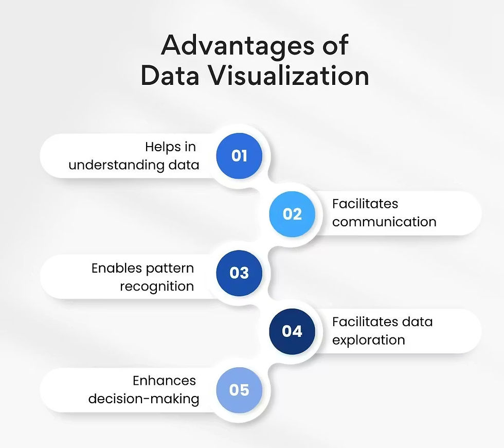
Why is Data Visualization Important?
Data Visualization is more important now a days because the human brain processes the visual information more and more faster than the Text and a long paragraphs. In the real world people are generating more data every day and the visualization has become the most important and practical bridge between the raw data and human understanding, Decision making and action.
The main Reasons why Data visualization matters so much:
1.Makes the complex data immediately understandable - Too much of big data and large numbers makes the people difficult to understand . Good visuals gives us good Patterns, Trends and Outliers easily and instantly.
Here are some excellent business dashboard example that show how overwhelming data becomes clear and actionable:

2.Reveals what numbers hide :
Look at these four datasets which has identical statistical summary metrics such as mean , variance , correlation and regression line.
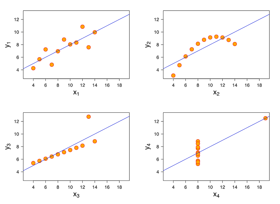
From the above visualization you can immediately understand one is a linear relationship , One is a Quadratic curve, one is an outlier that drives everything and one is random except for one extreme point. Statistics can lie but the visual tells only the truth.
Dramatically Speeds up Decision Making:
In Business, Medicine, Engineering, journalism and Government the millions of dollar can be saved by spotting or understanding the 3 Second Visual vs 30 minutes Data.

Good Vs Bad Visualization Makes a Huge Difference :
Good Visualization always gives us the clear insights, accurate and tells the story clearly for the audience. Whereas the bad visualization leads to confusing or miss leads the data with poor quality of charts and graphs.

Good Visualization (Effective) :
Clarity and Simplicity - It is easy to understand with very much minimum Clutters.
Accuracy - It avoids misleading proportions. Example: Pie chart showing correct percentage of values.
Relevance - It Highlights the important insights for the audience.
Appropriate chart type - It uses the best chart. Example: Line for trends and Bar for comparisons.
Focus - It gives importance to the color and hierarchy.
Tells a story - It communicates with the correct and clear message.
Bad Visualization (Ineffective):
Clutter - It gives overcrowded text, colors and too many data points . Example : Spaghetti chart
Misleading - Shows data with more manipulated scales.
Distracting - It uses excessive colors or awkward charts.
Wrong format - It makes comparison difficult. Example: Vertical Lists for trends.
Hides information - It fails to show all the relevant data or adds extra irrelevant information.

Quick Summary of Why Data visualization Matters:
In real time Data Visualization is not just nice to have but its the primary interface between the humans and overwhelming information. The better we Visualize - the smarter we decide- the faster we act- the better outcomes.
Reason | Benefit | Real-world Impact |
Speed of understanding | Brain processes visuals 60,000× faster | Faster decisions |
Pattern & outlier detection | Reveals what tables hide | Avoid costly mistakes |
Storytelling & persuasion | Emotions + insights = action | Better pitches, reports, journalism |
Democratization of data | Non-technical people can understand data | Data-driven culture across organizations |
Error & bias detection | Visuals expose problems statistics miss | More trustworthy insights |
Memory & retention | People remember visuals much better | Lasting impact & knowledge transfer |
5 C's of Data visualization :
Clear - Data shown in the visualization looks more neat and clean where the people can easily understand the insights without any Confusions.
Concise - It Focuses more on key insights for faster understanding and better decision making. It Extracts the essence of the data to respect the Audience's time and improve communication.
Correct - It identifies and removes the error in the data. It involves correcting data, misspellings and standardizing the data.
Consistent - It gives the uniform and accurate data. It also ensures data aligns with the rules , reflects reality , acting as a cornerstone of data quality.
Compelling - It gives reliable , relevant data presented with a very clear narrative . It gives the highlighting key insights, structuring the information with a beginning , middle and end.
How to tell compelling story with data?
In today's data driven world the raw data or numbers are not enough to inform . Those numbers or data needs context. interpretation and a narrative story to bring them to life. Data storytelling blends the data analysis ,visuals ( like charts) and compelling narrative to transform the complex information into clear , actionable insights making the data understandable.

Understand your objective and Audience:
Before diving into a data first clarify your story's objective and be clear about what to convey . Then consider the audience's target about their needs , backgrounds and understanding.
Dive deep into your data:
It is very essential to understand the nooks and corners of your data. It is very much important to look and analyze for patterns, trends and anomalies.
Select Appropriate visualizations:
The right choice of visualization always Illuminate your data which makes more understandable and engaging.
Final Thoughts:
In 2026 we are surrounded with millions and millions of data from real time analytics and AI predictions to climate measurements and social media trends. Data visualization is just not nice to have but it has become a primary bridge between an overwhelming information and human understanding.


