Visualizing Time Series Data : A step-by- step Guide
Time series data is essential in understanding patterns, trends, and seasonality, making it crucial for data-driven decision-making. Tableau, a powerful data visualization tool, offers several techniques to create compelling and informative time series visualizations. In this blog, we’ll explore the best practices for visualizing time series data in Tableau, including step-by-step instructions and tips for creating insightful charts.
Using a dataset like Tableau's Sample Superstore, start by plotting the Order Date field on the Columns shelf to represent time on the x-axis. This will establish the timeline.
Step 1.
Add AGG(MIN(0)) on the Rows shelf. This technique positions your data at a base level to help customize the visual design.
Why Use AGG(MIN(0))?
By positioning data at a base level (zero), you gain better control over the visual alignment and layout of your visualization. This is especially useful for:
Adding consistent baselines for reference.
Designing charts with uniform spacing.
Enhancing visual clarity in complex dashboards.
How to Implement It
1. Add AGG(MIN(0)) to Rows:
Drag a calculated field containing AGG(MIN(0)) onto the Rows shelf in Tableau. This creates a baseline at zero.
2. Combine with the Timeline:
Plot Order Date on the Columns shelf to establish a time-based x-axis.
This step ensures your visualization is structured with a consistent base and timeline.
3.Customize as Needed:
Use this baseline to layer additional elements, such as trend lines, bars, or annotations, creating a polished and professional design.
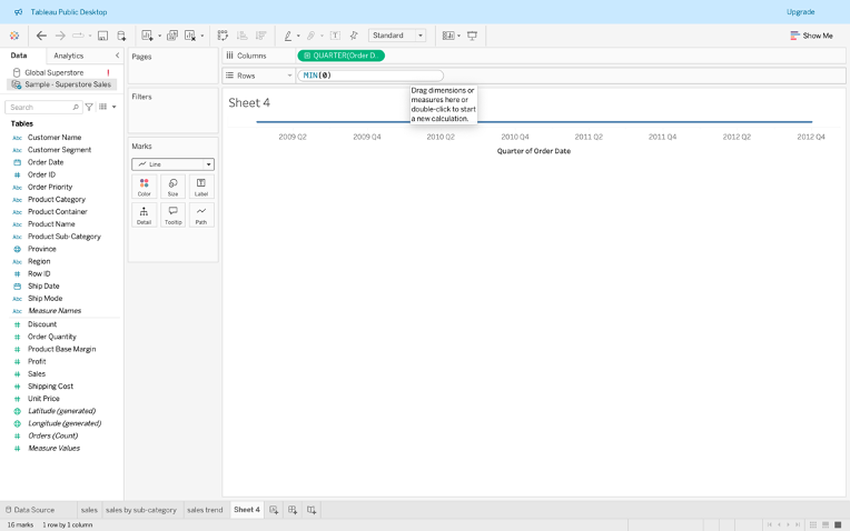
Step 2: Duplicate this axis and change one of them to a circle marker type. This creates visual differentiation, laying the groundwork for advanced customization.This involves aligning the data into
one overlay, but the two measures are plotted with separate scales.

Enhancing the Visualization
Step 3: After establishing the timeline by plotting the Order Date on the Columns shelf, duplicate the axis and combine it into a dual-axis chart. This allows you to overlay different visuals, such as bar and line charts, on the same timeline. Aligning multiple data points enhances interpretability and enables richer comparisons.

Step 4: Create a calculated field for quarters using the formula :
DATETRUNC ('quarter', [Order Date]).
Drag this calculated field to the Color shelf to assign unique colors for each quarter. This enhances the chart's readability, making it easier to identify trends and patterns across quarters.

When working with time series data in Tableau, adding interactivity can elevate your visualizations. One effective way to do this is by creating parameters. In this step, we’ll create a Quarter Parameter to allow users to dynamically filter and analyze data by quarters.
Step 5: Create a Quarter Parameter and associate it with the calculated field for quarters.
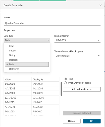
Step 6: Enable the Show Parameter option to display the parameter on the right-hand side of the dashboard.
Users can now interact with the visualization by selecting quarters, dynamically updating the chart's appearance with corresponding colors and data points.
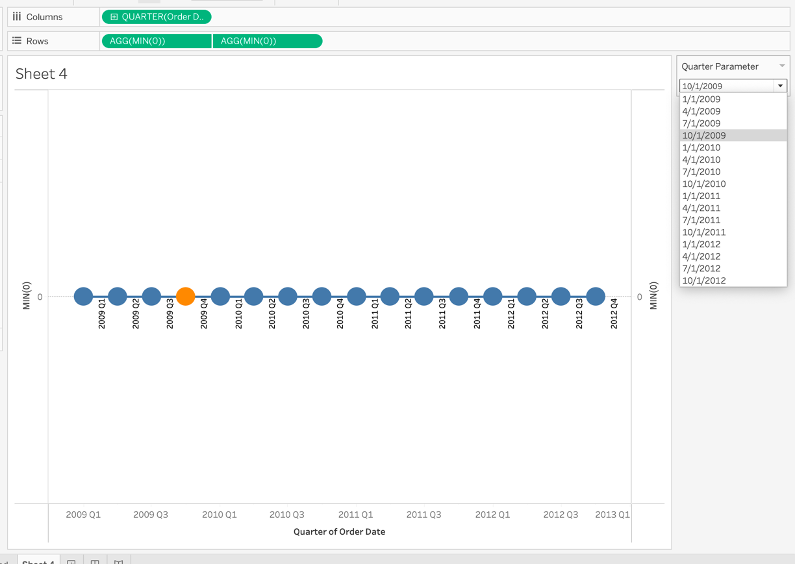
The visualization in the screenshot demonstrates the power of Tableau's Quarter Parameter, which allows users to interact with the time series data dynamically. Let’s break this down:
Quarter Filter in Action:
The right-hand side of the dashboard features a Quarter Parameter dropdown. Users can select a specific quarter, and the chart updates dynamically to highlight data for that period.
For example, when 1/1/2009 is selected, the chart reflects data corresponding to the first quarter of 2009.
Visualization Setup:
The x-axis represents the Quarter of Order Date, showing the timeline in quarterly increments.
The y-axis contains aggregated measures, such as SUM(Sales) or SUM(Profit), based on the calculated field associated with the Quarter Parameter.
Highlighting Selected Quarters:
The visualization marks the selected quarter with a distinctive highlight (e.g., orange), allowing users to focus on the data for that period without losing sight of the overall trend.
To add more value to the visualization, design a comprehensive dashboard:
Include additional charts, such as:
Sales KPI: Key metrics like total sales.
Sales by Sub-Category: A breakdown of sales trends across categories.
Step 7: Add Parameter Action:
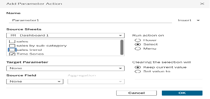
The "Add Parameter Action" dialog box allows you to define an interaction between a dashboard element (e.g., a chart or table) and a parameter.
Parameter actions dynamically update a parameter’s value based on user interactions like hover or select.
Access the "Add Parameter Action" Dialog Box
Navigate to the top menu and select Dashboard > Actions.
In the Actions dialog box, click Add Action and choose Change Parameter from the dropdown.
2. Define the Action Properties
In the "Add Parameter Action" dialog box, configure the following:
Source Sheets: Select the sheets that will trigger the parameter action. For example:
Dashboard 1
Specific charts like sales, sales by sub-category, or time series
Target Parameter: Choose the parameter you created earlier (e.g., Quarter Parameter) as the target.
Source Field: Select the field from the source sheets that will pass its value to the parameter. For time series data, this is typically the date or quarter field.
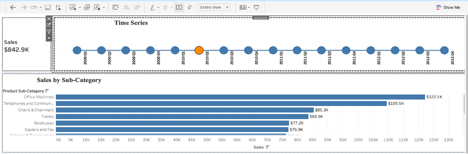
Use hover actions to allow users to explore data interactively. For example, hovering over specific time periods updates the Sales KPI and other charts in real time.Interactive dashboards in Tableau can significantly improve data exploration and user experience. The screenshot demonstrates the use of hover actions to dynamically update multiple charts on a dashboard, offering real-time insights
. For example, hovering over specific time periods updates the Sales KPI and other charts in real time. The top chart represents a time series visualization where each data point corresponds to a specific quarter. When a user hovers over a particular quarter (e.g., Q1 2010), the related charts below dynamically update to reflect data specific to that quarter.
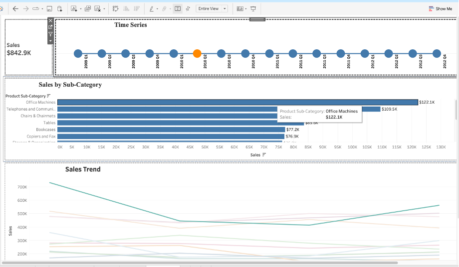
The completed dashboard which I created ties everything together hope you will gain some understanding . Selecting a specific quarter in the time series chart dynamically updates other visualizations, such as KPI metrics and sub-category trends. This interactivity enhances data exploration, enabling users to uncover meaningful insights effortlessly. By integrating parameter actions triggered by hover events, you can create an intuitive user experience that delivers immediate insights. This approach is particularly effective for time series data, where analyzing specific time periods is critical for identifying patterns and trends.


