Visualizing Hierarchies with Dendrograms in Tableau
Writing was never my cup of tea. I have always felt inferior when I come across eloquent writers and wondered how they mastered the art of writing. Back in school days, I remember writing the regular essays like 'About my family', 'My summer vacation', 'Unforgettable memory' etc. It was easy then because as a kid I never thought or cared about people judging me. As an adult, I have become more conscious about other's opinion. I seek affirmation from pro writers but hesitate to approach them. But here I am, finally gathered the courage and ready to showcase my first ever blog to the world.
I started my Data Analyst journey with my Tableau lessons. I got to understand the basics of visualizations and how to present them with lots of clarity and insights. Moving from basic to advanced charts excited me. But, it was tough hurdle to cross. My first hands on with advanced charts was a dendrogram. First few attempts were failures. I didn't give up. Kept searching for resources to learn the steps for dendrogram creation. At last I found a blog that helped me overcome the hurdle. This learning was the inspiration for me to write my first blog. I hope this helps someone who is eager to explore different visualizations in Tableau.
A dendrogram is a diagram representing a tree that provides a powerful visual representation of hierarchical relationships within a dataset. By systematically clustering data based on similarity, dendrograms facilitate deeper insights into the structure and patterns inherent in the data. This process not only aids in data analysis and interpretation but also supports informed decision-making in various applications. Proper understanding and application of dendrograms can greatly enhance the effectiveness of exploratory data analysis and cluster validation.
Let’s jump into the exciting process of creating a dendrogram. For creating the dendrogram, we will be using the Sample Superstore data. This data can be downloaded from Kaggle using the below link: https://www.kaggle.com/datasets/namratakapoor1/superstore
1) Open Tableau Public edition.
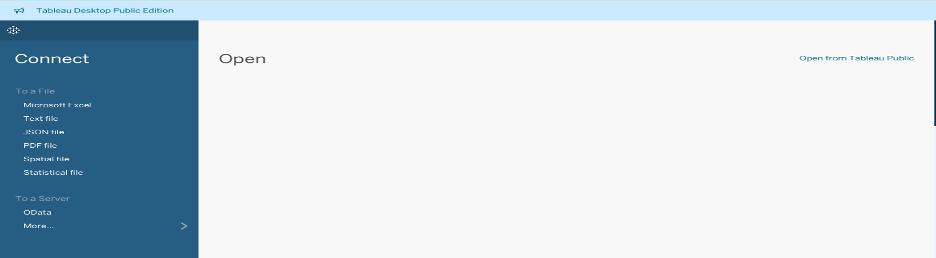
2) Choose the data source as Microsoft Excel and open the excel file.

The Sample - SuperStore has been added to data source.

Drag the Orders sheet to create the data model.

3) Creation of union in the data source can be done in two ways. Both the methods of union creation are given below.
METHOD 1
a) To create a union with the same sheet/table, click the dropdown menu on the Orders.

b) Click Ok.

c) Self union of Orders table has been created.


METHOD 2
a) In the Data source, add a connection and choose Microsoft excel.

b) Choose the Path Excel file.

Below is the Path Excel file layout.

c) Create a union between Orders and Path files.

d) The above screenshot shows an error. To fix it, create a relationship calculation between the two files.


Now the connection has been established and the error is fixed.
4) Next, let’s create a path bin.


Path bin has been created.
Now, let’s create all the calculated fields.
1) Create a calculated field for sum of Sales. Name the field as C_Sales. It is divided by 2 because duplicate of sales is created when we create a union with path file.

2) Create the next calculated field C_Total Sales. It is exactly same as C_Sales.

3) Create the calculated field C_Percentage.

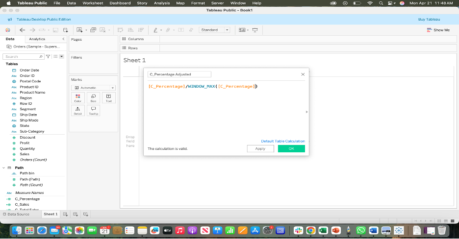
4) Create the calculated field C_Percentage Adjusted.
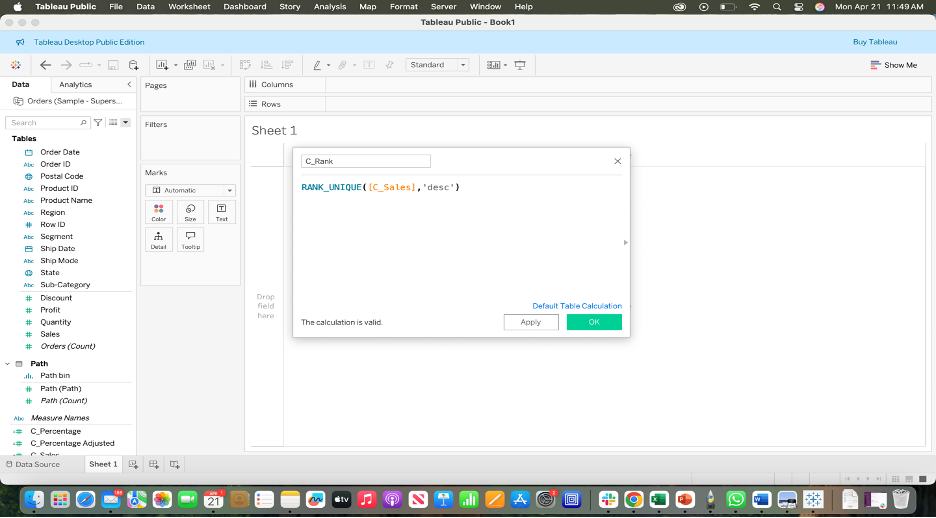
5) Create a calculated field C_Rank. This will assign rank to Sales in descending order.
6) Next, we create a calculated field for X-axis as below. The numbers specified is for the spacing in our chart.

7) To create the Y_axis we first need the calculated field C_Sigmoid.


8) Next, create the calculated field C_Size.

Now, let’s start creating the chart.
1) Under marks, choose Line. Drag C_X to Columns. Drag Path bin to Rows. In the drop down, check the ‘Show Missing Values’. Move the Path bin to Details under Marks.

2) Drag Sub Category to Color under Marks. Drag C_Y to Rows.

3) In the drop down of C_X in Columns, go to ‘Compute Using’ and choose ‘Path bin’. In the drop down of C_Y in Columns, go to ‘Compute Using’ and choose ‘Path bin’.

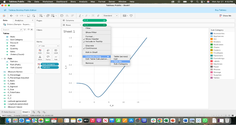
4) In the drop down of C_Y in Rows, go to ‘Edit Table Calculation’.
a) In the Nested calculations for C_Y, choose Specific dimensions and click Sub Category instead of Path bin.

b) In the Nested Calculations for C_Rank, choose Specific dimensions and click Sub Category instead of Path bin.

Now, we can see the spikes.

5) Drag C_Size to Size under Marks.

6) Now go to Compute Using and choose Path bin to get the bars.

7) Go to Edit Table Calculation under C_Size. In the Nested Calculations for C_Total Sales, choose Specific dimensions, select both Path and Sub Category, drag the Sub Category above Path. Uncheck ‘Show calculation assistance’.

8) In the Nested Calculations for C_Percentage Adjusted, choose Specific dimensions, select both Path and Sub Category, drag the Sub Category above Path.
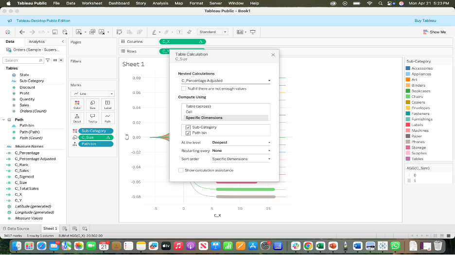

9) The dendrogram can be made to descending order by choosing ‘Reversed’ under ‘Edit Axis’.


10) The above chart can be formatted to remove the grid lines and the axis.

This step-by-step guide has outlined the essential process for creating a dendrogram, from data preparation to hierarchical clustering and chart visualization. By following these steps, users can effectively construct a dendrogram that reveals meaningful groupings and relationships within their dataset. Whether used for exploratory analysis or to support data-driven decisions, the dendrogram serves as a valuable tool for understanding complex data structures through visual representation.


