Visualizing Comparison: A Step-by-Step Guide to Creating Butterfly Charts in Tableau

Updated: Jan 22, 2025
Butterfly Charts for Clinical Insights: Visualizing Lactate and Calcium Levels by Age Groups
Butterfly charts, also known as diverging bar charts, are an effective way to compare two variables side by side. In this blog, we’ll explore how to create and interpret a butterfly chart, focusing on Lactate and Calcium metrics grouped by age bins using Tableau. This visualization is especially useful for comparing clinical measurements across patient demographics, such as Lactate and Calcium levels in sepsis patients.
Understanding the Clinical Context
In the context of sepsis:
Lactate Levels: Elevated lactate levels indicate insufficient oxygen and systemic stress, often leading to complications like kidney damage and septic shock.
Calcium Levels: Abnormal calcium levels disrupt the body’s balance and can exacerbate kidney dysfunction, especially in severe sepsis cases.
Use Case:
The butterfly chart enables us to compare Lactate and Calcium levels across different age groups, categorized by severity (“Normal,” “Elevated,” and “Severe”).
Dataset used:
For this analysis, we used a sepsis dataset, focusing solely on sepsis patients. We’ll walk through the process of creating calculated fields, age bins, and filters in Tableau to build a butterfly chart. We need to write a calculated field for the Lactate range and calcium range considering using only sepsis patients.
Understanding the Chart
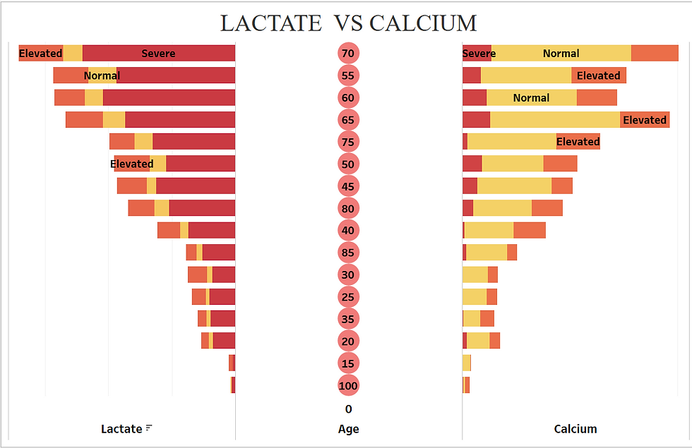
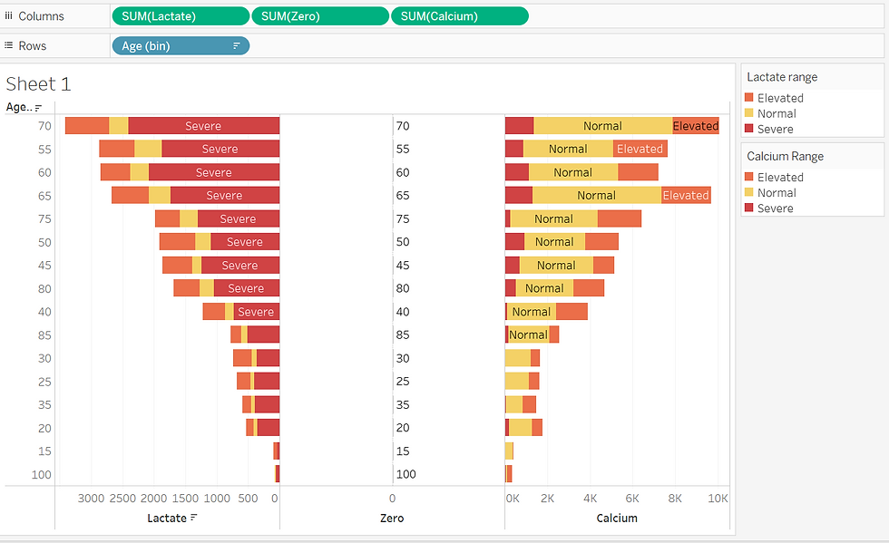
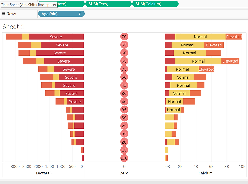
The chart in the image below compares Lactate and Calcium levels across different age bins. Here's how to interpret it:
Left Side (Lactate): Displays the distribution of Lactate levels across age groups.
Right Side (Calcium): Displays the distribution of Calcium levels across the same age bins.
The central axis separates the two measures for clear comparison.
Now, Let us see the calculation used for this analysis.
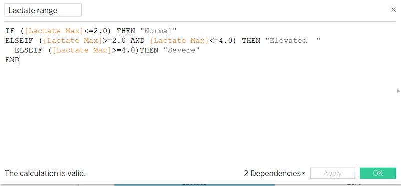
Creating Calculated field for Lactate Range:
Creating a Calculated Field for Calcium Range:

In the above Calculations, We get Lactate and calcium ranges. Now we create a calculation field for sepsis and non-sepsis patients.

Creating Age bin
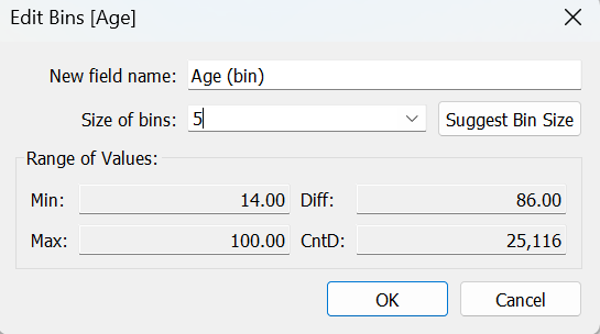
Now, Right-click the age field ‘Create’ and choose ‘Bin’.I have used the age bin 5, Screenshot is given below,
Now, Let’s Start step-by-step guide for the Butterfly chart.
Step 1:
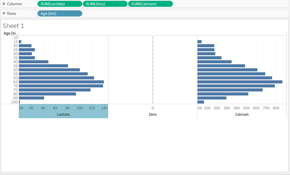
Drag the Lacate to columns, Zero Axes to columns, and calcium to the column. Then Drag the age bin to rows.
Here is the following screenshot for this.
Create a Placeholder for the Zero Axis
Create a calculated field named Zero with the formula:0
Drag Zero to the Columns shelf (between Lactate and Calcium).
Step 2:Adjust Axis Alignment:
For one measure ( Lactate), reverse the axis to create a mirrored effect:
Right-click on the axis, choose “Edit Axis” and then choose “Reversed”
Here is the screenshot for this,
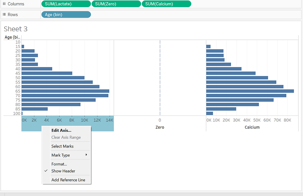
After choosing the Reverse, the Chart flips Here is the screenshot for this, Now, Change the names on both sides to Lactate and Calcium. Right-click on the axis and choose "Edit Axis".In that, you can edit your title in Axis Title.
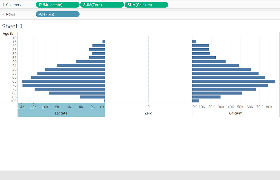
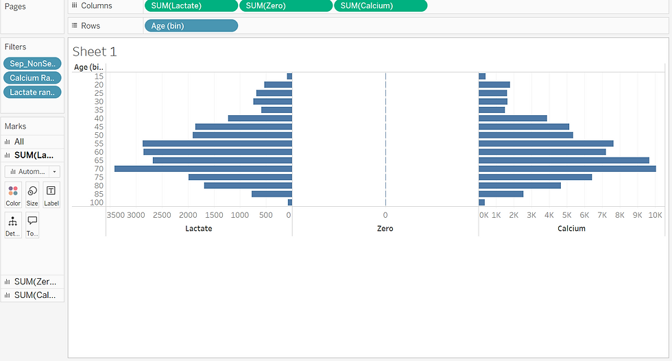
Step 3:Add Filters
Add Sepsis and non sepsis calculated fields to filter. In that select only the sepsis patients. Now add the lactate range calculated field to filter, then select normal, severe, and elevated. Do the same for the calcium range also. By using this filter it allows users to focus on specific data subsets.
Step 4:Apply Formatting and Colors
Use Colors To Enhance Insight:
Drag Lactate range to colors and patient ID to detail change patient ID as count of distinct.
Assign a distinct color palette for easy interpretation (e.g., red for "Severe," yellow for "Normal", and orange for Elevated).
2. Do the Same for Calcium as well. Drag calcium range to colors Patient id to detail change patient ID as count of distinct.
Assign a distinct color palette for easy interpretation (e.g., red for "Severe," yellow for "Normal", and orange for Elevated).
Here is the screenshot for this,
Step 5: Customize Tooltips and Labels
Add tooltips to display values dynamically when hovering over a bar.
Ensure labels are visible and readable.

Step 6:Create Age bin
Right-click the Age field and select “Create Bin.” Use a bin size of 5 years to group patients into age categories. This helps compare distributions across uniform age ranges.
Step 7: Finalize the Visualization
Clean up the chart by removing unnecessary gridlines and legends.
Use a descriptive title and annotations to clarify insights.
Customize font size and colors for age labels for better readability.
Here is the screenshot for it.

Key Use Cases for Butterfly Charts
Butterfly charts are ideal for:
Comparing population distributions.
Analyzing metrics across demographic groups.
Highlighting disparities or trends in data.
Conclusion
A butterfly chart is an innovative visualization technique used to compare two metrics side by side. In this case, Lactate levels are displayed on the left side, while Calcium levels are on the right, with a central axis representing age groups. This format makes it easy to identify differences and patterns at a glance. By aligning lactate and calcium levels side by side across age groups, this chart makes it easy to compare the severity and distribution of these health metrics.
Thank you for reading this blog…


