Visualize Hierarchies with Style: Sunburst Charts in Tableau

In today’s dynamic, data-driven landscape, the ability to interpret and communicate hierarchical information effectively is crucial. Just as important is presenting this data in a way that’s intuitive and visually engaging. The Sunburst Chart in Tableau is a powerful visualization that helps display multi-level categorical data in a radial layout, making relationships and proportions easy to understand at a glance. Here are the main types or variations of Sunburst Charts:
1. Basic Sunburst Chart
Shows hierarchical data in concentric rings.
Inner ring = top-level category (e.g., Department)
Outer rings = deeper levels (e.g., Product Category → Product Name)
Use Case: Organization structures, product category breakdowns.
2. Sunburst with Repeated Categories
Same category (e.g., “Electronics”) may appear in multiple branches due to different parent relationships.
Requires aggregation logic.
Use Case: Network relationships or complex taxonomies.
3. Interactive Sunburst (Drill-down)
Allows clicking on segments to zoom in on specific paths or branches.
Common in Tableau or Power BI dashboards.
Use Case: Navigation paths, file directories, user journeys.
4. Sunburst with Value Encoding
Segment size or arc length is proportional to a value, like Sales, Revenue, or Quantity.
Optional: use color gradients for additional metrics (e.g., profit margin).
Use Case: Sales contribution by region/product hierarchy.
5. Dual-Axis (Donut-Inside-Donut)
Like the one you're making in Tableau — mimics a Sunburst by layering two pie charts:
Inner ring = high-level category
Outer ring = sub-category
Use Case: When you want visual clarity without building a full tree. In this section, we’ll walk you through how to create and leverage Sunburst Charts to bring clarity and depth to the data storytelling.
Here, we would forcus on Interactive / Drill down Sunburst Chart. For this demonstration, we are using the Superstore dataset and focusing on key fields such as Category, Sub-Category, and Sales. The goal is to visualize the hierarchical relationship between product categories and their respective sub-categories using a Sunburst-style chart. This layered view allows us to understand overall sales distribution at a high level (Category) while also drilling down into the finer details (Sub-Category). Such a visualization helps uncover which product segments contribute the most to total sales, enabling more informed, data-driven decisions. Let’s dive into the process:
Step-by-Step Guide to create a Sunburst Chart:
Step 1: Connect to Your Data Source
We begin by launching Tableau Public or Tableau Desktop and connecting to the Sample - Superstore dataset.
Step 2: Create Relationships Between Tables
This dataset includes three tables: Orders, People, and Returns. We need to create logical relationships between them.
First, we create a relationship between Orders and People using the common field Region.

Creating a relationship between Orders and People using the "Region" field
Step 3: Linking Orders with Returns
Next, we notice there’s no direct field connecting People and Returns. However, both Orders and Returns share the Order ID field. We use this field to build another join.
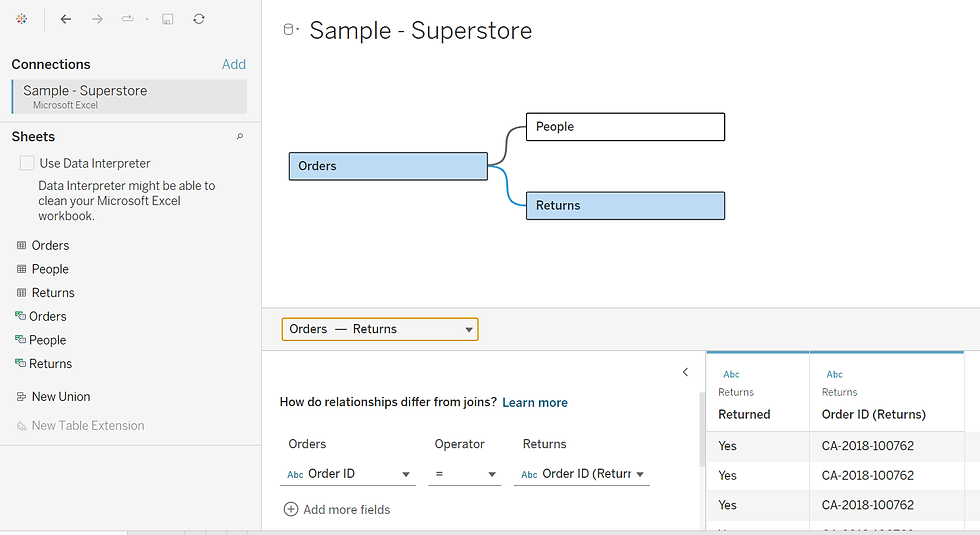
Linking Orders and Returns using the "Order ID" field
Step 4: Build the Pie Chart
Now that the relationships are in place, let’s build the pie chart:
Navigate to a new worksheet.
From the Marks dropdown, select Pie.
Drag Category to Color and Sales to Angle.

Initial pie chart with Sales split by Category
Step 5: Create a Duplicate Pie for Dual Axis
In the Rows shelf, double-click and type AVG(0). Click outside so Tableau converts it to AGG(AVG(0)).
Repeat the step to create a second identical axis. Now you’ll have two pie charts side by side.
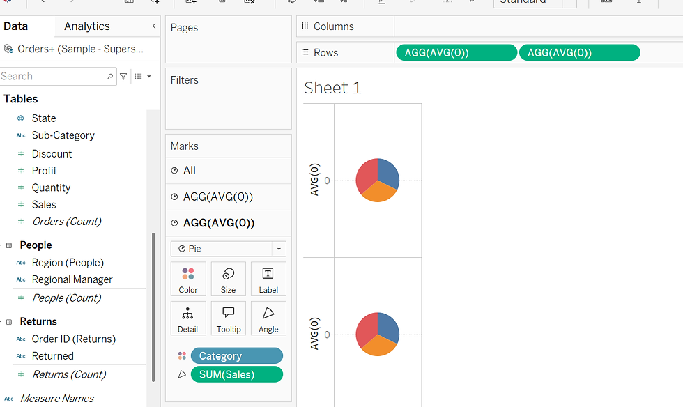
Two identical pie charts appear side by side after duplicating the axis
Step 6: Add Sub-Category Details
Now we differentiate the pies:
In the second Marks section (AGG(AVG(0))), drag Sub-Category to Detail and Color.
Adjust the colors to ensure they match the main categories (e.g., Technology remains green across both layers).
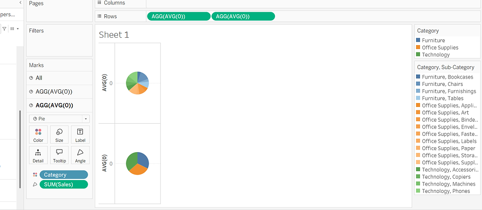
Sub-categories added to the second pie with matched color palette
Step 7: Merge with Dual Axis
Increase the size of both pies for better visibility.
Right-click on the second axis and select Dual Axis.
Now the two pies overlap, with the inner ring showing Category and the outer ring showing Sub-Category.
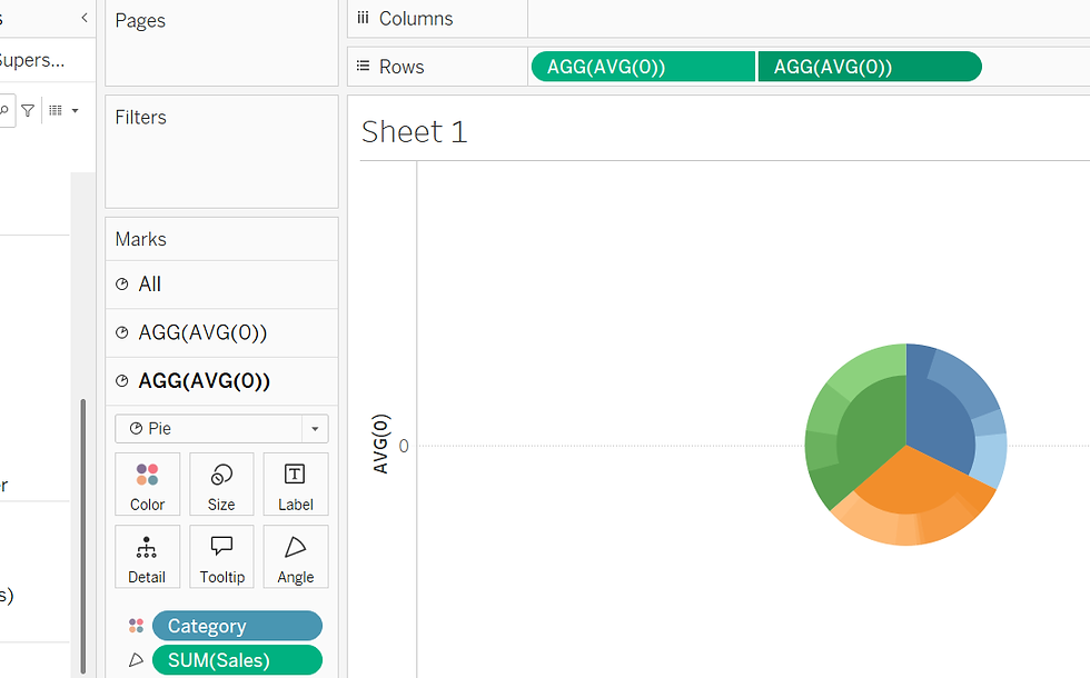
Two pie charts merged using Dual Axis to resemble a sunburst chart
Step 8: Final Formatting Touches
To enhance the look:
Remove gridlines: Right-click > Format > set Gridlines to None.
Hide headers: Right-click the axis > Uncheck Show Header.
Drag Category to Label in the inner pie for better clarity.

Final dual-axis pie chart showing Categories and Sub-Categories by Sales
Final Output: Dual-Axis Pie Chart in Tableau
You've now created a clean, informative dual-axis pie chart (sunburst style) that visualizes both categories and their sub-categories in one compact view. This technique helps add depth and clarity to your dashboards with minimal effort!
Conclusion
Creating a dual-axis pie chart (or a sunburst-style chart) in Tableau is a great way to represent hierarchical data in a compact and visually appealing format. By combining two pie charts—one for categories and another for sub-categories—you can clearly communicate both summary and detailed insights in a single view.
This type of visualization is especially useful for business dashboards, where understanding the breakdown of sales, revenue, or other KPIs at multiple levels is crucial. With a few simple steps—setting up relationships, customizing the Marks pane, and formatting the layout—you can elevate your Tableau dashboards and make your data stories more impactful.
Have questions or suggestions? Feel free to share them in the comments below.
Enjoy visualizing!
References:


