Unveiling Insights: The Power of Waterfall Charts

Updated: Jan 22, 2025
Tableau is a powerful data visualization tool that enables users to connect, visualize, and share data in an interactive and intuitive way. Widely used in business intelligence, Tableau transforms raw data into meaningful insights through its user-friendly interface.
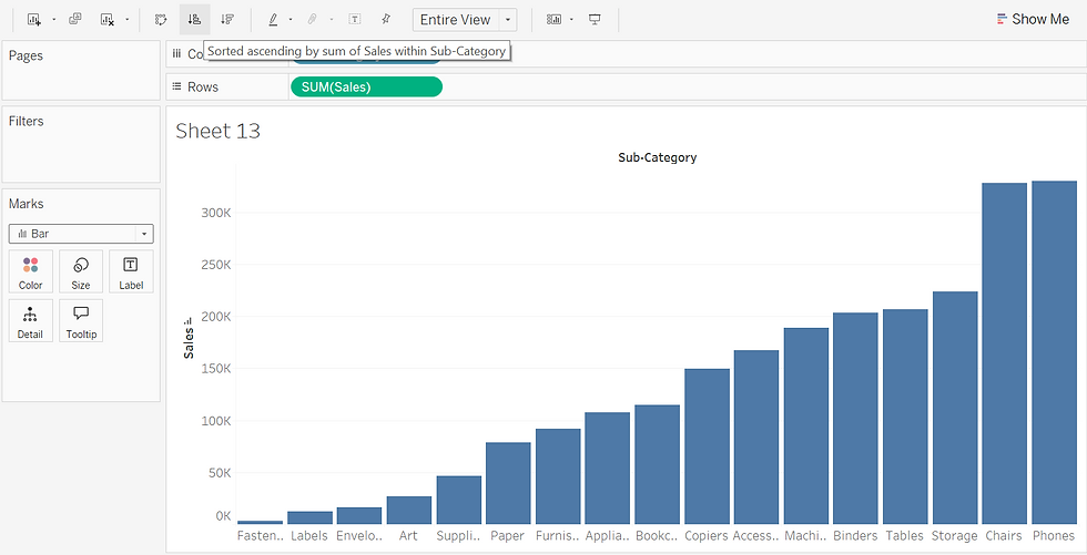
Let us use the Sample - Superstore dataset for our analysis. The chart below shows sales by sub-category in a bar chart. Let’s create a waterfall chart for the same sub-category sales.

What is a Waterfall Chart?
A Waterfall Chart is a type of bar chart designed to show how individual positive and negative values build up to a final total, providing a clear picture of the overall change. The columns "flow" from left to right, making the chart intuitive and easy to follow.
Key Features of Waterfall Charts:
Cumulative Totals: Visually represents how each value contributes to the total.
Color Coding: Distinguishes positive (gains) and negative (losses) values using different colors.
Clear Progression: Each bar starts where the previous one ends, showing the flow of values clearly.
Use Cases: Commonly used for financial data, such as revenue changes, profit margins, or expense breakdowns.
Steps to Create a Waterfall Chart:
Drag Fields to Columns and Rows:
Drag Sub-Category to the Columns shelf.
Drag Sales to the Rows shelf and sort the results in descending order.
Change the Mark Type:
Select Gantt Bar under the Marks card.
Apply a Quick Table Calculation on Sales using Running Total.

3.Adjust the Bar Size:
Drag Sales to the Size shelf under the Marks card.
To make it negative and fill the gaps between the Gantt bars, double-click on SUM([Sales]) and add a minus (-) sign before it.

Enhance the Visuals:
Increase the size of the bars slightly so they touch each other to create the waterfall effect

Sort the Sub-Categories:
To achieve the desired effect, sort the Sub-Category from largest to smallest.
Right-click on Sales in the Rows shelf, select Edit Table Calculation, and:
Choose Specific Dimensions.
Apply Custom Sort in Ascending order based on SUM(Sales).

Display Percent of Total:
Drag Sub-Category and Sales to Text under the Marks card to display values.
To show Sales as a percentage of the total, click the Sales dropdown under Marks and select Percent of Total.

To hide the axis, right-click on it and select "Show Header" to uncheck it. Then, drag Sales onto the Color shelf under the Marks card. This will display the Sub-Category in different colors, differentiating them by their percentage of sales.
Waterfall Chart



