Unleashing the Power of Pivot Tables in Excel for Data Analysis
MS Excel is an easily available tool. We often use it only to store relevant data in a table format. But that’s not all about it. I can visualize Excel as a person and shouting out loud, “Don’t underestimate the power of a common man”. Excel is a far more advanced tool than we can imagine. It has features and functions that help us derive a lot of valuable insights from the data.
Based on their functionality, the different worksheet functions can be categorized as follows:
· Text functions
· Math and Trigonometry functions
· Logical functions
· Statistical functions
· Data and time functions
· Database functions
· Engineering functions
· Financial functions
· Information functions
· Lookup and reference functions
· Compatibility functions
· Cubes
· User defined functions that are installed with add-ins
· Web functions
Excel has many powerful features. Below are some of the key features in Excel.
· Spreadsheet and Data organization
· Formulae and Functions
· Data Visualization
· Pivot tables and Pivot Charts
· Conditional Formatting
· Data Sorting and Filtering
· Collaboration and Sharing
· Data Import and Export
And the list goes on…
Pivot Table
Pivot Table is one of the key features of Excel. It helps to calculate, summarize, and analyze the data. By simply dragging the columns and grouping them in the pivot table, we can get the patterns and trends in the data. Using these trends, the data can be converted into charts to visualize the insights.
Now, I am going to walk you all through Pivot Table creation and the valuable insights it can offer. Let’s get started.
Open the data in Excel. I am using an extract from Superstore data.

Select the data and create a table by clicking Ctrl+T. Then click OK. This will create an actual table from the raw data.

The table gets created as shown below.

Go to Insert in the toolbar and choose Pivot Table. Then select the cells. Click OK.

The Pivot Table gets created in a new worksheet.

Let’s rename the sheets as Analyze and Data.

Drag the Profit to values and sub-category to rows, to get sub-category-wise profits.

We can also add the Categories to the above. Adding the Category column under different sections changes the table representation accordingly. Below is the illustration of the same.
a) Under rows, above the sub-category.

b) Under rows, below the sub-category.

c) Under columns

We can remove any column from the pivot table by just deselecting the column.

If the column value of Profit has to be sorted, then right click on the column, choose Sort.

After sorting the data in descending order, we get the first insight that phones have the maximum profit.

The representation of the sum of profit can be changed using ‘Show value as’. This can be done in two ways: either by right-clicking and choosing ‘Show value as’ or by choosing from the PivotTable fields pane.
1) First option


Here, the percentage of the total is negative as the grand total of the sum of profits is negative.
2) Second option

There are 2 methods to create another pivot table in the same worksheet.
Method 1:

In the Analyze worksheet, choose the cell where the pivot table has to be placed and click OK.

A new pivot table is created in the same worksheet.
Method 2:
Copy and paste the pivot table on the same page.

Remove the fields from the pivot table and add new fields.

Next, filters can be added to the pivot table. Let’s add the order date field as a filter. This way, we can get the sum of the quantity of products sold in each sub-category on a single date or multiple dates.


A better representation can be achieved by using the menu option Pivotable Analyze – Insert Timeline.


The product quantity can be seen on a yearly, quarterly, monthly, and daily basis.

The Order date field can be added in the pivot table directly under rows.

If the sum of sales for each quarter is not required, then it can simply be removed from under the rows section.

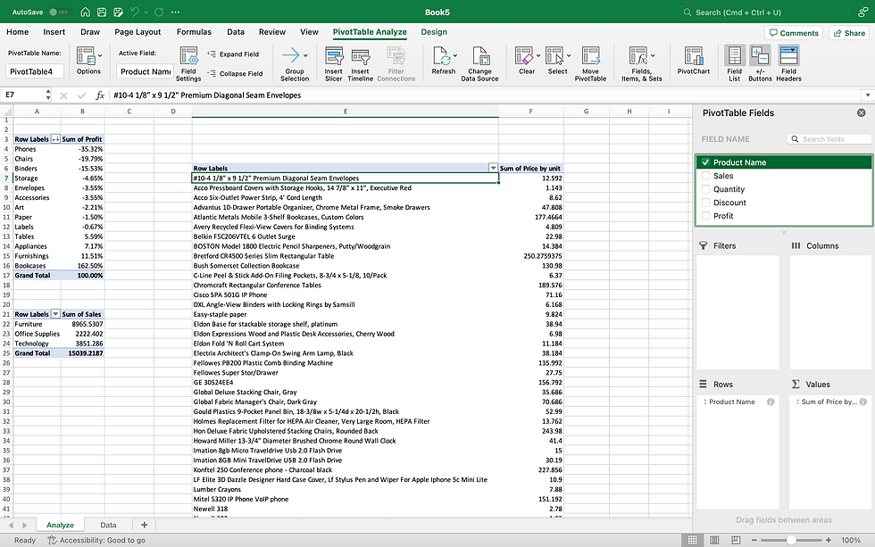
Let’s see how to create a calculated field in Excel. We have the Sales and the Quantity fields. We can calculate the unit price of each product as follows:
Create the pivot table with the product names and sales.
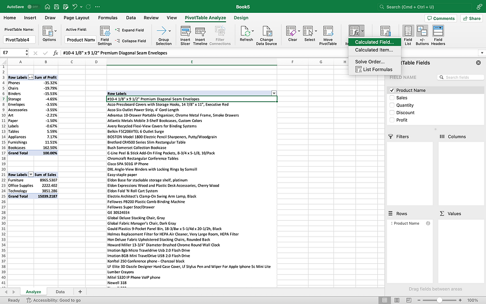
Choose the menu option PivotTable Analyze - > Fields, Items & Sets - > Calculated fields
Insert the Sales and the Quantity fields in the formula and divide them to get the unit price. Click Add and then Ok.

We just saw how to create pivot tables. Now, let’s move on to visualizing the pivot table data.
The raw data is first converted to a table format.
The pivot tables are created in a new worksheet named Pivot.
A new worksheet is added and renamed as Dashboard. This sheet will have the visualizations.

We are going to create three pivot tables using the above data.
The first pivot table is created as shown below, using which we will create KPIs.

The second pivot table is shown below, using which we will create a table chart.

The third pivot table is shown below, using which we will create a bar and line chart. In this chart, we have changed the Operating margin to average and made it numeric with 2 decimal places. Using the Design menu option, the pivot style, the report layout, and the grand total and the sub-totals have been turned off.


Let’s dive into creating the dashboard.
The first step will be to remove the gridlines using the View menu option and deselecting the gridlines.

Next, let’s create placeholders for Title, Filter, and the KPIs. Using the Insert menu option and selecting shapes, the placeholders are created as shown below.

Let’s add the title and the KPIs to the dashboard by double-clicking each box. The text can be formatted using the Home menu option.

Next, to add the KPI values, insert text boxes under each KPI. The value will be added in the text box using cell referencing from the Pivot sheet. The text box and the text can be formatted using the Shape format and the Home menu options, respectively.


Similarly, the other KPI values can be added to the dashboard.

Next, let’s add the table chart to the dashboard. The title of the table chart is written using the text box, and the column names are entered directly in the cells.
The first three column values are added using cell referencing from the Pivot worksheet.

The variance is calculated by subtracting Sales 2022 values from Sales 2023 values. The formula is written in the first cell and dragged down to fill the other row values.


The table can be formatted using the Home menu option. The Sales and Variance can be changed to the currency format. We can add conditional formatting to the Variance column.


Based on the above visualization, it’s clear that
· Overall beverage sales declined in 2023
· Powerade experienced the steepest drop
Next, let’s see the steps to create a bar and line chart.
1) Copy the pivot table data using cell referencing.

2) Select the copied table data, choose the Insert menu option, and select the combo chart.
Note: Recommended charts provide a list of charts.


4) Copy and paste the chart to the Dashboard worksheet.

5) To add a filter to the dashboard, click on the pivot table, go to the Insert menu option, and select Insert Slicer.


6) Cut and paste the slicer in the filter placeholder in the Dashboard worksheet.

7) Only the KPI values change when the data is filtered for the Northwest region, as the slicer was created on the KPI pivot table.

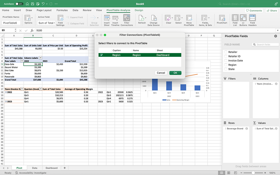
8) To expand the filter to the other visualizations, click on the individual pivot tables, select the Filter connections under the PivotTable Analyze menu option, choose the filter, and click Ok.

9) Below, it is evident that the values in all the charts in the dashboard change as per the filters chosen.


Thus, pivot tables serve as a powerful tool for visualizing data and uncovering valuable insights. By transforming raw data into structured, interactive summaries, they empower users to detect trends, compare performance, and make informed decisions.


