Understanding Sepsis Through Lab Trends: A Beginner‑Friendly Guide

Sepsis is one of the most challenging conditions in clinical care because it affects the entire body — especially vital organs like the kidneys. In this blog, To make things easy to understand, we’re starting with a simple chart that shows how two common kidney markers Creatinine and BUN behave in Sepsis compared to Non‑Sepsis patients.
Even if you’re new to medical data or healthcare analytics, this visual makes the pattern clear at a glance. It highlights how these markers rise together and how their levels shift when sepsis is present, helping us see the connection between kidney function and severe infection.
Core Basics to Pay Attention To
The chart plots average Creatinine and BUN levels for large groups of patients. Each dot represents a group, and the colors show:
🟢 Sepsis patients
🔴 Non‑Sepsis patients
A trend line for each group helps us see the overall pattern. Tracking lab trends helps clinicians see how sepsis affects different organs over time. These patterns reveal early signs of organ stress, guide treatment decisions, and support faster, more accurate clinical judgment.
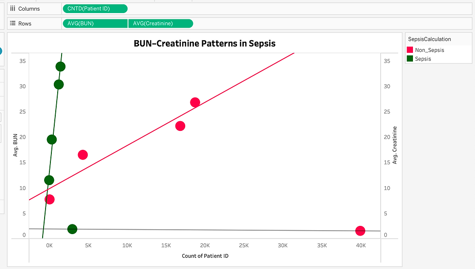
Correlation between Creatinine & BUN in Sepsis Patients
Yes — there is a positive correlation between Sepsis and higher Creatinine & BUN levels.
Meaning:
When sepsis is present, → Creatinine tends to go up → BUN tends to go up
Why? Because sepsis stresses the kidneys.
Sepsis causes:
Low blood flow to kidneys
Inflammation
Toxin buildup
Organ dysfunction
This leads to Acute Kidney Injury (AKI) — a common complication of sepsis.
When kidneys are injured:
They cannot filter waste properly
Waste products (Creatinine & BUN) accumulate in the blood
So the correlation is: More severe sepsis → more kidney stress → higher Creatinine & BUN
Simple Analogy
Think of the kidneys as a water filter:
Normal filter → water stays clean (normal BUN/Creatinine)
Clogged filter (sepsis) → dirt builds up (high BUN/Creatinine)
Sepsis “clogs the filter,” so waste levels rise.
The Signals That Shape the Overall Insight
Sepsis patients have higher Creatinine and BUN
The green dots sit higher on the chart. This means sepsis patients tend to have elevated kidney waste markers.
Both markers rise together.
As Creatinine increases, BUN also increases. This is called a positive correlation — both move in the same direction.
Sepsis amplifies this relationship
The trend line for sepsis patients is steeper, showing that kidney stress is more pronounced when sepsis is present.
The Underlying Renal Response in Sepsis
Sepsis causes:
Reduced blood flow to the kidneys
Inflammation throughout the body
Toxin buildup
Risk of Acute Kidney Injury (AKI)
When kidneys cannot filter properly:
Creatinine rises
BUN rises
So the chart is essentially showing how sepsis impacts kidney function.
Insight | Meaning |
Sepsis patients have higher BUN & Creatinine | Sepsis stresses the kidneys |
Both markers rise together | They reflect kidney filtration ability |
Sepsis trend line is higher | Kidney injury is more common in sepsis |
These markers show severity, not diagnosis | They help assess organ damage, not detect infection |
How All These Findings Fit Together
Sepsis is linked to higher Creatinine and BUN levels because it stresses the kidneys. Both markers rise together, and this correlation becomes stronger in sepsis patients.This makes the chart a powerful visual tool for understanding how sepsis affects kidney function.

Sepsis ↗ → Creatinine ↗
Sepsis ↗ → BUN ↗
Creatinine ↗ ↔ BUN ↗ (they rise together)
In the end, this chart explored how visual analytics—especially Tableau charts—can simplify complex medical data and make clinical patterns easier to understand. By focusing on the relationship between Creatinine, BUN, and Sepsis, we saw how a single chart can reveal meaningful insights about kidney function during severe infection. The visual separation between Sepsis and Non‑Sepsis groups highlights how strongly sepsis impacts the kidneys, leading to higher waste markers and a clear upward trend. For clinicians, this kind of visualization supports faster interpretation, early recognition of organ stress, and more informed decision‑making. For beginners, it transforms raw numbers into a story that’s easy to follow. Ultimately, the chart demonstrates how data visualization bridges the gap between analytics and patient care, helping everyone—from students to experienced clinicians—see the clinical picture with greater clarity.
Creatinine levels behave across different age groups
In our earlier charts, we explored how Creatinine and BUN levels rise together in sepsis, and how those patterns shift across age groups. Now, this Sankey diagram offers a fresh, flow‑based view of the same story — showing how creatinine levels (normal vs abnormal) connect to different age groups.

Sankey diagram showing creatinine levels by age
The Hidden Process Behind the Numbers
On the left, we see two categories:
Abnormal Creatinine (71.68%) in red
Normal Creatinine (28.32%) in green
These flow into four age groups on the right:
Children
Young Adults
Older Adults
Seniors
The thickness of each flow line shows how many patients fall into each category. What stands out is that abnormal creatinine dominates across all age groups, especially among Young Adults, Older Adults, and Seniors. This reinforces what we saw earlier: kidney stress is more common in older populations, and creatinine is a reliable marker for spotting that stress.
The Sankey format makes it easy to see how age and kidney function interact — not just as numbers, but as patterns that flow across the population.
Conclusion
This chart adds clarity to our ongoing story: abnormal creatinine is widespread, and its burden grows with age. Seniors and older adults show the highest flow from abnormal levels, highlighting their vulnerability in sepsis cases. By visualizing these connections, we move beyond isolated lab values and begin to understand how age, kidney function, and infection severity form a clinical pattern.
Next, we’ll look at how these patterns shift when we break them down by gender, and then explore how BUN behaves across gender and age groups to complete the picture.
🌼 Happy Reading!


