Understanding data types in Statistics(With Examples and Charts in Python)
- krishnananavaty
- Oct 8
- 3 min read
Introduction:
In today’s world, data plays a critical role in many aspects of life. By analyzing data, we can uncover meaningful insights across a broad spectrum of endeavors and make informed predictions about future outcomes. To effectively undertake any data analysis, it is essential to first understand the different types of data. This foundational knowledge is vital, as it informs the selection of appropriate analytical methods.
Let us begin by exploring the various data types in statistics and their significance in enabling accurate and meaningful data analysis.
1) Qualitative Data (Categorical Data):
These describe qualities or characteristics that can’t be measured with numbers directly.
A. Nominal Data
Description: Categorical data without any inherent order. It represents names or labels. You can count how many items fall in each category, but you can’t order or perform arithmetic on them.
Examples: gender, country names, Marital Status or product categories.
Significance: Useful for grouping and counting data points but not for measuring or ranking.
Implementation: Treated as discrete fields.


Interpretation of Bar Chart:
The North and West regions have the highest number of patients, while the South and East have the fewest.

Interpretation of Pie Chart:
Blood type O is the most common among hospital patients, followed by A, while AB is the least frequent, highlighting key patterns in patient demographics.
1.1 Binary Data (a Special Case of Nominal)
Binary variables are categorical but have only two values—often represented as 0/1 or Yes/No.


Interpretation of Bar Chart:
Females show a higher number of diabetes cases compared to males, despite similar non-diabetic counts.
B. Ordinal Data
Description: Categorical data with a clear, meaningful order or ranking, but the intervals between the categories are not necessarily equal or known. Categories with a natural order. (e.g. low, medium, high). No meaningful difference between the ranks.
Examples: customer satisfaction ratings (e.g., low, medium, high), or education level (e.g., high school, bachelor’s, master’s).
Significance: Important when order matters but precise differences between categories are unknown.
Implementation: Treated similarly to nominal data but can be sorted in a meaningful order.


Interpretation of stacked Bar Chart:
The chart shows that male patients report higher levels of severe and very severe pain, while female patients more frequently report mild to moderate pain.
2. Quantitative Data (Numerical Data):
These are numbers that represent measurable quantities.
A. Interval Data
Description: Numerical data with meaningful differences between values but no true zero point.
Example: temperature in Celsius or Fahrenheit, Dates
Significance: Allows for measuring the difference between data points, but ratios are not meaningful because zero does not mean absence.
Implementation: Treated as continuous data, enabling the creation of line charts or scatter plots.


Interpretation of line chart:
The patient's body temperature fluctuated over the 8 days, peaking on Day 5, indicating possible high fever.
B. Ratio Data
Description: Numerical data with meaningful differences and a true zero point.
Examples: height, weight, sales figures, or revenue.
Significance: Supports all mathematical operations, including meaningful ratios (e.g., twice as much).
Implementation: Also treated as continuous or discrete data. You can perform calculations like averages, sums, and ratios, and visualize them through bar charts, histograms, or time-series graphs.
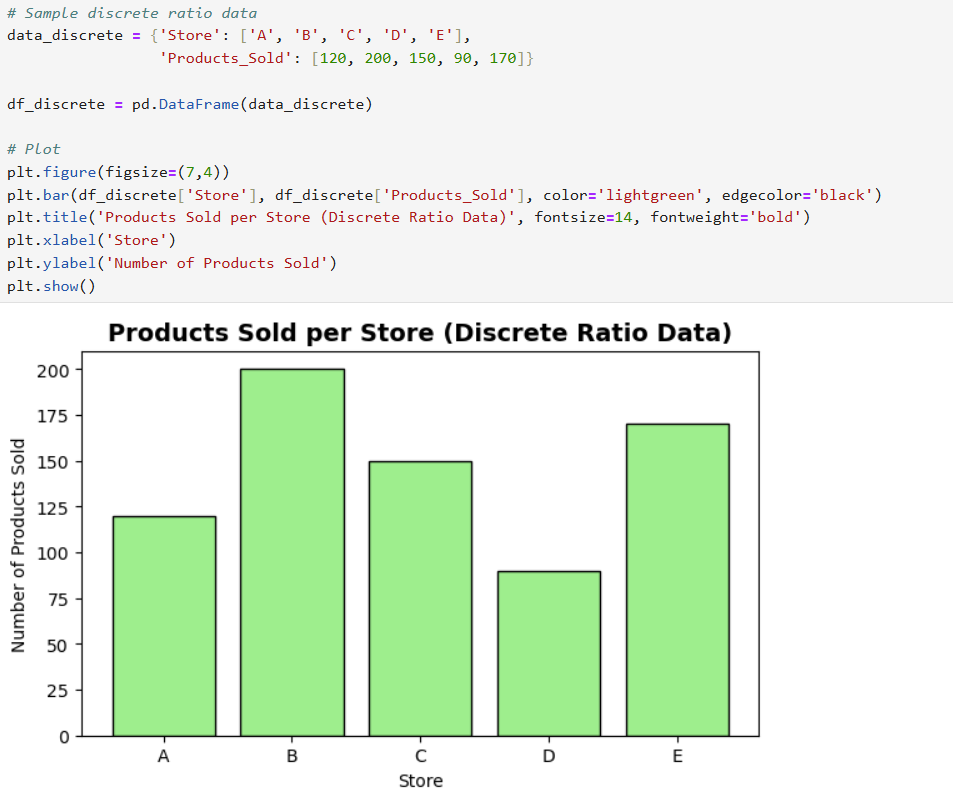
Interpretation of Bar Chart:
Store B sold the highest number of products, while Store D sold the least among the five stores.


Interpretation of Boxplot:
Glucose levels increase with age, with seniors showing the highest levels and young adults the lowest.
Why Understanding Data Types Matters
Choosing the Right Visuals: Different data types are best visualized using certain chart types.
For example, categorical data (nominal/ordinal) is often best shown with bar charts or pie charts, while numerical data (interval/ratio) works well with line charts, histograms, or scatter plots.
Correct data typing ensures your plots make sense and clearly communicate your findings.
Accurate Analysis: Understanding whether a column is categorical, ordinal, or numerical helps you apply the correct statistical operations:
You should only calculate averages, medians, or standard deviations on numerical data.
Categorical data should be used for grouping, filtering, or labeling — not for math.
Mistyped data can lead to misleading results, incorrect insights, or errors in code.
Effective Data Preparation:
In Python, assigning proper data types (e.g., category, int, float, datetime) during the data cleaning phase improves both performance and accuracy:
Categorical fields should be stored as category or object types.
Quantitative fields should be explicitly cast to int or float as needed.
Dates should be converted to datetime for time series operations.
Correct typing ensures efficient aggregation with .groupby(), accurate joins and merges, and meaningful visualizations.
Conclusion:


