Types of Charts in Tableau and uses of Charts
- spandanachss
- Oct 17
- 10 min read

Tableau offers many chart types for different purposes, such as bar charts for comparing categories, line charts for showing trends over time, scatter plots for identifying relationships between variables, pie charts for displaying parts of a whole, and histograms for showing data distribution. Choosing the right chart depends on the data and the insight you want to communicate, like comparing values, analyzing trends, showing proportions, or finding correlations.
Common chart types and when to use them
Here are some examples of some charts.
Bar Chart :
Bar charts enable us to compare numerical values like integers and percentages. They use the length of each bar to represent the value of each variable. For example, bar charts show variations in categories or subcategories scaling width or height across simple, spaced bars, or rectangles.
How to read Bar Chart :
Bar charts can represent quantitative measures vertically, on the y-axis, or horizontally, on the x-axis. The style depends on the data and on the questions the visualization addresses. The qualitative dimension will go along the opposite axis of the quantitative measure. Bar charts typically have a baseline of zero.
Many other variations of bar charts exist. Stacked bar charts, side-by-side bar charts, clustered bar charts, and diverging bar charts.
A good bar chart will follow these rules:
The base starts at zero
The axes are labeled clearly
Colors are consistent and defined
The bar chart does not display too many bars
When creating a bar chart, do not:
Make each bar a different width
Cram too many bars into subcategories
Leave the axes unlabeled
Examples :
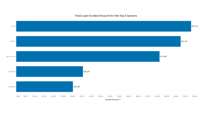
This bar chart measures the number of loans received in each sector of business.
A single color is used
Data is sorted from highest to lowest
Labels are readable
The axis starts at zero
Line Chart :
A line chart, also referred to as a line graph or a line plot, connects a series of data points using a line. This chart type presents sequential values to help you identify trends. Most of the time, the x-axis (horizontal axis) represents a sequential progression of values. The y-axis (vertical axis) then tells you the values for a selected metric across that progression.
How to read Line Chart :
For most line charts, the horizontal axis represents a dimension of time, while the vertical axis represents a quantitative value (Ex. money, number of people, percent change, etc.). The graph should have each axis, or horizontal and vertical lines framing the chart, labeled. Line charts can display both single or many lines on a chart.
Example :

This line chart follows the number of borrowers measured every month over the course of several years.
The x-axis represents the date field
The y-axis represents the quantitative field
The first and last points are labeled for context
Labels for each data point are not displayed to reduce clutter
Axis and light grid lines are visible to the viewer to help in identifying locations of data points
Pie Chart :
A pie chart helps organize and show data as a percentage of a whole. True to the name, this kind of visualization uses a circle to represent the whole, and slices of that circle, or “pie”, to represent the specific categories that compose the whole. This type of chart helps the user compare the relationship between different dimensions (Ex. categories, products, individuals, countries, etc.)
How to read Pie Chart :
To read a pie chart, you must consider the area, arc length, and angle of every slice. Because it can be hard to compare the slices, meaningful organization is key. Slices in a pie chart should be organized in a coherent way, usually the biggest to smallest, to make it easier for the user to interpret. Start at the biggest piece and work your way down to the smallest to properly digest the data. The colors of the slices should match their respective blocks in the legend, so that viewers do not need to consult the legend as much.
Use a pie chart if:
You have a total number that can be split up into 2-5 categories.
One category outweighs the other by a significant margin.
Do not use a pie chart if:
Your dimension has too many categories.
Similar percentages/numbers exist between different values within the chosen dimension.
Data doesn’t represent a uniform “whole”, or the percentages don’t measure to 100 percent.
There are negative values or complex fractions in your measure value.
Example :

This pie chart shows the percentage of total sales per regional market.
No more than five slices were used.
The largest slice starts from the top of the circle.
Slices are colored with distinct, vivid colors. Consider using colors friendly to colorblind users.
Scatter Plot:
A scatter plot displays data points on a chart at the point at which two measures intersect. Scatter plots make it easy to analyze the relationship between two numbers, as they display all data points in the same view. The x-axis (horizontal line) and y-axis (vertical line) each contain their own field. Scatter plots display data points as dots or symbols along the x- and y-axes of a chart.
How to read Scatter Plots :
A scatter plot uses two fields to show the relationship between pairs of variables in a single chart. In general, the x-axis is the chart’s independent variable, and the y-axis is the chart’s dependent variable. An independent variable is not changed by the other variables in your measurement. Alternately, independent variables affect dependent variables. A scatter plot’s purpose is to show how changes in the independent variable change the dependent variable. You can use scatter plots to investigate whether there is a relationship between two variables. Doing so can show if one variable is a good predictor of another.
Example :

This chart looks at the correlation between sales and profits made by a store. You can tell from the chart that higher sales do not necessarily equate to higher profit.
Each point is clearly labeled.
There are not too many marks on the view, so viewers can see the points with minimal overlap.
There is one consistent color.
There is one consistent shape.
Histograms are a specific variation of bar charts, and provide a way to show distributions of data. A histogram tracks the different values found in one set of data as a series of connected bars. Statisticians, scientists, and analysts refer to the widths of each bar as bins or classes.
How to read Histograms :
Histograms split a single continuous measure into bins, or groups, that represent a specific range of values. Data points are then grouped into these equally sized bins. The bins are then displayed visually as bars stacked next to each other. Histograms work best when displaying continuous, numerical data.
You should use a histogram if:
You would like to explore how members within a category in a dataset are distributed. i.e. The breakdown of salaries within an organization with the ability to see how balanced your pay scale is, or the count of bank members that have X amount of dollars in their accounts.
You have one continuous, numerical value that can be split into multiple bins.
You are looking to understand the distribution of values within a single category.
Avoid using a histogram if:
You need to analyze multiple dimensions simultaneously.
Your data set isn’t scaled correctly.
You want to compare the specific values of individual data points.
Example :

This histogram looks at Airbnb rentals in Austin, Texas, showing price per day in $25 bins. The chart has a right-skewed distribution, and the average price for an Airbnb seems to be between $50 a night and $150 a night.
This histogram uses only one color.
It looks at one measure.
It has an easily estimated average.
Tree Map :
The tree map functions as a visualization composed of nested rectangles. These rectangles represent certain categories within a selected dimension and are ordered in a hierarchy, or “tree.” Quantities and patterns can be compared and displayed in a limited chart space. Tree maps represent part to whole relationships.
How to read a Tree Map:
Tree maps provide an accessible way for viewers to interpret their data at a glance. Color can represent dimensions (such as categories) or measures (such as KPIs). If used to represent a KPI, a darker color may highlight extremes, high or low.
A good tree map will have:
Distinct numerical values.
A distinct hierarchy.
No more than three or four labeled tiles.
An obvious highest level of the hierarchy.
Not display negative values.
However, a poor tree map will:
Look cluttered with too many categories and labels.
Have too many similar values.
Example :

This tree map looks at the listings per type of lodging available. The biggest box tells the viewer that most of the rooms available are the entire home or apartment, while the second biggest box measures the number of private rooms available.
This tree map only measures a few categories in relation to each other.
The white borders indicate that all three measures make up a whole.
The colors are distinct from each other.
Bubble Chart :
A Bubble chart is a visualization that can be useful in showing high-level comparisons between members of a field. In any bubble chart, the size of the bubbles is a reflection of the values of the categories or members within a field. The number of categories within your selected field will determine the number of bubbles in your chart. You can add color to provide insight and it is often used to help identify categories or as a way to gauge numerical value.
How to read Bubble Chart :
When presented with a bubble chart, the goal is typically to allow you to quickly make a comparison between members of a categorical field. To do so, end-users should visually compare the size of the bubbles as well as the color to the other field members in the view to draw conclusions from the data. Bubble charts can help to simplify a complex dataset into a visual that makes it easy for viewers to compare members within a given field.
When using a bubble chart:
Use few colors and ones that are easy to distinguish.
Label the bubbles.
Sort the bubbles by size to make it easier for the viewer.
Don’t use a bubble chart if:
You only have one mark in a field.
There are too many bubbles, making analysis difficult.
The range of values is very small between marks.
The position of your marks on an axis is important.
Example :

This bubble chart shows a split in the gender of borrowers from a specific bank. The bubble that represents female borrowers is larger than the bubble that represents male borrowers. These two bubbles correctly represent the portion for male borrowers and female borrowers.
Turquoise represents the female borrowers.
Gray represents the male borrowers.
There are only two bubbles in this graph, making the difference obvious.
Box and Whisker Plots:
Box and whisker plots portray the distribution of your data, outliers, and the median. The box within the chart displays where around 50 percent of the data points fall. It summarizes a data set in five marks. The mark with the greatest value is called the maximum. It will likely fall far outside the box. The mark with the lowest value is called the minimum. It will likely fall outside the box on the opposite side as the maximum.
The box itself contains the lower quartile, the upper quartile, and the median in the center. The median is the value separating the higher half from the lower half of a data sample, a population, or a probability distribution.
Example :

In this box and whisker plot, salaries for part-time roles and full-time roles are analyzed. Two plots show the average for each kind of job. Applicants might be able to learn what to expect for a certain kind of job, and analysts can quickly determine which job titles are outliers.
The measures use consistent colors.
There is clearly a 25th percentile, a median, and a 75th percentile.
Bullet Graphs :
A bullet graph is a type of chart represented by a bar marked with extra encodings to show progress towards a goal or performance against a reference line. Each bar focuses the user on one measure, bringing in more visual elements to provide additional detail. The bullet graph depicts a single primary measure. It includes measures from other fields to enhance the graphical display for analysis.
How to read it :
A bullet graph consists of a bar representing the featured measure. This bar stands out from the rest of the graph with its strong color and bold line. It positions itself in the middle of the graph. A reference line, denoting a goal or other critical threshold, is set perpendicular to the bar on the axis with the quantitative scale. When the main bar passes the reference line the goal has been met or the state has changed.
When creating a bullet graph:
Use a strong, clear color for the feature measure.
Use softer colors from the same color scheme to mark the comparative measures.
Make sure your sets of time are the same.
Don’t use a bullet graph if:
Your sets of data aren’t measured over the same lengths of time.
You want to compare the performance of many categories (Ex. products or regions).
You don't want to check a quantitative measure against qualitative ranges or threshold.
Example :

This bullet graph tracks the sales of different coffee products and compares them to the budgeted goal allotted for each product. Note the bars denoting the goals for each product.
This bullet graph:
Uses a vertical bar to show the target for each Product.
Uses colors (yellow and green) to distinguish which product met its sales goals.
Uses gray to mark the goal bar around the product bar.
Starts at a base of zero.


