Turning Numbers Into Stories - How to Plot with Python

Introduction
Have you ever looked at rows and rows of data and felt overwhelmed? You're not alone. Data is powerful, but without a way to see what it’s telling you, it can feel like a foreign language. That’s why data visualization is so important.
Python, one of the most popular programming languages today, offers simple yet powerful tools to help you turn raw data into compelling charts and graphs. In this post we will walk through how to create your own plots in Python even if you’re just starting out.
Why Plotting Matters
Imagine trying to understand a year's worth of sales data by scanning a spreadsheet. Not fun, right?
Trends with line plots
Comparisons with bar charts
Distributions with histograms
Relationships with scatter plots
Good visualization isn’t just about making things look pretty—it’s about making your data speak clearly. It enhances storytelling, highlights important insights, and supports better decision-making.
Getting Started - Install Your Tools
Before we start plotting, we need the right tools. The three main libraries we will use are:
matplotlib – the foundation of all Python plots
seaborn – built on top of matplotlib, easier and prettier
pandas – helps organize and work with data
Open a terminal and run:
pip install matplotlib seaborn pandasOnce installed, open a Jupyter notebook or Python script and start exploring!
Matplotlib - The Foundation
matplotlib is the core plotting library in Python.
It gives you full control over how your plots look-titles, labels, colors, ticks, and more.
A Simple Line Plot
Line plots are great for showing trends over time or across an ordered sequence.
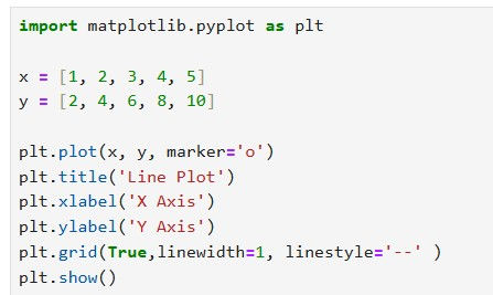
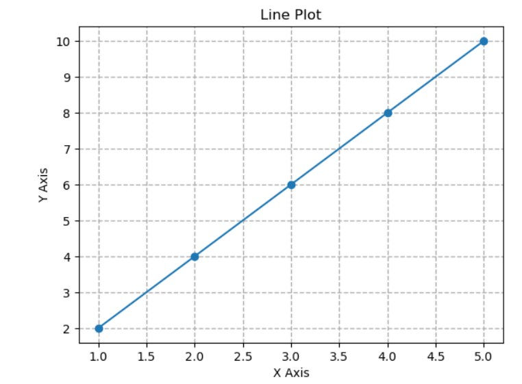
plt.plot() draws a line connecting your points
marker='o' puts a circle at each point
plt.show() displays the plot window
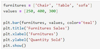
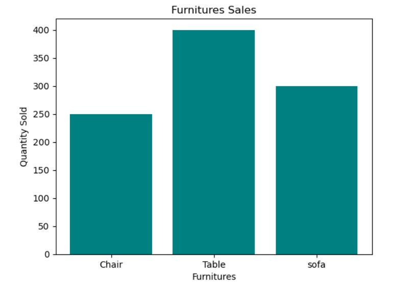
Bar Chart – Comparing Categories
Bar charts are perfect for comparing different groups or categories. They help you instantly see which items are more or less popular.
Making It Beautiful with Seaborn
If matplotlib is the raw engine, seaborn is the luxury car built on top of it. Seaborn, a Python data visualization library, provides several built-in datasets for examples and practice. These datasets are readily accessible through the sns.load_dataset() function.
Here's a selection of datasets included in Seaborn:
tips: Data on tips, total bill, time of day, smoker status, and day of the week.
iris: Classic dataset for flower species, with measurements of sepal and petal length and width.
iris: Classic dataset for flower species, with measurements of sepal and petal length and width.
mpg: Data on car fuel efficiency, including variables like manufacturer, model, displacement, horsepower, and more.
penguins: Data on Adelie, Chinstrap, and Gentoo penguins, with measurements like bill length, bill depth, flipper length, and body mass.
flights: Data on passenger flights on airlines.
fmri: Data from a functional magnetic resonance imaging (fMRI) study.
taxis: Data on taxi rides in New York City. It’s perfect for quick, beautiful charts—especially when dealing with real datasets.
Histogram of Spending Data
Use histograms when you want to understand how frequently certain values appear.
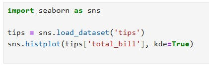
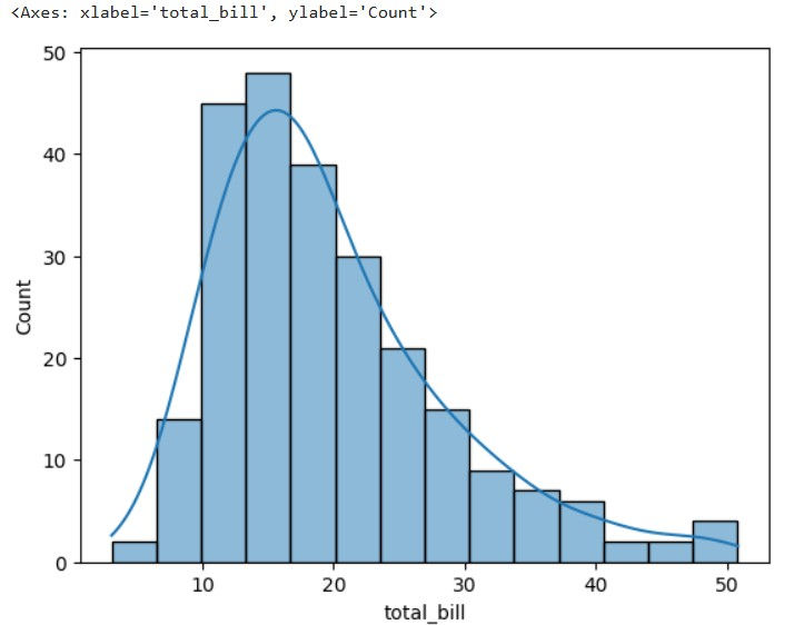
A histogram helps you see how values are distributed.
The kde=True option adds a smoothed curve to highlight the trend.
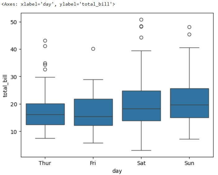
Box Plot – Spotting Outliers
Box plots are incredibly useful. They show the median, the interquartile range, and any outliers.

Scatter Plot - Exploring Relationships
Scatter plots reveal how two variables relate.

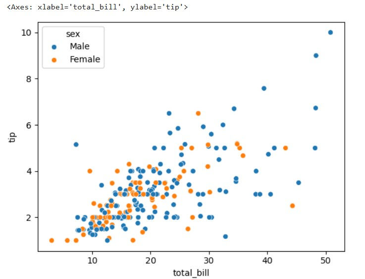
Here, we compare how much people spent versus how much they tipped, and color the dots based on gender. Patterns emerge quickly.
When to Use Each Plot
Knowing the right plot to use is half the battle. Choose the one that matches your goal and your message becomes crystal clear.
Goal | Use This Plot |
Show trends over time | Line Plot |
Compare categories | Bar Chart |
Show distribution | Histogram |
Identify outliers | Box Plot |
Examine relationships | Scatter Plot |
✨ Plotting Pro Tips
Label everything – Title, axes, legend. Always.
Keep it clean – Avoid unnecessary clutter.
Use color with purpose – Don’t overdo it. Let colors highlight meaning.
Tidy your layout – Use plt.tight_layout() in matplotlib to fix overlapping elements.
Try different styles – With seaborn and matplotlib, you can apply different themes like sns.set_style("darkgrid") for extra flair.
Conclusion
Learning to plot in Python is like unlocking a superpower. With just a few lines of code, you can turn mountains of data into stories, insights, and decisions.
Start with the basics. Experiment. Try new datasets. Whether you're analyzing your sleep tracker, building a dashboard, or prepping for a data science role, plotting helps you see what the data says.
Got a dataset in mind? Open up your Jupyter notebook and start plotting today.


