🧰 Top 7 Tools Every Aspiring Data Analyst Should Know
Start strong in your data journey with the right tools in your arsenal.
In today’s data-powered world, companies rely on analysts to make informed decisions, and tools are at the heart of that work.
Whether switching careers, studying data science, or leveling up your current job, mastering the right tools can set you apart. In this guide, I’ll walk you through 7 foundational tools every aspiring data analyst should know, with examples and learning tips for each.

1. 📊 Microsoft Excel
Still, the gold standard for quick data analysis
Despite its age, Excel remains one of the most widely used tools in the data world. It's accessible, versatile, and surprisingly powerful once you go beyond the basics.
What you can do with it:
Organize and clean raw data
Data Validation: Prevent errors by setting rules (e.g., dropdown menus for data entry).
Conditional Formatting: Highlight trends, such as high/low values or duplicates, for faster interpretation.
Integration: Easily import/export data from external sources like web tables, databases, or APIs via Power Query.
Use pivot tables to summarize large datasets
Create basic charts and dashboards
Use formulas like VLOOKUP, IF, SUMIFS, and INDEX-MATCH
Use it when:
You need to quickly analyze data without setting up a full analytics environment.
Real-world example:
An e-commerce manager uses Excel to track weekly sales, returns, and inventory levels, identifying underperforming products quickly. It’s often the first step in the data pipeline, especially in small companies.
Learning tip:
Master Power Query and Power Pivot to unlock advanced Excel capabilities for larger data sets.

2. 🧾 SQL (Structured Query Language)
Your gateway to databases — where real data lives.
Why it matters:
Most companies store data in relational databases (like MySQL, PostgreSQL, or Microsoft SQL Server). SQL is how you access and manipulate that data. Almost every company uses some kind of SQL-based database system.
Popular SQL Flavors: MySQL, PostgreSQL, Microsoft SQL Server
What you can do with it:
Extracting data from relational databases
Subqueries & Nested Queries: Solve complex questions using one query inside another.
Performance Optimization: Learn about indexing and query tuning — crucial for big datasets.
Data Manipulation: SQL isn’t just for reading; you can also insert, update, and delete records.
Filter, join, and aggregate data across multiple tables
Prepare data for further analysis in tools like Excel or Python
Use it when:
Your data is stored in a relational database, or you’re building pipelines to extract, transform, and load (ETL) data.
Real-world example:
A marketing analyst uses SQL to pull user behavior data from a database, then filters for users who abandoned carts to target them in email campaigns.
Learning tip:
Start with basic queries: SELECT, WHERE, JOIN, GROUP BY. Then level up with window functions and CTEs (Common Table Expressions).

3. 🐍 Python
The most versatile language for data analysis.
Why it matters:
Python is the backbone of modern data work, especially when automation, data wrangling, and machine learning come into play. Libraries like pandas, numpy, matplotlib, and scikit-learn make Python incredibly powerful.
What you can do with it:
Data cleaning and transformation with pandas
Analyze trends with numpy, matplotlib, and seaborn
Build predictive models using scikit-learn
Automate reports and repetitive tasks
Data APIs: Use libraries like requests to collect live data from APIs (e.g., weather, social media).
Use it when:
You need flexibility, automation, or are working with unstructured or large datasets.
Real-world example:
A financial analyst writes a Python script to automatically pull daily stock prices, clean the data, and generate a weekly performance report with charts.
Learning tip:
Focus first on pandas, numpy, and matplotlib. These cover 80% of day-to-day data tasks.

4. 📒 Jupyter Notebook
Write, test, and visualize your Python code — all in one place.
Why it matters:
Jupyter Notebooks are perfect for exploratory data analysis. They let you run code and see results immediately, with the ability to add text, charts, and visuals. Widely used in data science for its readability and shareability.
What you can do with it:
Document your data analysis process
Share insights with code + commentary
Visualize data step-by-step as you explore
Visual Explanations: Combine Python code, graphs, and Markdown text for presentations and tutorials.
Versioning with Notebooks: Jupyter works well with tools like GitHub for tracking project changes.
Export to PDF/HTML: Share analysis reports directly as viewable documents.
Use it when:
You're doing exploratory work, teaching, documenting your process, or collaborating in data teams.
Real-world example:
A data analyst creates a Jupyter notebook to document trends in customer churn, combining SQL queries, Python plots, and written insights.
Learning tip:
Use Google Colab if you don’t want to install anything locally — it’s Jupyter in the cloud, and it’s free.
5. 📈 Power BI
Turn raw data into interactive dashboards and visuals.
Why it matters:
Power BI is Microsoft's business intelligence tool, widely used in corporate environments to create dashboards, reports, and visual storytelling. It integrates well with Excel and other Microsoft products, making it popular in corporate settings.
What you can do with it:
Connect to multiple data sources (Excel, SQL, APIs)
Create dynamic dashboards
Build custom visuals with slicers and filters
Real-Time Dashboards: Connect to streaming data (IoT, sales) for live monitoring.
Natural Language Querying: Users can type questions like “total sales this month” and get visual answers.
Data Modeling: Define relationships between tables and build reusable data models.
Enterprise Use: Scales well with Microsoft Azure, SharePoint, and Teams.
Use it when:
You're reporting to business teams, creating executive dashboards, or analyzing Microsoft stack data.
Real-world example:
A sales analyst builds a Power BI dashboard to track weekly revenue by region, helping managers focus on underperforming territories.
Learning tip:
Start with importing Excel data and building basic charts. Then explore Power Query Editor and DAX formulas for more control.
6. 📊 Tableau
Visual analytics that speak for themselves.
Why it matters:
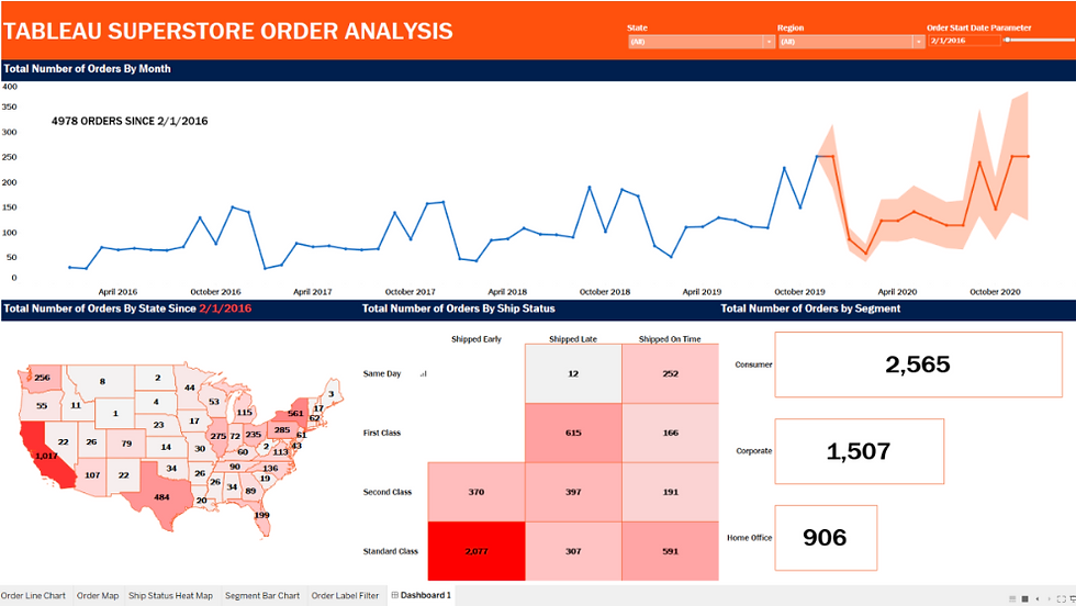
Tableau is powerful for data visualization, allowing you to create drag-and-drop dashboards that are both beautiful and insightful. Tableau helps non-technical stakeholders understand complex data quickly.
What you can do with it:
Visualize trends, comparisons, and outliers
Connect to live data sources
Calculated Fields: Customize metrics on the fly (e.g., profit margins, running totals).
Storytelling Feature: Build visual stories with a sequence of dashboards and annotations.
Geospatial Analysis: Excellent mapping features with built-in geocoding.
Tableau Public: Share interactive dashboards with the world and build a portfolio.
Use it when:
You're telling visual stories with data or creating dashboards that allow users to explore them deeply.
Real-world example:
A healthcare analyst uses Tableau to visualize patient admission trends, identifying peak seasons and resource needs.
Learning tip:
Use the Sample Superstore data to practice. Focus on building line, bar, and map charts before diving into advanced calculated fields.
7. 📄 Google Sheets
Lightweight, powerful, and collaborative.
Why it matters:
Google Sheets is Excel’s cloud-based cousin — great for real-time collaboration and quick analysis. Lightweight, free, and easy to use for smaller datasets.
What you can do with it:
Collaborate with teammates in real time
Pull live data from APIs or Google Forms
Use formulas, filters, and conditional formatting
Live Data via IMPORT Functions: Pull stock prices, RSS feeds, currency rates using IMPORTXML, IMPORTHTML, etc.
Add-ons & App Scripts: Automate emails, data refreshes, and even integrate with Google Analytics or Gmail.
Version History: Roll back to previous versions — especially useful in collaborative environments.
Forms & Surveys: Collect real-time data into Sheets via Google Forms — great for user feedback or A/B tests.
Use it when:
You need lightweight, collaborative tools or are working in early-stage projects with minimal overhead.
Real-world example:
A startup founder tracks website signups and lead conversions in Google Sheets, which auto-updates from a connected Google Form.
Learning tip:
Explore App Scripts and Add-ons like Google Analytics or BigQuery connectors for more advanced use.
🧠 Final Thoughts
You don’t need to learn all 7 tools at once. Here’s a simple learning path:
Start with Excel and SQL – understand the basics of handling and querying data.
Add Python and Jupyter – when you want to scale, automate, or go deeper.
Master a visualization tool – either Power BI or Tableau, based on your job goals.
Keep Google Sheets handy – for flexibility, simplicity, and teamwork
🧭 Bonus Tip: Tool Synergy
Many of these tools complement each other:
Use SQL to query the data → Python to clean and model it → Power BI/Tableau to visualize → Share via Google Sheets or Excel.
Python notebooks + SQL = Powerful data exploration
Excel and Power BI work seamlessly together
🚀 Ready to start learning?
Pick one tool, commit to daily practice, and build small projects. You'll be amazed how quickly things start to click. Tools are just tools — what sets a great analyst apart is their ability to ask the right questions, interpret results clearly, and tell a compelling data story.
Have you started learning any of these tools? Share your journey or ask questions in the comments — let’s grow together!


