The Hospital Safety Net: A Predictive Approach to Patient Readmissions-PART 3
The goal of a hospital management in modern healthcare system is to make sure the patient goes home after they were discharged, they must stay home. However, by analysing the data with 720 records taken in 2018 nearly 26.9% readmission rate have been identified and most of the patients are coming back to the hospital within a week. To work on this we must work in advance to not only proceed with simple reporting but also proceed with Prescriptive and Predictive analytics.
By using the data from the registry, we have developed different strategy to find high-risk patients before they leave from the hospital and also work on giving extra care they need.
Prescribing Action: Turning Data into Action
In the previous (Descriptive Analysis) sections, We found what is happening?. Now, we work on Prescriptive Analysis, which will help the hospital administrators to answer multiple questions like what steps to be taken to do about it?
The aim of our prescriptive strategy is "Risk Stratification". Instead of handling every patients with same follow up model, we use the analysed data to form a protocol.
The Logic we used Behind the Prescription
By analysing the readmission rate we set the threshold at 40%
The "Standard Follow-up" Protocol: Diagnoses below this 40% threshold will come under the standard hospital discharge.
The "High Priority" Protocol: Diagnoses such as Stroke or Heart Failure having threshold above 40% will come under high priority and follow up appointments, telehealth check in within 48hrs, home visit and medication related follow up should be made.
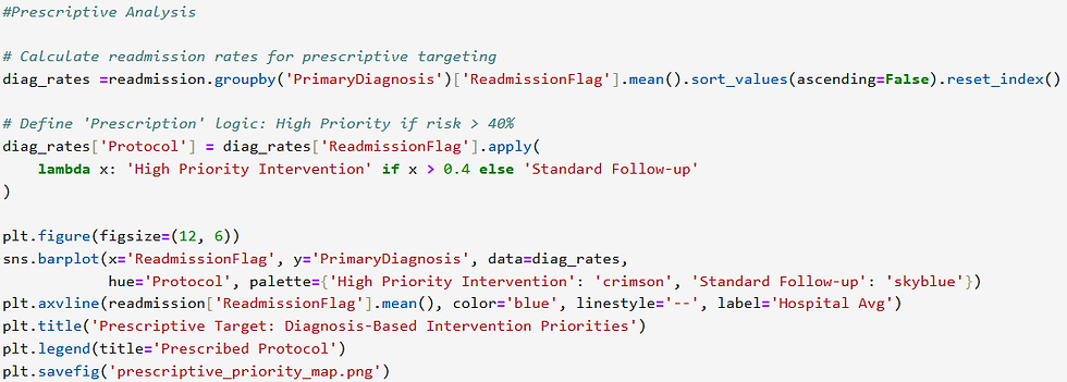
Understanding the Visual: The Intervention Priority Map
The visualization acts as a roadmap to the hospital’s Transition of Care (ToC) team.
High Priority (The Crimson Zone): These are the high-risk zone. The bars clearly shows that the coloured in crimson represent high risk areas. Where it is must to concentrate on this area because the hospital's current safety net is failing here most often.
The Blue Dashed Line (Hospital Average): The blue line represents our baseline performance. The right side of this blue line is performing worse when compare to the left side of the line.
Targeted Resource Allocation: By seeing this it is clear that rather than providing resources and care to every patients in all the area, high risk sides need to be concentrated more.

At what point does risk demand action?-"Action Trigger"
Mortality Deciles is used in prescriptive analysis to find the "Trigger Point". Because it is the biggest challenge for hospital management to decide at what point the patients risk level will be transformed from manageable to critical.
The Logic: Handling Risk by Deciles
Based on Expected Mortality we divide the entire population into 10 equal groups.
Decile 0-3: Shows the lowest-risk patients.
Decile 7-9: Shows the most clinically critical patients.

Understanding the Visual: Mortality Score vs Readmission
From the line chart it is clear that as the mortality score increases the number of patients returning to the hospital also increases.
The Green Dashed Line: 35% readmission probability mark is set as the Mandatory Protocol Trigger.
The Action Zone: The patients in highest deciles of 8 and 9 crosses the 35% threshold consistently.
The Prescription analysed: For patients who falling in highest top deciles are enrolled to the monitoring program and not to standard discharge, they need regular follow up and health assessment.
By allowing this trigger point guess work can be avoided by the staff. This will give us a better idea to provide resources not to all the deciles but to concentrate on giving resources to clinically critical patients.

3.Optimizing Resources: Aligning care with Clinical Risk
In hospital environment every nurse's hour and every dollar is very important. A comparative gap analysis is used in our prescriptive analysis to find which hospital services are not performing well related to the risk profile of the patients.
The Logic: Actual Performance vs Expected Performance
Expected Mortality (The Risk Baseline): This refers how many patients are "sick" on average when they enter into the service.
Readmission Rate (The Actual Outcome): It shows how many patients are returning to the hospital.
By using these variables and creating a bar chart, we can clearly see which department have 'Readmisson Gap'.

Understanding the Visual: Prescriptive Resource Reallocation by Service
This visualisation shows us where to allocate the staffs and also how to handle the budgets
Identifying-the Efficiency Gaps: Service in the ICU shows that the readmission rate rises over the expected mortality. This Prescribes immediate auditing. And also it is not only gives suggestion on the sickness of the patients and also the issues arises in the transition of patients from ICU to low risk unit and also returning to their home.
The "Best Practice" Benchmark: Service like Orthopaedics are of golden standards because the readmission rate in equal or lower than the expected mortality.
Reallocation: Transition of Care(ToC) coordinators are planned to move to high -gap areas from low-gap areas.
This visualisation is very important because it helps hospital on avoiding huge financial penalties and also to avoid high return rates.

Predictive Analysis-What to decide?
By considering past history and statistics lets start looking into the future. We created a "Warning System". This system scans all the data and calculate the patient probability of return to the hospital within 30 days.
1. Identify - "The Whistleblowers"
Here we are not considering all the information as equal. We identify specific clinical factors as the powerful predictors which is responsible for failed recovery.

Probability Distribution- Mapping the Risk Landscape
From this result it is clear that how many patients will fall into danger zone. The green line indicates 50%risk threshold. Any patient right side of the line goes to standard discharge zone and left side of the line goes to risk zone. So that the hospital management understands how much patients with risk factors are currently in the hospital.

3. The ROC Curve(Receiver Operating Characteristic Curve)
ROC Curve is used to identify how the model separates risk patients and the safe patients.
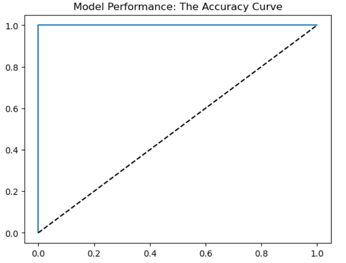
The blue curve bows toward the top-left corner, this shows the model is more accurate. This model shows high area under the curve. It means highly effective at finding readmission before it happens. It minimize "false alarms" for healthy patients.
Conclusion on Predictive analysis:
Predictive analysis helps to transform the hospital from being reactive(treating the patient after they return) to proactive(prevent the return completely). By visualising all these risk factors we can ensure that no patients with high risk leave the hospital without any safety net.


