The Art of Choosing the Right Charts: A Key to Clearer Insights and Better Data Storytelling

In healthcare, data is abundant, but insight is rare. In hospitals, dealing with serious conditions like sepsis, every decision matters. It is a fast-moving, life-threatening condition that can progress in a matter of hours. In this environment, data can be the lifeline, but only if it’s communicated clearly. Data visualization isn’t just decoration. A wrong visualization could mean missing a trend, misinterpreting a risk and ultimately, costing lives.
When I started working on my Sepsis data analysis dashboard, I quickly realized that all the data analysis in the world wouldn’t matter if it wasn’t displayed correctly. The challenge wasn’t just organizing numbers, it was choosing the right charts to communicate the most crucial insights to busy healthcare professionals. As I was progressing with the project work, I was gaining the skills to choose the right chart which could turn mountains of raw numbers into meaningful insights. Today, I want to share my learnings, that allowed me to transform real-time sepsis data into clear, actionable stories, enhancing the data analysis and insights.
Going into the first sprint of the project, knowing the dataset was key to understand what data analysis and visualization can be performed for useful insights. The first among many was data analysis and visualization based on demographics. In all the tasks, there were various questions asked and here is how we mapped the key questions to the right charts.
Bar charts - They are the most versatile useful charts. They are ideal for comparing data across categories and visualizing differences clearly. They’re especially useful for showing distributions and trends in grouped data. For example, for visualization of count or volume of patients in different ICU department. It clearly depicted the distribution of patients, comparing two different ICU departments (MICU – Medical intensive Care Unit and SICU- Surgical intensive Care Unit)
Stacked bar chart – It allowed us to show multiple demographics on one axis. For example, age and gender composition of Sepsis patients. It worked best as we could see the combined gender and age group into one visual. It also showed which age group or gender is dominant in that population.

Donut or Pie chart – This is a good choice to show ratio distribution or composition or breakdown of a total.
For example,
o Gender or race in a given population.
o Patient’s category in different departments.
o Distribution of patients across a particular category.

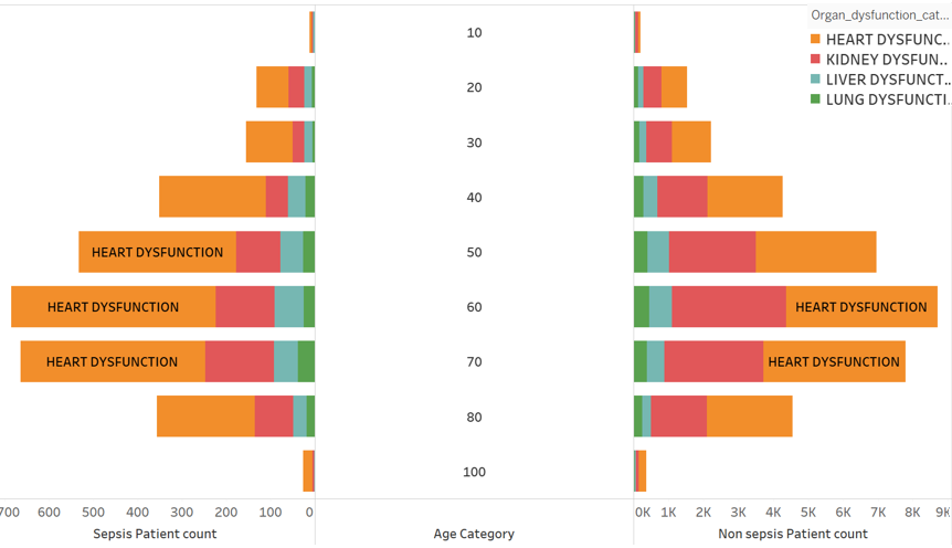
Butterfly char – It is also a good visualization chart to choose for seeing differences and similarities at a glance with a side-by-side layout. It’s like picturing two bar charts facing each other sharing a common axis in the middle. For example, to show the prevalence of organ dysfunction among Sepsis and Non Sepsis patients across the age category
Line charts or histograms are good choices for tracking trends.
For example, to show how with ICU length of stay affected patient outcome with different category of organ dysfunction I chose a line chart. Here, I wasn’t just showing numbers but a trend over time.

Scatterplot charts were the ideal choice to explore relationships between two variables.
For example, to see the correlation between Heart rate and Oxygen saturation among Sepsis patients. The data analysis revealed negative correlation. This relationship is crucial to monitor cardiac health of patients.

For Hierarchal data representation two powerful visualization chart I explored were Dendrogram and Sunburst Charts. Both help untangle complexity, but in very different ways. While a dendrogram emphasizes the branching connections and similarities between groups, a Sunburst chart reveals the size and composition of categories at a glance.
o Dendrogram chart - When it comes to seeing how patients naturally cluster based on clinical variables, nothing paints the picture quite like a dendrogram.
For example, to see the segregation of hospitalized patients based on the risk of mortality for each category of Sepsis condition.

o Sunburst chart - Where dendrogram showed us the map of connections, the Sunburst chart offered a bird’s-eye view of the entire data landscape, all in a single, powerful image.
For example, to see the distribution of lactate levels category across different age group of patients.

Here are some realizations that I made through my data analysis and visualization journey:
Keep Charts Simple and Self-Explanatory: Healthcare professionals and stakeholders are often short on time. Charts should be quick to interpret without extra explanation. Clear titles, concise labels, and visual clarity are key. A well-labeled chart can speak for itself.
Label Axes Clearly — Units Matter: Always include axis labels with correct units (e.g., mmol/L, hours, %). In clinical data, the absence or mislabeling of units can lead to misinterpretation and that’s a risk we can’t afford.
Maintain Patient Confidentiality: Protecting patient privacy is non-negotiable. Avoid displaying identifiers like patient names, IDs, or dates of birth on any public-facing charts or dashboards. Use anonymized or grouped data wherever possible.
Use Consistent and Meaningful Color Coding: Color can enhance or confuse, depending on how it’s used. Stick to a consistent color scheme, for instance, green for normal or positive outcomes, red for risks or alerts. In medical settings, avoid using red unless you're purposefully signaling danger, as it immediately draws attention and can cause unnecessary alarm.
Some common mistakes to avoid:
Avoid Overcomplicated Pie Charts: Pie charts are tempting for showing proportions, but they become hard to read when there are more than 5 - 6 slices. Stick to simplicity or switch to a bar chart or Sunburst chart when categories and subcategories increase.
Skip 3D Effects: While visually striking, 3D effects can distort data and mislead interpretation. In healthcare, where accuracy matters most, clean and flat designs are always a better choice.
Never Leave Axes Unlabeled: Omitting axis labels or units, creates confusion and invites misinterpretation. In clinical contexts, this can lead to critical misunderstandings. Always label axes clearly.
Don’t Overload a Single Chart: Trying to squeeze too much information into one chart often backfires. It’s better to split complex data into multiple simpler visuals than overwhelm your viewer with clutter.
To summarize, no one becomes expert in chart selection overnight. It’s an art you learn as you go. To practice this skill and be better I adopted a few ways.
1. Re-visualize old data reports: What could you have shown better?
2. Try visualizing one dataset with 3 different chart types and see how the story shifts.
3. Study professional dashboards (from WHO, CDC) as they rarely use fancy visuals, just effective ones.
4. Always ask: Is there a simpler way to tell this story?
As final thoughts, every dataset holds hidden stories of people, patterns, decisions, and outcomes. But raw numbers alone don’t tell those stories. The way we visualize them does. The right charts can turn a wall of complexity into something understandable, something decision-makers could act on, fast. It can create the difference between confusion and insight, between noise and action. So next time you sit down to visualize your data, don’t just ask what you’re showing. Ask who needs to understand it and what decisions might depend on how clearly you tell the analysis. Because sometimes, the right chart doesn’t just explain data, it changes outcomes.


