Tableau Fundamentals: Architecture, Data Modeling, and Core Features
Updated: Sep 9
In today's data-driven world, organizations generate massive amounts of information every day. However, raw data alone has little value unless it can be analyzed and presented in a meaningful way. This is where data visualization tools play a crucial role. Data is all about raw information that you collect from multiple source, those source could be a CSV file ,Excel, Text, or even big data frameworks. Data visualization helps transform complex datasets into clear and understandable charts, graphs, and dashboards that support better decision-making. There are many visualization tools available today, Among them Tableau has emerged as one of the most popular Business Intelligence (BI) platforms due to its ease of use, powerful analytics capabilities, and interactive dashboards.
In this blog, we will explore Tableau, its key features, architecture, and how it helps organizations convert raw data into actionable insights.
Tableau
Tableau converts complex datasets into meaningful and interactive, easy to understand visuals and charts. Its key features include interactivity, ease of use, and fast performance. Tableau makes it simple to build dashboards — no coding required and it helps users quickly turn data into beautiful insight which will be easy to understand
Why Tableau?
Hyper
Tableau can handle huge volumes of data without affecting dashboard performance, using high‑performance, in‑memory data engine called Hyper, which helps analyze large datasets efficiently, Where data is stored inside columns instead of rows which can boost performance in dashboards. Tableau has no limitations — even datasets with millions of data points can be viewed and analyzed, compared to other tools. This allows us to explore and analyze large datasets, in order to find trends and patterns, and gain insights with great performance. It fulfills the primary objective of Business intelligence and Data visualization.
Quick and interactive visualization
Tableau enables fast, dynamic, and interactive visualizations that make data exploration effortless.
Intuitive and No-code:
Being intuitive and user friendly drag and drop approach , requires no coding knowledge, acessible to both technical and non technical users.
Tableau community:
A large, active community supports users all over by sharing dashboards, solutions, tutorials, and creative ideas.
Tableau offers interactive and automated visualization, security, and better handling of big data compare to traditional and old method
Tableau Architecture:
Tableau architecture includes four different layers :

Source layer
It is outside of Tableau; it contains the source of our data, which could be Excel, MySQL, Oracle, JSON, AWS, or even API's
Desktop Layer:
Data source Layer:
we have data connectors to connect our data with Tableau, access information where the location of our sources can be stored and how to access it.
Once connected, based on the data freshness and performance, this can be chosen
Extract — Tableau creates a separate copy of your data and stores it in its fast, in‑memory engine (Hyper). This improves performance and speeds up dashboards.
Live — Tableau queries the data directly from the original source in real time, without making a copy.
Data Model
This layer also includes the Data Model, where we combine tables together and do aggregation, or we do some customization . Each worksheet from two different data source by using combining method called data blending can be done here . This is a unique feature which is not available in other tools. i.e., one visualization from different source.
Server and consumer layer:
Once the visualization is done or the workbook is ready, if we have to send it to any (stakeholder, team) can be send to user as a Tableau file or directly publish to the server or cloud.
user is not going edit then, .twbx extension file is good (Tableau Readers)
incase what to see the analysis and check and discuss the .TWB,.HYPER,.TDSX,.TDX,.TWBX, (Tableau Desktop) is preferred. We do have static users where they don't interact with the visualization.
Data modelling:
Data modeling is simply the process of organizing your data so it becomes easy to understand, easy to use, and easy to analyze. In real projects, data lives in many different tables inside data warehouses or data lakes. Before visualizing, then with the tools like Tableau or Power BI we have to connect those tables and one clear data model.
Data models has entities inside that we have informations we call them as attributes, the connection of them in the data model we called them as relationship.
We have three different data models:
Conceptual model: High level representaions, It is like map , shows the entities and relationships.
Logical: More detailed model, how the data is structured and organized. It includes the attributes of each entity and constraints.
Physical: Actual implementation of the data model, used to create and manage database

Special data models :
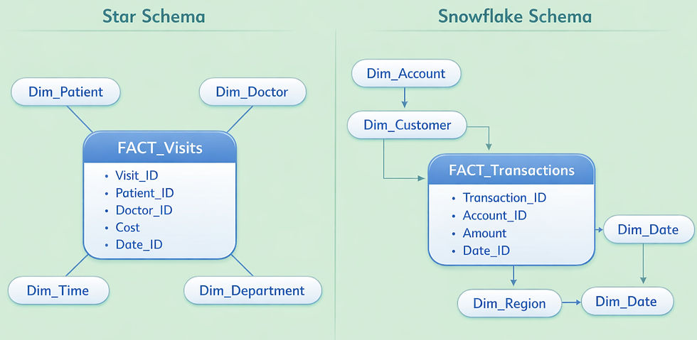
For data warehousing and business inteligence we need special data models that are optimized for queries, flexible for reporting and easy to understand .we have two special models
Star scheme: Has central fact surrounded by dimensions ,the relationship between and the fact and dimension reflects the star shape hence it is called star schema
Snowflake schema: similar to star fact is surrounded by dimensions but they are broken into subdimensions
(normalized table or dimension , those tables broken into small dimensions to avoid big table or dimension , which reduce data duplication and make performance slower)
Understanding the UNIONS, JOINS ,RELATIONSHIP AND BLENDING:
UNION combines tables by stacking rows from the same structure into one dataset, when table have same column but different records this works. JOINS combines tables horizontally using common keys to create a single combined table. RELATIONSHIPS and BLENDING keep tables separate but connect them logically, with blending used only when data comes from different sources
How to organize the Data?
A hierarchy organizes data into multiple levels—such as Category, Subcategory, Product or City, Pincode, State—so users can analyze information from broad summaries down to detailed records. By Drill‑up and Drill‑down, we can move between these levels, making it easy to switch between high‑level and its granular form. This structure ensures consistency and flexibility of aggregation across all levels. Hierarchy is essentially a way to group dimension members into meaningful levels, and this grouping can be created using several techniques: Groups, Clusters, Sets, Bins, and Histograms.
Groups combine similar dimension members into one clean labelled category, while Clusters automatically detect pattern in data and segment into statistically similar groups. Sets create dynamic in/out memberships based on conditions, giving flexible control for comparisons and filtering. Bins convert continuous measures into equal‑sized numeric intervals, so you can understand how values. are spread A Histogram visualizes these bins, showing how frequently values fall within each interval helps to spot trend and patterns.
Filtering & sorting:
Filters means to remove or select specific subset of data for different purposes and use cases. In Tableau it help reduce data size especially when dealing with huge data, improve performance, enable interactivity, reduce processing time and protect sensitive information. They fall into two groups: performance filters (Extract, Data Source, Context) and analysis filters (Dimension, Measure, Table Calculation). Performance filters reduce the amount of data moving through Tableau’s layers, improving loading and query response times. Analysis filters allow users to slice, and explore subsets of data for deeper insights.
Tableau filters help control what data flows through each layer of the workbook, supporting performance, security, and focused analysis.
Data source filters hide sensitive information and reduce data size for all worksheets connected to that source.
Extract filters remove unnecessary records before data enters Tableau, improving extract load time and overall performance.
Context filters create a temporary subset only for a specific worksheet, giving flexibility but not suitable for hiding sensitive data.
Dimension filter, it is at worksheet level : General (minimum selection), dynamic filters -wildcard (selecting from long list values is hectic so use contains ,starts with and ends-with, exact matches; also it is not case sensitive), condition (setting a rule with By field and By formula), and Top (setting a rule with Byfield that is for top or bottom and Byformula)
Measure filter (at worksheet level) , can filter original or aggregates like sum, value, median, mode and so on with range of values and null values.
Table calculation filters allow users to slice, dice, and analyze data interactively

Sorting in Tableau can be done directly from the view using quick‑sort icons on headers, axes, or field labels, letting users flip between ascending, descending, and default order. Developers can also control sorting through the toolbar or by editing a field’s sort settings, choosing alphabetical, data‑source order, field‑based, manual, or nested sorting. Nested sorting is especially helpful with hierarchies, because it keeps every level—like Continent, Country, and City—sorted logically as users drill up or down.
Parameter:
Parameters are unique feature ,it is game-changers in Tableau. they are like variables in programming language that allows to replace fixed constant values in calculation, filters, text, Bins , reference lines and soon. In the views of users the values are going to static . instead of keeping the values in static you can make then interactive and adjustable too. You can even create dynamic parameters that pull their values directly from the data source, keeping your fields automatically updated.
Example:


Calculations:
Calculated field in Tableau lets you create new field when the original data doesn't contain the information you need or you need to extend the existing information. You can create them globally from the data pane, menu, or field options, or locally inside a single view using quick calculations similar to parameter. The calculation editor helps you write expressions, check for errors, explore functions, and understand dependencies so you can build reliable, reusable logic across your worksheets.
Conclusion:
Tableau is a powerful analytical and visualization tool that makes it easy to connect to data, explore, and turn data into meaningful insights. Its intuitive interface, fast Hyper engine, flexible data modelling, and rich analytical features are the reasons it has become a leading platform in modern BI. In this blog, we walked through the core foundations of Tableau — from architecture and data connections to modelling concepts, filters, parameters, calculations, and essential visualization features. These basics form the groundwork for building dashboards that are both efficient and interactive. In the next blog, we’ll dive deeper into Tableau chart types, advanced visualizations, and practical design techniques to help you create dashboards.


