TABLEAU – An Abridged Overview
Tableau is one of the most widely used data analysis tool to create visualizations, generate insight, find trends thereby helping data driven decision making. Tableau prioritizes user friendliness by allowing both technical & non-technical users to convert raw data into complex visualization.
Introduction
Tableau is a very powerful and flexible tool to manage and analyze data. Learning Tableau does not require any coding knowledge as it can be operated simply by dragging and dropping values to desired fields. It supports a wide range of data sources from csv/ spreadsheets and databases to cloud services ensuring ease of accessibility. With the wide variety of charts and representations, Tableau not only helps in Data Visualization but also tells a story by representing complex data into colorful charts and graphs. From the most standard Bar chart, Pie chart, Area chart; Tableau offers advanced types of charts like Scatter plots, Funnel charts, Pareto chart, Heat Map, Bullet chart, Gnatt chart, Treemap, Box & Whisker plots, Map chart, Moving chart etc. Tableau also features some special representations called Expressions like Regular Expression and LOD (Level of Detail) Expression which help to create advanced calculation to create complex visualizations.
There are various components of Tableau with different scopes like:
Tableau Desktop – This version allows user to analyze data and create visualizations but is subscription based.
Tableau Public – This is a free version of Tableau Desktop with almost all the functionalities. It supports limited file formats (supports only CSV, Excel and text) and also limits the number of rows that can be imported to 15 million.
Tableau Reader – A read-only application to open and read Tableau file types.
Tableau Online – A cloud version that allows publishing and sharing of Dashboard and Stories online. It is hosted by Tableau.
Tableau Server – This is also a cloud version but unlike Tableau Online this is not fully hosted by Tableau but on public cloud platforms like AWS, Google Cloud.
Importing Data into Tableau
How to get started with Tableau? First, we have to download Tableau Public, preferably the most recent version. After successful installation we can double click on the exe file to open and start working by importing the data file previously downloaded and saved locally.
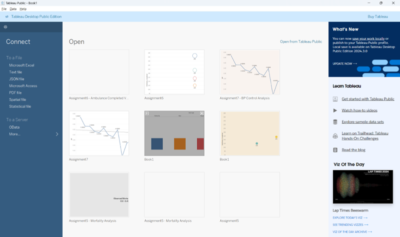
STEP 1: Here we are using the Superstore data (from kaggle.com) to get some insight into customer order, category and region wise sales and profit. We can either “Double Click” or “Drag and Drop” the table to the canvas.
STEP 2: Joining Dataset can be done by dragging multiple tables to the canvas. Relationship between datasets can be pre-established based on common fields among the two tables or can be built with an equal operator (=) in between the manually selected common fields from each table, shown below.

Creating Charts for Visual Representation
Let’s see some simple visualizations from the raw data:
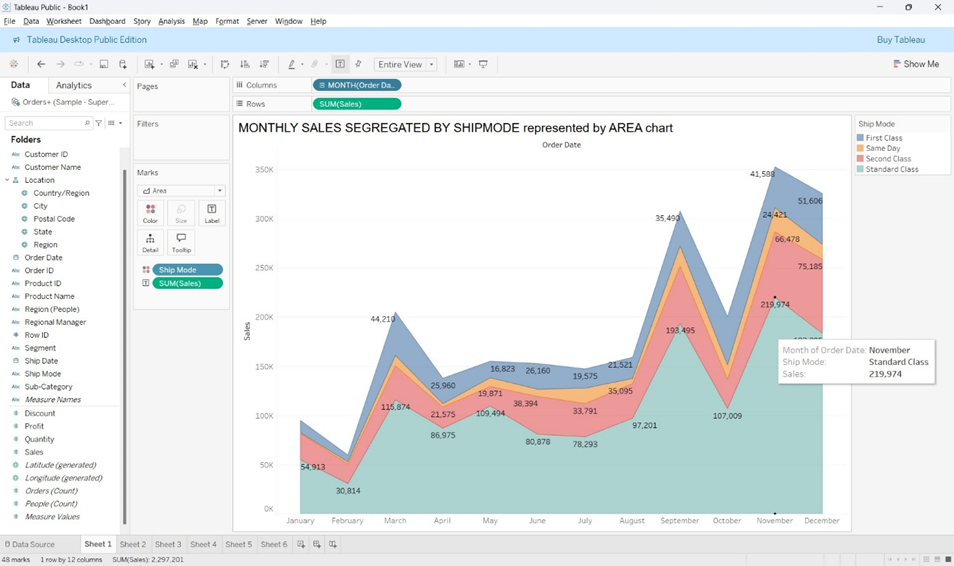
1. MONTHLY SALES SEGREGATED BY SHIPMODE represented by AREA chart.
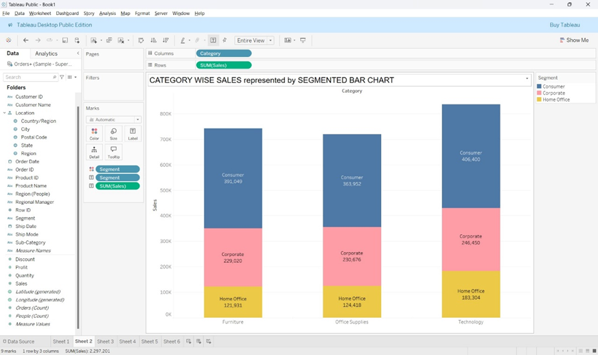
2. CATEGORY WISE SALES represented by SEGMENTED BAR CHART
3. SEGMENT WISE SALES represented by BUBBLE PACKED CHART
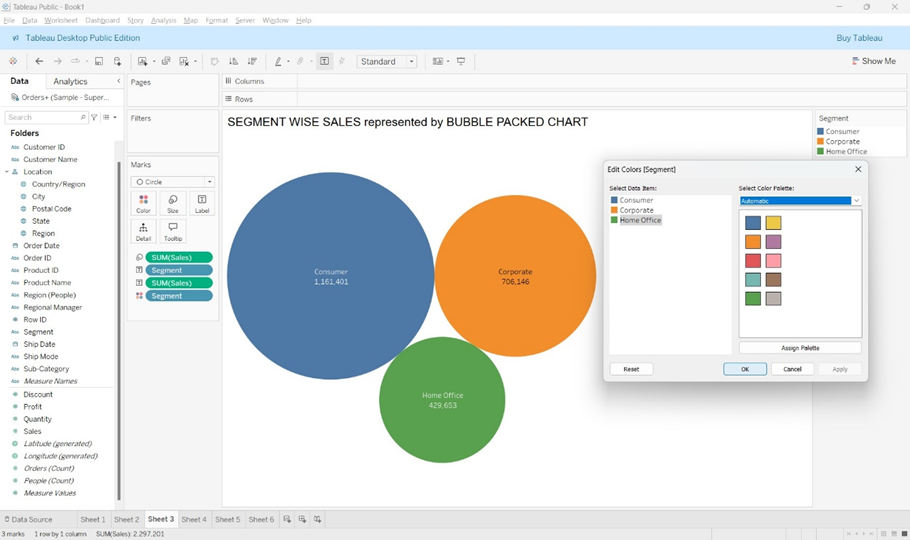
NOTE: Color of the charts can be changed by clicking on the Label at the top-right corner of the sheet and selecting the desired color by highlighting the target.
SUB-CATEGORY WISE SALES AND PROFIT represented by a TREEMAP
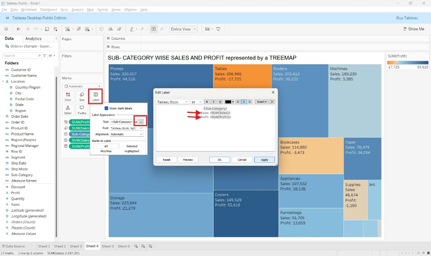
NOTE: Label can be edited by clicking on the highlighted spots in the image above.
5. MAP CHART – to represent STATEWIDE SALES and REGIONWIDE PROFIT
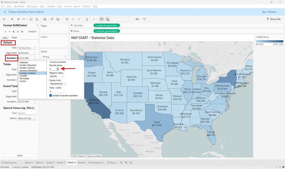
NOTE: Map charts can be created with the help of calculated fields such as Latitude, Longitude. The Sales representation can be changed by right-clicking on the Sum(Sales) field under Marks and changing the options for Numbers as shown in the figure above.
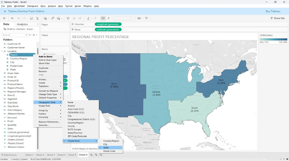
NOTE: Region can be defined by selecting the Geographical Role which can either Country/Region, State, City or Postal Code.
Building a Dashboard in Tableau
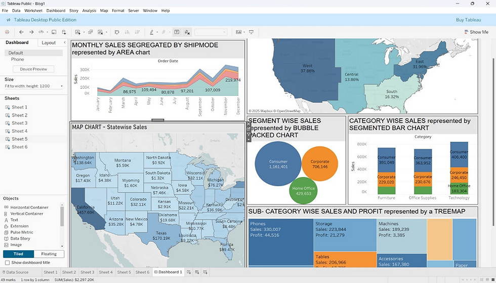
After creating multiple charts, they can all be combined into a single Dashboard for presentation.
Step 1: Dashboard can be created by clicking on the New Dashboard icon at the bottom beside the Sheet name.
Step 2 : All the charts created appear on the left-hand side and can be brought into the dashboard by double-clicking or by dragging and dropping.
Step 3 : Dashboards can be designed and formatted by selecting the size, choosing background colors, using various layouts and fonts.
Creating Story in Tableau
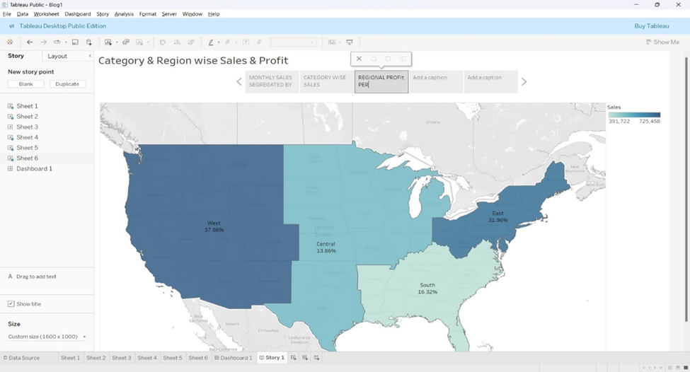
An alternative to Dashboards are stories which can be created by adding multiple visualizations and even Dashboards. As the name suggests, Story this tells a story about the data thereby creating a deeper better visual insight. Below are the steps to create a Story :
Step 1: Click the New Story icon at the bottom and the previously created charts will appear on the left-hand side.
Step 2 : Double-clicking the name of the charts will add them to the Story. Charts will appear as horizontal slides with navigation bar to toggle through. The navigator also allows to add title and description to each visualization.
Saving the work in Tableau
Now it is time to save all the visualizations we have created in Tableau Public, a free cloud service. The steps involved are :
Select File ---> Save to Tableau Public As ---> Login to Tableau Public ---> Give a name to the Workbook Title ---> Click SAVE.
NOTE: The workbook will be saved to Tableau Public under your profile and can be accessed and downloaded by anyone.


