Radial Charts in Tableau: Eye-Catching Data Visualization Made Easy
If you want to break away from traditional bar charts and explore something more visually engaging, a radial chart might just be what you need. A radial chart also known as a circular bar chart takes the basic structure of a bar chart and arranges the bars in a circular layout. This gives your visualization a modern look while still allowing you to clearly compare values.
In this blog, I’ll Walk you through how I created a radial chart in Tableau to visualize region-wise sales using the popular Sample Superstore dataset from Kaggle.
Let’s get started!
Step 1: Create a Path File in Excel
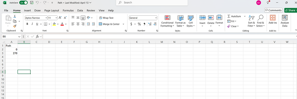
To begin, we’ll create a simple Excel file named Path.xlsx that contains one column titled Path with two rows: 0 and 270. This file helps in plotting curved lines and shapes in Tableau by allowing us to use it as a helper table for data densification.
Step 2: Join the Path File with Your Main Data
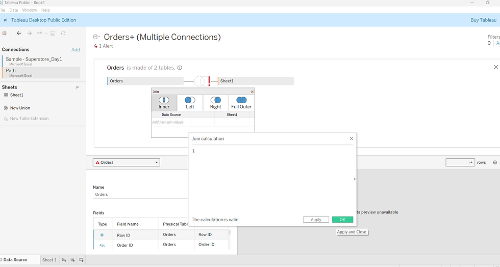
Next, open Tableau and to connect this path file to our data source and create a relationship between the both. Drag both tables into the canvas area and create an inner join between them.
When asked for the Join Calculation, use 1 = 1 to create a Cartesian join—this duplicates each row from your main dataset for both Path values.
Step 3: Create Bins from the Path Field
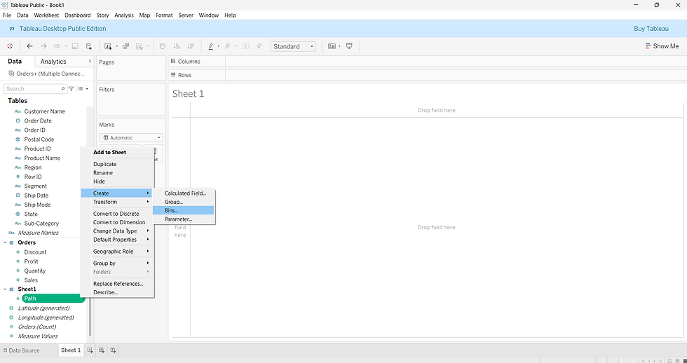
Once your data is loaded into Sheet 1, Right click on the path field in the Data pane and click on create bins.
Step 4: Define the Bin Size
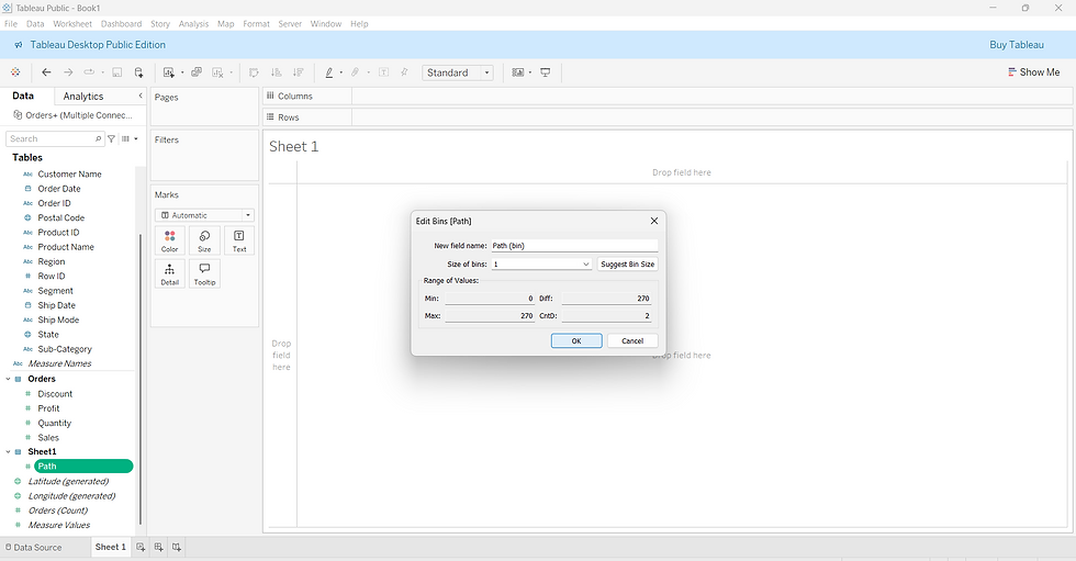
In the dialog box that appears, set the Size of bins to 1 and click OK.
This creates a binned version of the Path field, which Tableau uses to generate additional points along a curve—perfect for radial chart construction.
Step 5: Create the Index Field
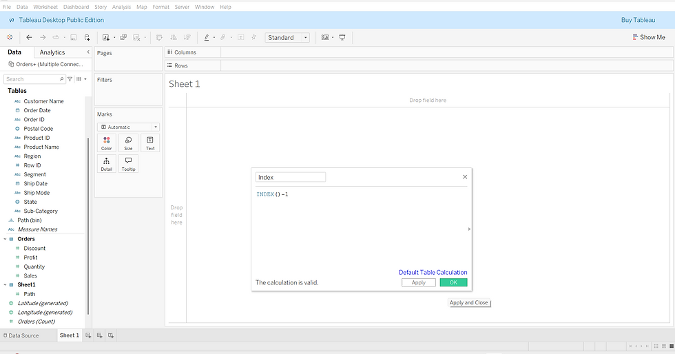
Create a new calculated field and name it Index as shown below. This assigns a unique number to each point, starting from 0.
Step 6: Create the X Coordinate
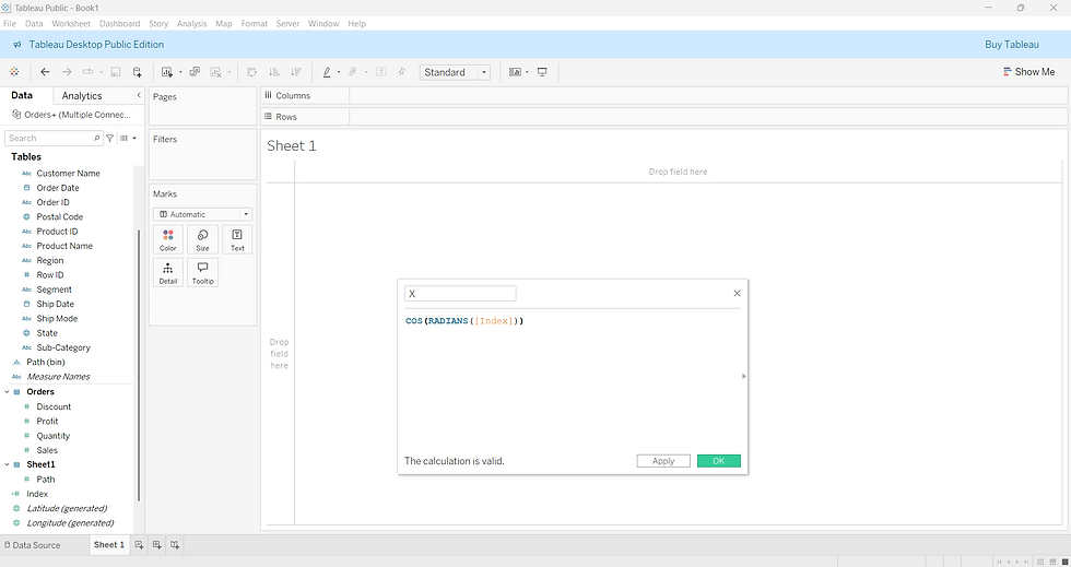
Now create another calculated field named X. This converts the index into a horizontal coordinate for circular plotting.
Step 7: Create the Y Coordinate
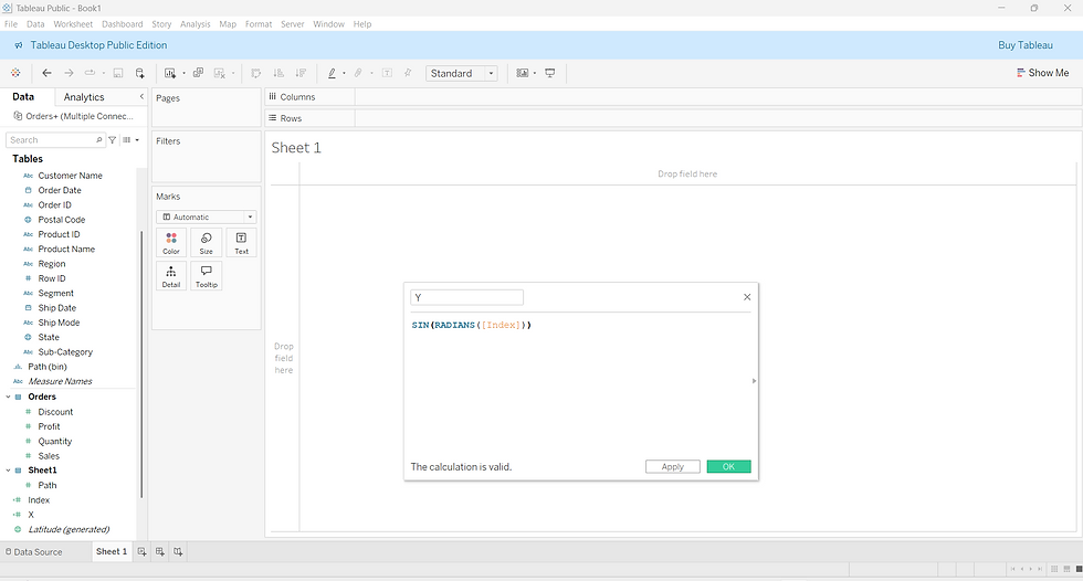
Next, create a calculated field called Y. This defines the vertical coordinate to complete the circular shape.
Step 8: Build the Circular Plot
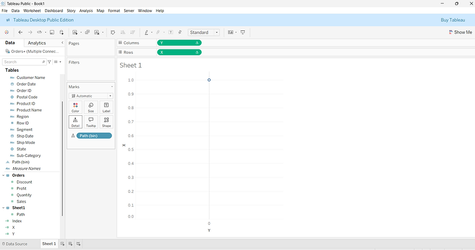
Drag Y to Columns and X to Rows. Also, drag the Path (bin) field onto the Detail shelf to enable point-level plotting.
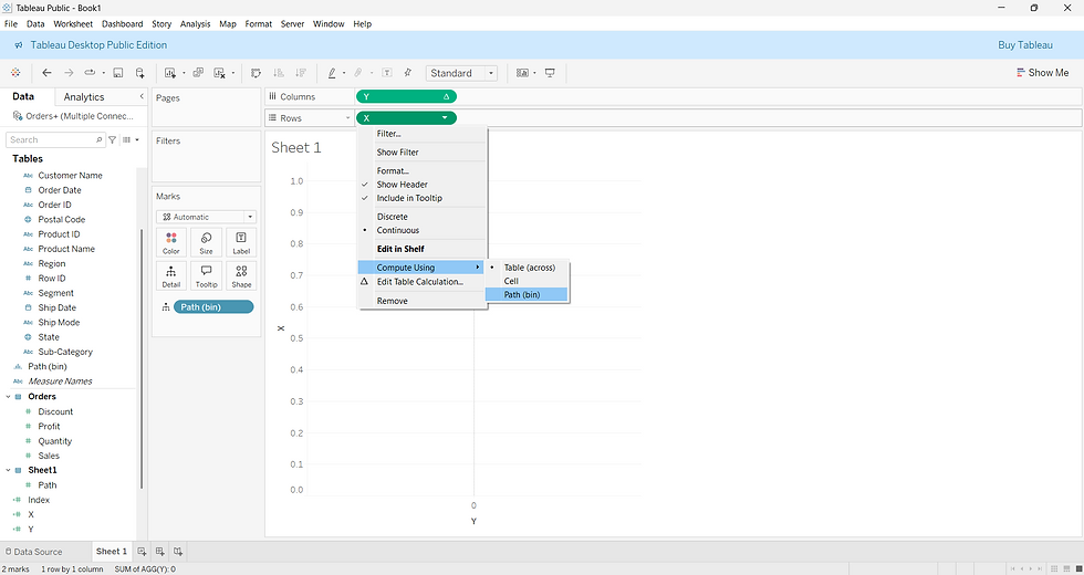
Step 9: Set the Table Calculation for X
Right-click on the X axis and choose Compute Using → Path (bin) to ensure the circular points are calculated correctly.
Step 10: Apply the Same for Y
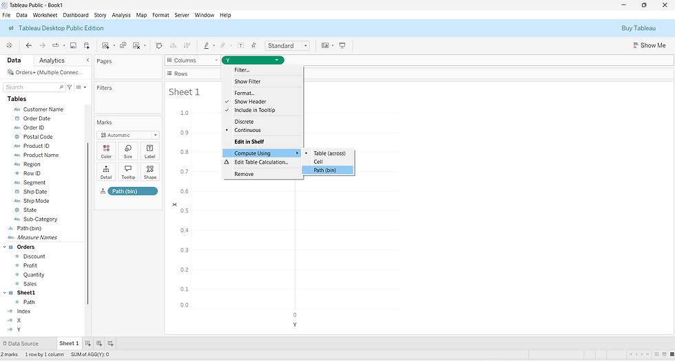
Repeat the same for the Y axis—right-click and set Compute Using → Path (bin).
Step 11: Generate the Base Circular Shape
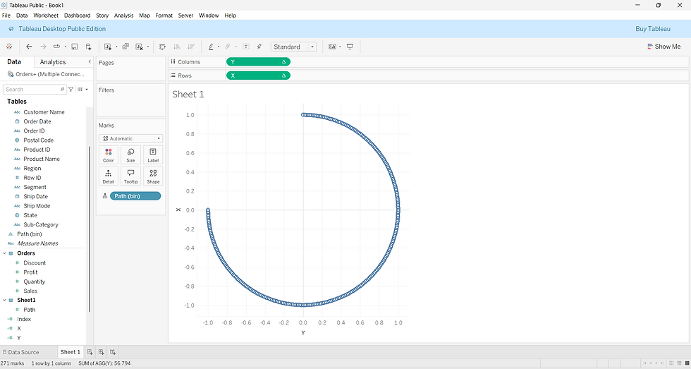
After that is done, you’ll see a perfect circular shape—this forms the base of your radial bar chart.
Step 12: Add Region and Set Mark Type
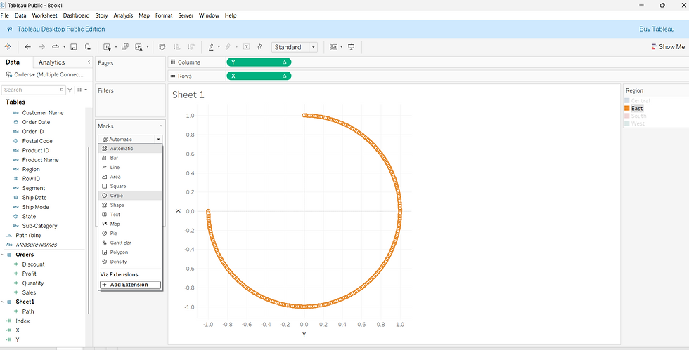
Drag the Region field to Color, then click the Marks card dropdown and select Circle to begin segmenting the radial chart by region.
Step 13: Create a Field to Capture Maximum Sales
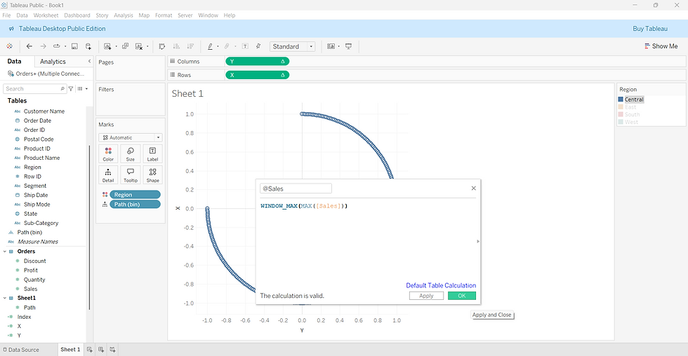
Create a calculated field named @Sales. It captures the highest sales value across all regions, which we’ll use for ranking.
Step 14: Add a Rank Calculation
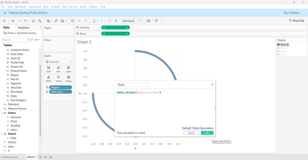
Next, create a calculated field called Rank to assign a unique ascending rank to each region based on the maximum sales value from the previous step.
Step 15: Update the X and Y Coordinates with Rank
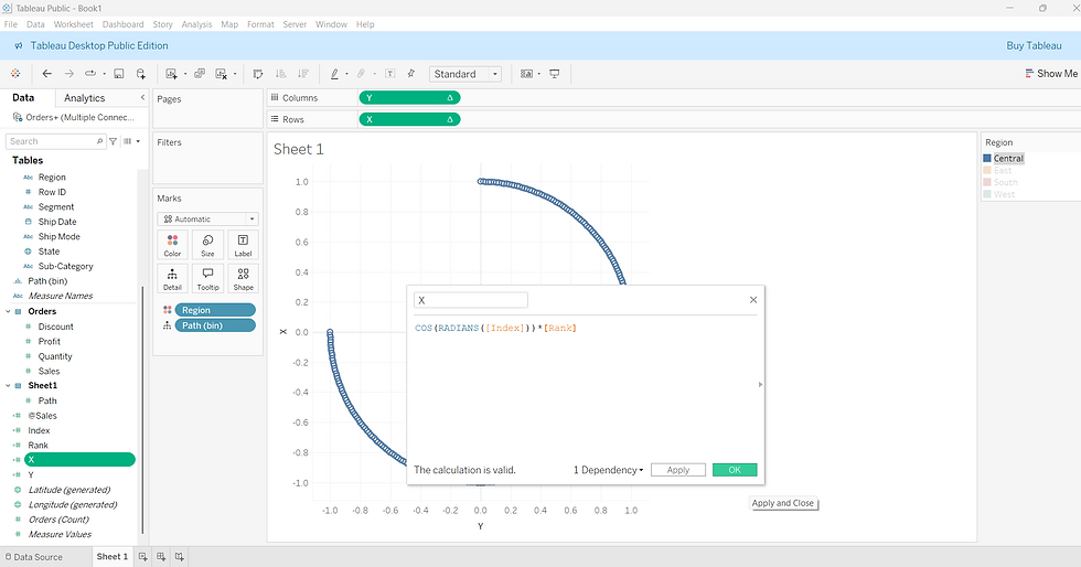
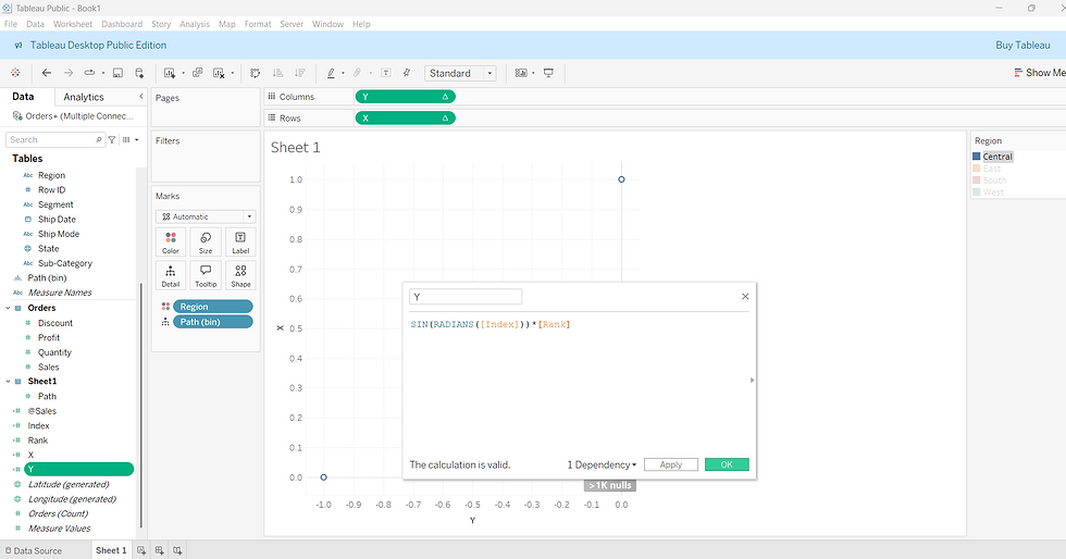
Now, modify the previously created X and Y calculated fields to include the Rank, so each region’s bar extends outward based on its sales position. This transforms the circular shape into a radial bar chart, with each region's bar growing based on its rank.
Step 16: Edit Table Calculations for Rank and Sales Fields
To ensure your radial chart plots correctly:
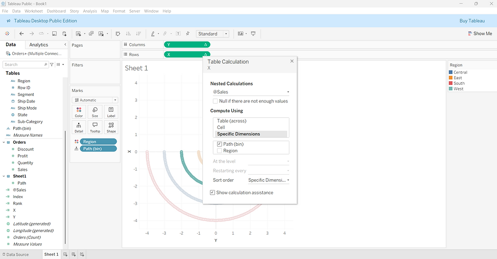
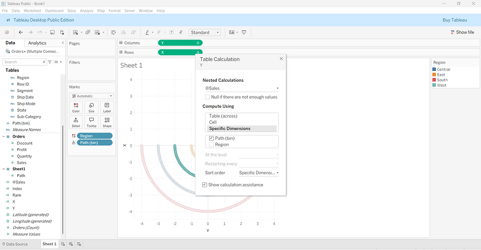
For both X and Y fields, right-click the dropdown arrow and choose Edit Table Calculation.
Set the Rank field to compute using Region.
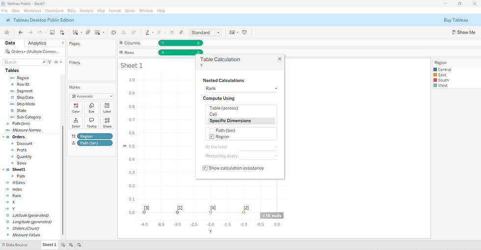
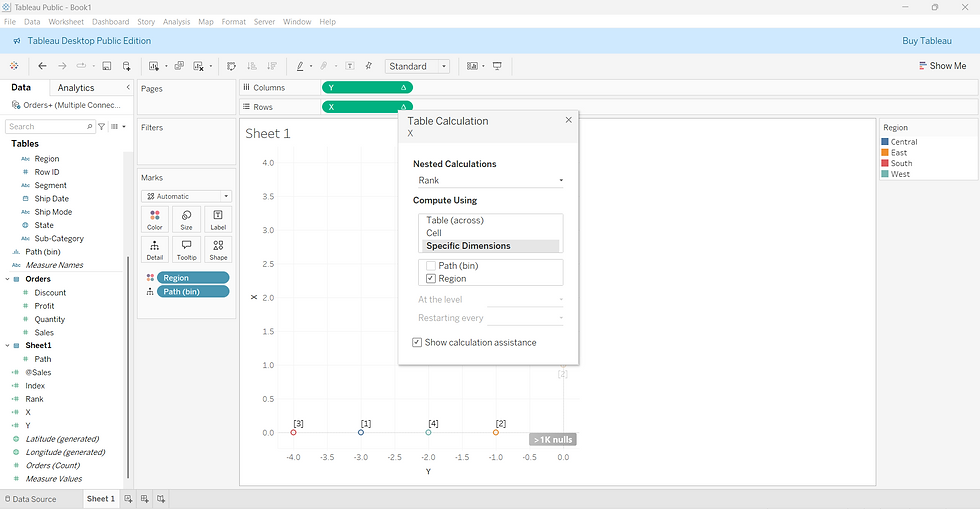
In the same window, set the @sales field to compute using Path (bin).
This setup allows Tableau to position each point based on regional rank while maintaining the circular path using the bin values.
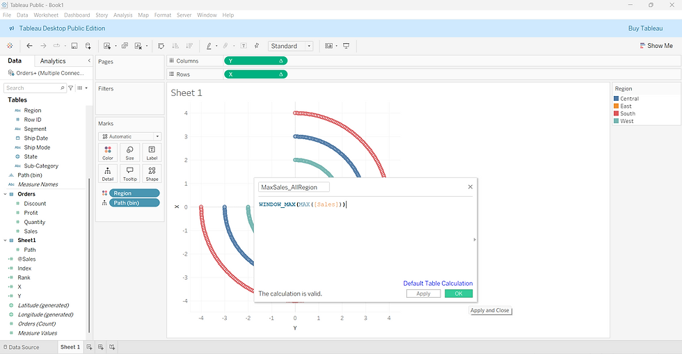
Step 17: Create a Field to Capture Overall Max Sales
Create a new calculated field named MaxSales_AllRegion. This gives you the absolute highest sales value across all regions—serving as a benchmark for comparison.
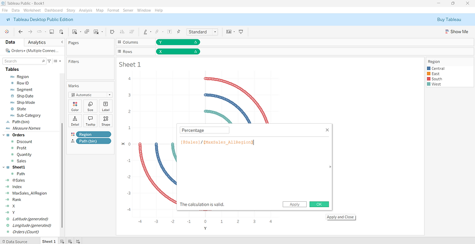
Step 18: Calculate Sales Percentage
Now, create another calculated field named Percentage. This field calculates each region’s sales as a percentage of the maximum, which will help scale the bars appropriately in the radial chart.
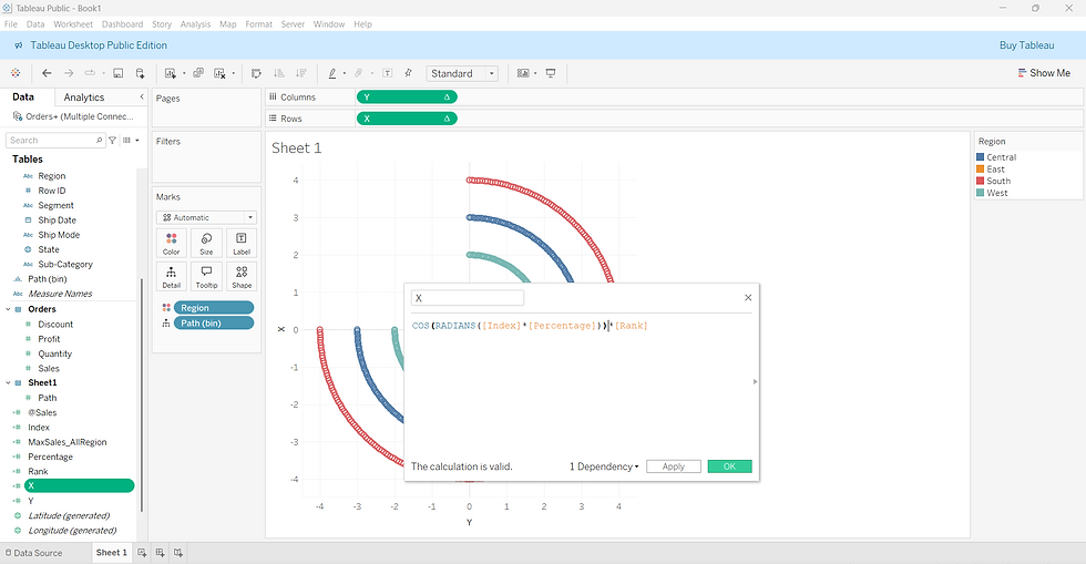
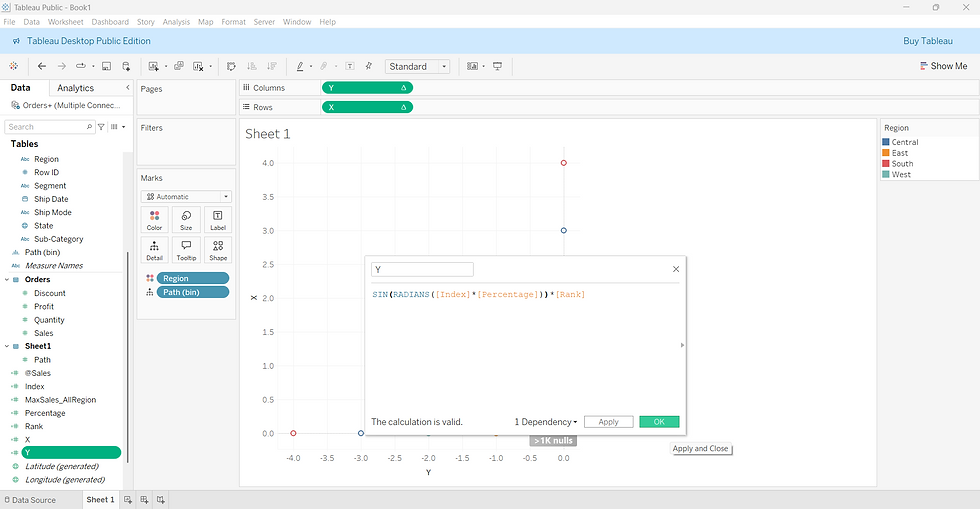
Step 19: Update X and Y Fields with Percentage
Now, modify the X and Y calculated fields to include the Percentage field so the bars scale according to each region’s relative sales. This step ensures the angles and lengths of the bars reflect the percentage of sales.
Step 20: Final Table Calculation Edits
We’re done creating all calculated fields! Now, right-click on both the X and Y pills and choose Edit Table Calculation again.
For MaxSales_AllRegion, select all available options in the "Compute Using" section.
Repeat this setup for both X and Y to ensure everything computes correctly.
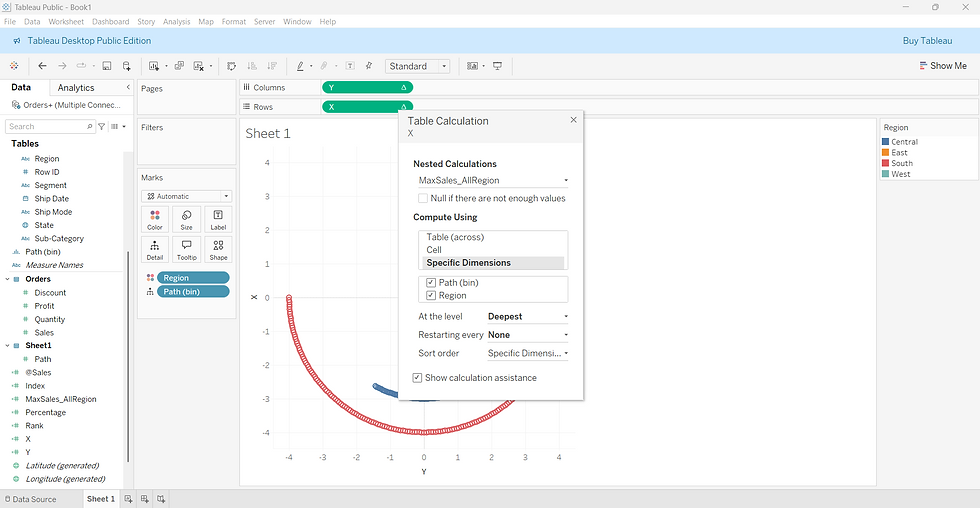
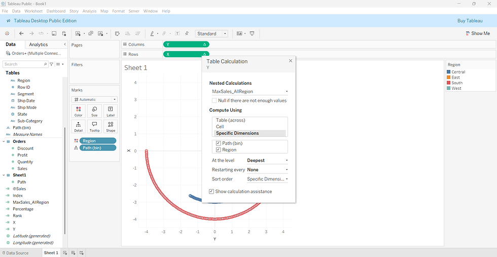
Step 21: Final Touches and Formatting
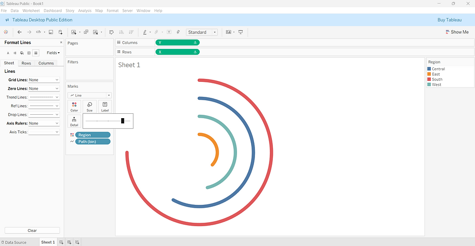
At this stage, your radial chart should be fully visible! You can fine-tune the appearance and readability by applying the following enhancements:
Clean up the chart by removing gridlines, zero lines, axis rulers, and headers for a polished look.
In the Marks shelf, switch the mark type from Circle to Line to draw smooth curves instead of scattered points.
Drag Path (bin) from Detail to Path to ensure the lines connect properly around the radial layout.
Adjust the ring thickness by using the Size option in the Marks pane.
Finally, drag Region and @sales to the Label shelf to display region names and their sales figures directly on the chart.
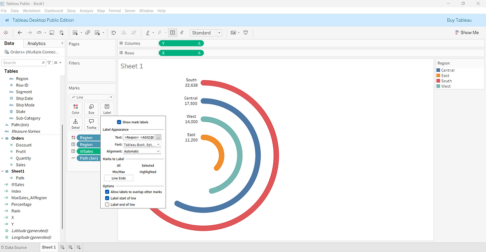
And here is our final Radial Chart after all formatting.
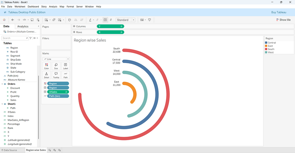
Creating a radial chart in Tableau might seem a bit complex at first, but with the right steps, it can be a powerful and visually striking way to represent data. In this blog, we visualized Region-wise Sales from the Sample Superstore dataset using a custom radial layout that highlights performance in a fresh, engaging format. Try it out with your own data and see what insights unfold in a circular view!
Thanks for reading. Happy visualizing!


