Prescriptive Analysis Using Data Visualization
Updated: Jan 13
Introduction
The main idea of this blog is to help readers understand what prescriptive analysis is and how it can be applied using data visualization in Python. It explains with an example how to create a visualization from a given dataset and how to interpret it to uncover the patterns and insights. By analyzing the visualization, readers will learn how to predict the potential problems and come up with a solution to address them.
What is prescriptive analysis?
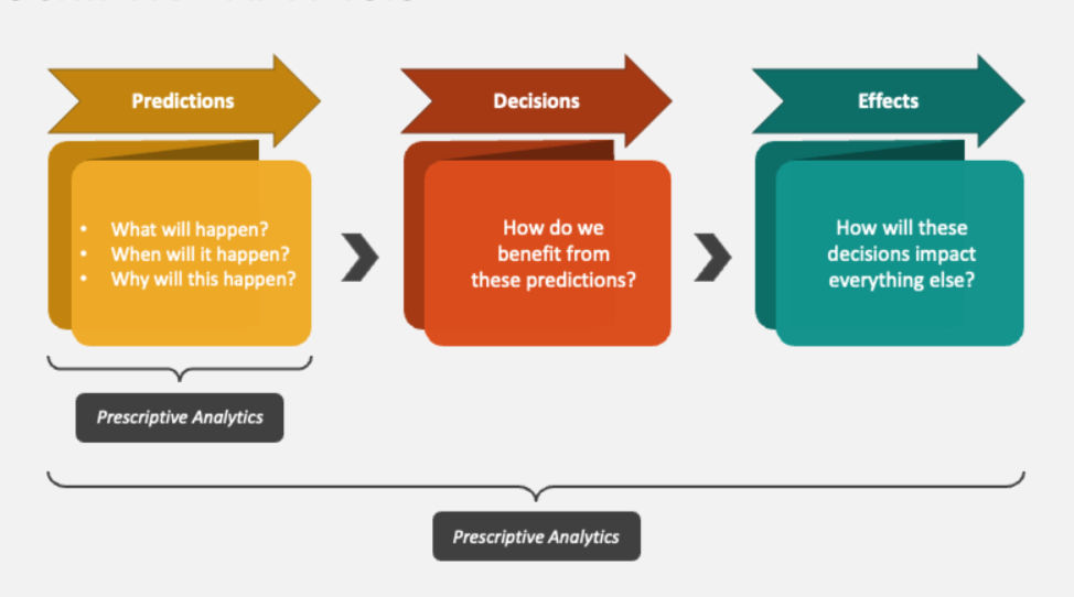
Prescriptive analysis, in simple words, focuses on the future. It helps to predict the problems that might happen and provides a recommendation on how to fix them to achieve the best possible outcome. It uses data to suggest specific actions that are helpful for decision making. Real world examples where prescriptive analysis is widely used are Google maps for route optimization, Netflix for content recommendations, airlines for pricing and scheduling, healthcare for treatment planning, retail and e-commerce for personalized offers to name a few among others.
I participated in a Python Hackathon organized by Numpy Ninja where the task was to come up with prescriptive analysis questions using the Flatten Covid-19 survey data from Canada. This dataset includes information related to symptoms, demographics and mental health. The goal was to predict possible problems from the data and come up with solutions, supported by visualizations created using Python.
The flatten covid-19 dataset consisted of three versions of the survey referred to as Schema 1, Schema 2 and Schema 3. Survey responses associated with Schema 1 are the most numerous, consisting of 263,640 individual level records submitted in the early weeks of the pandemic (March 23rd to April 8th of 2020). Survey responses associated with Schema 2 consist of 14,932 records (April 8th to April 28th of 2020) and Schema 3 consists of 15,534 records (April 28th to July 30th of 2020). The raw flatten dataset consists of 498,211 survey submissions from unique participants with granular temporal, spatial, and survey participant socio-demographic and health factors data.
Why data cleaning matters?
To come up with prescriptive analysis questions, the first thought that occurred to me was to combine the 3 schemas into a single master dataset. Before creating the master dataset, I performed several data cleaning steps like standardizing data formats, filling the missing values and fixing structural errors. Data cleaning is one of the most important steps in any data analysis project. Without clean and consistent data, the results can be incorrect. By standardizing the formats and removing irrelevant records, the analysis becomes more reliable. This ensures that the insights drawn from visualizations are based on accurate and meaningful data. After cleaning the data, only relevant and high-quality records were merged into the final master dataset with 45,948 records ready for analysis and visualization.
Let us look into an example question that was part of my prescriptive analysis during the hackathon.
Question: In which top five Forward Sortation Areas (FSAs) should we deploy mobile testing units tomorrow to reach the most "untested" but "vulnerable" individuals?
Why this question?
I chose this question because it helps determine where limited mobile units should be deployed to achieve the maximum impact on public health. Instead of spreading the mobile units across the entire city, we can focus resources on the top five FSAs with the highest need. Through this analysis we can use the available resources more effectively and reach the people who need them the most.
Please download Anaconda navigator and the Python 3.x installer on your system, complete the installation before proceeding to the next steps.
Open Anaconda Navigator, Launch Jupyter notebook then follow the path to create a new notebook
File -> New ->Notebook
Steps I have used to create the visualization using Python
Import the libraries (Pandas, Matplotlib and Seaborn).
Here pandas use is to load and manipulate the dataset. Matplotlib builds the plot window and the axes. Seaborn adds the colors, bars and style to the visualization chart.

Read the master file and identify the priority group by creating a new subset of data.


Count how many people live in each FSA based on the priority list.

Finding the top five FSAs by sorting the list so that the FSAs with the most people are at the top and to select only the top five.

Setting up the chart size and the background.

Creating the bar chart

Adding title and labels

Final Visualization

The bar chart identifies the difference in need across FSAs. Tallest bar represents the area with a higher number of untested and vulnerable individuals. Looking at the chart makes it easy for decision makers to quickly identify the priority locations.
Conclusion
The following conclusions can be drawn from the data driven analysis using the above visualization
Easily identify where to send the resources.
Identify the FSAs where the virus might be spreading undetected to address the service gaps.
Planners can analyze the scale of operation.
By targeting these specific FSAs, the overall mortality rate can be reduced.
The above explanation demonstrates how prescriptive analysis, combined with data visualization, can support decision making. By using Python to transform raw survey data into insights, it becomes possible to recommend the targeted solutions rather than less effective actions. This approach can be applied not only in public health but across many areas where data driven decisions are essential.
I hope this blog helped you understand the basics of prescriptive analysis and how to create a bar chart visualization using Python.


