Power BI: Where Data Meets Dynamic Interaction


Introduction: A business intelligence tool used for interactive data visualization
- Originally used as Power pivot and power query in Excel
- One stop shop to gather data from various sources,transform data,and draw insights from it.
Power BI Components:
Power BI Desktop: This is the place where we create interactive visualizations, calculations, and do DAX queries.We create the reports in this.
Power BI service: SAAS(S/w as a service) based online service .It is used to publish the reports and sharing the reports between different sources. Though this is a licensed version.(This service same as tableau public in tableau)
Power BI Mobile apps: These apps are for Android,ios,windows phones and tablets.
Power BI Gateway,Power BI report server,Power BI premium/Pro
Power Query: This is the place where we do the ETL(Exctraction,transformation and loading) process of data. Where we can clean the data to make it more readable and understandable to gather further insights.

Data loading into Power BI(Mainly 3 ways):
Get the data from database
From Web: Get Data->Web->Give URL from the web where we want to get data from.
Excel workbook
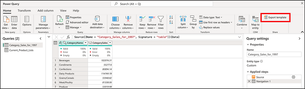
Essential tools in the POWER Query ribbon:
Detect Data type: If the data type of columns is not coming correct,we use this option,and it will detect data type automatically for the selected columns.
In Add new column in power query editor,we can add new columns in several ways to do the calculations like Custom column ,column from examples etc on existed columns.
Pivot Column: It is used to display unique values in a single column as separate columns.Then we can do any calculations on those columns.
Fill Up/Down: It fills up/down the values correspondingly related to the values right down/up.
Close and Apply: Before closing power query editor,we can click on Close and apply,which will apply all changes in power BI desktop too.
-Data modeling is done in Power BIO desktop(in front end) .In Data modeling,power BI automatically detects the relationships between tablesIf two tables have same columns,still power BI is not creating relationship between them.there can be few reasons like the common column is not Unique,in that case,many to many relation will form, which is not recommended.
Format : Capitalize, lowercase, trim, clean the data etc.
7. Standard/Scientific/Math : This is used to apply built-in calculations.
Query settings: Show applied steps, Name, Source etc.
Advanced Editor : See/Edit raw M code behind transformations
Column quality and distribution : Profile data for error and uniqueness.
Essential tools in the POWER BI ribbon:
Home tab: a) Get Data : Import data from Excel, SQL Server, web, etc.
b) Transform data : Launches Power query editor for cleaning data
c) Manage Relationships : Define how tables get connected
d) Save : Save your .pbix file
Insert tab : a) Add Visuals : Use to add different visualizations like Bar charts,KPIs, Tables etc.
b) Text Box / Image : Use to add notes,images and any design elements.
Modeling Tab : a) New Measure/Column : This is useful to create DAX based calculations, which we name as calculated measures/calculated columns.
b) Manage Relationships : This is used to manage relationships between tables
c) Sort by column : Control how categorical data is sorted
View Tab: a) Themes – Apply color themes to reports
b) Selection / Bookmarks / Sync Slicers – For interactive dashboards, and filtering the information .
Format Tab (when a visual is selected): a) Customize Colors, Fonts, and Layouts – Style your visuals
b) Data Labels, Titles, Tooltips – Control what users see
Very Useful and Easy Visualizations(Beginner level):
Before Starting with the visualizations, we should be sure that our data is cleaned.
-Stacked Bar chart & 100% Stacked bar chart: In the Stacked bar chart,different bars (which are stacked) will be showing raw data(sum might not be 100 of total bars for particular category) whereas in 100% stacked bar chart,data will be showing in % form by bars,and total sum will be 100%.
-Line Chart:It is used to show Trend of sales year wise generally. There is drill down arrows(deep down analyze) which appears in this chart,so if we select first drill down,then it will divide year into quarters,if we do again drill down, then it will further divide quarters in months etc….
-Ribbon Chart: Just like the Sankey chart in tableau
-Waterfall chart :When we want to see the complete picture of data that when it is increasing/decreasing
-Funnel chart: Shows data in desc order. When we change the order to ascending,it becomes Pyramid chart.
-Scattered Chart: To show data in scattered form. If we want to draw trend line here,we go to further analyse(select magnifier type icon from top of visualizations).
-Scattered Chart(Similar to motion chart of tableau): For this,put order date field in Play axis (down to legend)
-Pie chart and Donut chart: Select Pie to make Pie chart.Then we can copy this visual in the same window and paste it nearby,and select pie chart. Now we can do comparisons in both.
-Gauge chart:This chart is mainly used to show KPI and Target value as well. We can find the target value by using a formula,then put that into target value field,then a line will show for target value,so that we can compare how much target we need to met more.
To show KPI: We use Card, Multi row card, KPI, Gauge chart
-Slicer: Uses as a filter
-Table chart work as Pivot table.
-Key Influencers: This chart will show the fields or categories which are majorly influencing the output data.
-Decomposition Tree(Like we do Dendogram in tableau): This chart uses to show that branches of tree is dividing further into subcategories…size of branch can depict the value.
Wrapping Up
Congratulations! You've just taken your first step toward mastering Power BI— this is the tool which is used in every industry to provide data insights. With its wide range of features and functionality, Power BI empowers you to clean, visualize, and analyze data with ease.
Knowing Power BI will give you a superpower in today’s data-driven world. Keep practicing with real datasets, experiment with visualizations, and soon you’ll be making complex visuals like a pro.
What’s Next?
In upcoming blogs, we’ll explore:
Making Power Bi visuals with help of Python
Time & Intelligence functions in power BI
Relationship functions
Dax Logical functions
Operators
Real-world business use cases
Stay tuned, and keep visualizing!
References:


