My First Dashboard : E-commerce Sales Analysis Step by Step
Being from non IT background, it was quite complicated for me to start my journey as DA. After exploring & getting guidance finally I prepared my First Dashboard in Tableau, which can give an overview to a beginner who is confused from where should I start learning Tableau!
How a .xls file containing complicated data in multiple sheets with huge number of rows & column can be converted into a beautiful & simple display in the form of dashboard in Tableau, was amazing to learn and easy to understand as well.
By taking just a baby step I learnt how raw data can be transformed into information and actionable insight.
After installing Tableau public & downloading dataset, I followed below mentioned steps.
Step 1: First I downloaded the dataset in my desktop and opened it in Tableau by clicking Microsoft Excel option and selecting the required file.
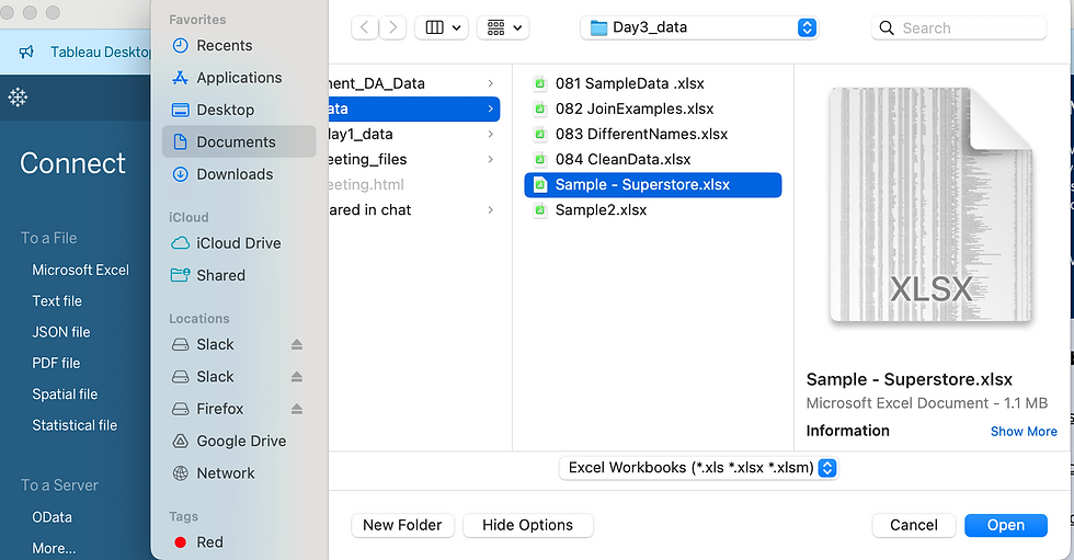
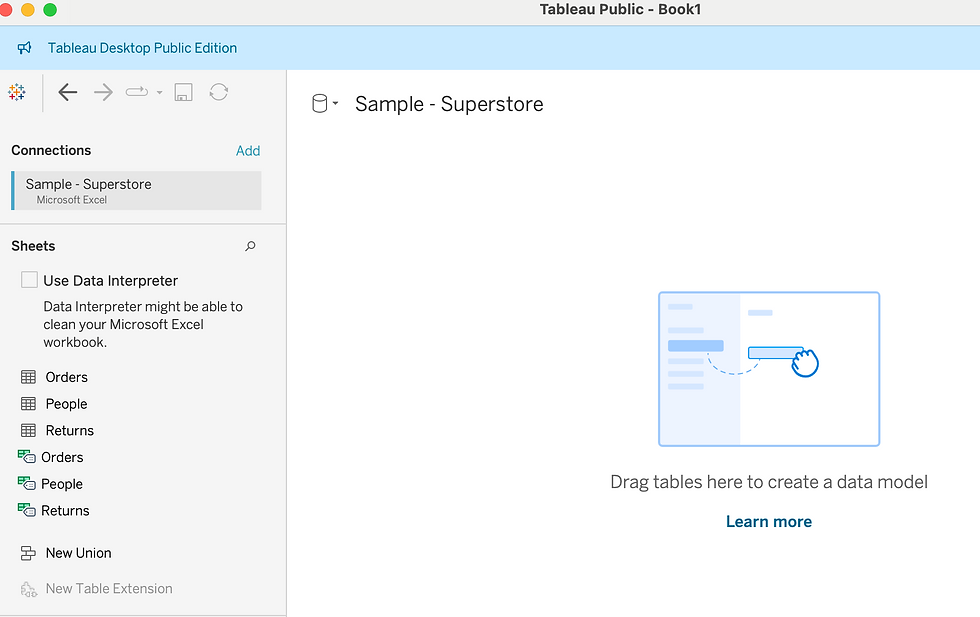
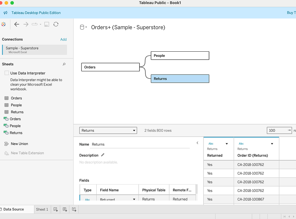
Step 2: Created joins between Orders, People and Returns by dragging & dropping on canvas.
Joins in Tableau involves a simple process that allows us to combine data from multiple tables based on common fields or columns.
In general, there are four types of joins that we can use in Tableau: inner, left, right, and full outer. If join is not solving the purpose to combine data from multiple tables, we should use relationships.
2a. Dragged the Order table onto the canvas to create a data source tab.
2b. Dragged the People & Return table onto the canvas, and Tableau automatically detects any common fields between the tables.
Note : Sometimes It happens if column name is different but keys (common Field) are same, Tableau shows error while creating join. How to fix it?
2c. Select and drag the common field from one table to the corresponding field in the other table. This establishes the join relationship.
Note : This table helped me to better understand various types of joins and its Results
Join Type | Results | |
Inner | When we use an inner join to combine tables, the result is a table that contains values that have matches in both tables. When a value doesn't match across both tables, it is dropped entirely. | |
Left | When we use a left join to combine tables, the result is a table that contains all values from the left table and corresponding matches from the right table. When a value in the left table doesn't have a corresponding match in the right table, you see a null value in the data grid. | |
Right | When we use a right join to combine tables, the result is a table that contains all values from the right table and corresponding matches from the left table. When a value in the right table doesn't have a corresponding match in the left table, you see a null value in the data grid. | |
Full Outer | When we use a full outer join to combine tables, the result is a table that contains all values from both tables. When a value from either table doesn't have a match with the other table, we see a null value in the data grid. |
Step 3: Moved to Automatic, selected pie from dropdown.
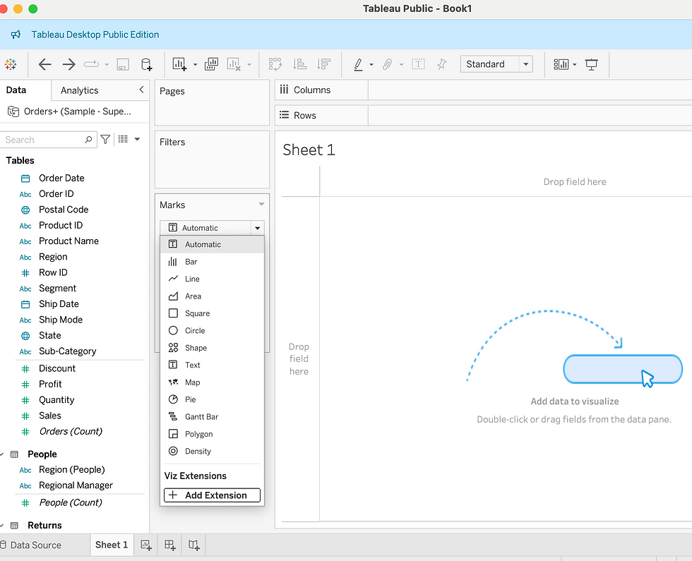
Step 4: Dragged Sales & Dropped in Size, dragged Sub-category & Dropped into color. Changed standard to Entire View for clear & bigger presentation.
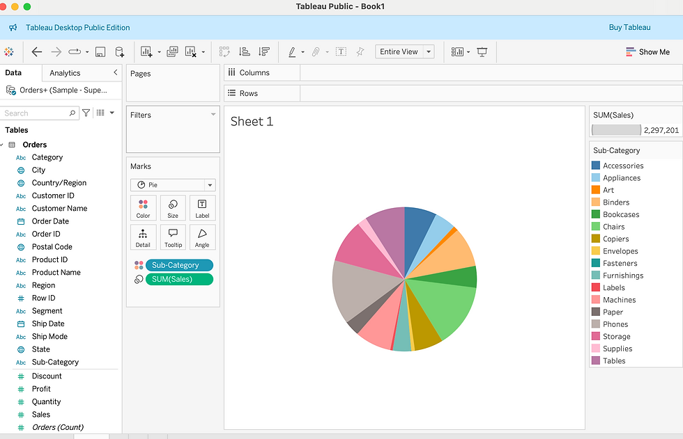
Step 5: Dragged Sales & Dropped in Label, dragged Sub-category & Dropped into Label.
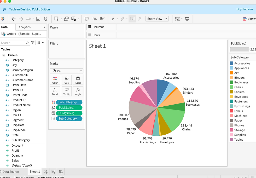
Step 6: Clicked on Sheet1 (Right click) Renamed as pie chart. This is how I got visualization of Subcategory wise Sales Analysis.
Step 7: Clicked on Sheet 2, Dragged Sales & Dropped in Rows, Changed standard to Entire View for clear & bigger presentation.
Step 8: Dragged Region & Dropped in Color.
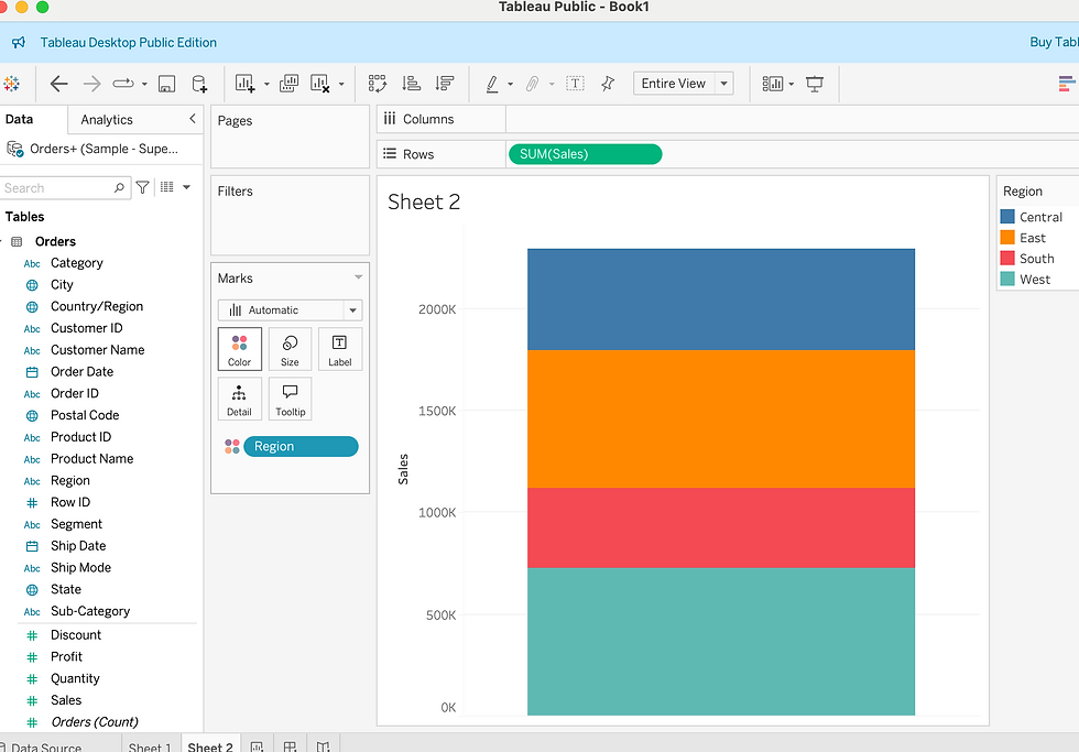
Step 9: Put Sales into Size & selected “Sorted Region descending by Sales”.
Step 10. Put Region & Sales into Labels.
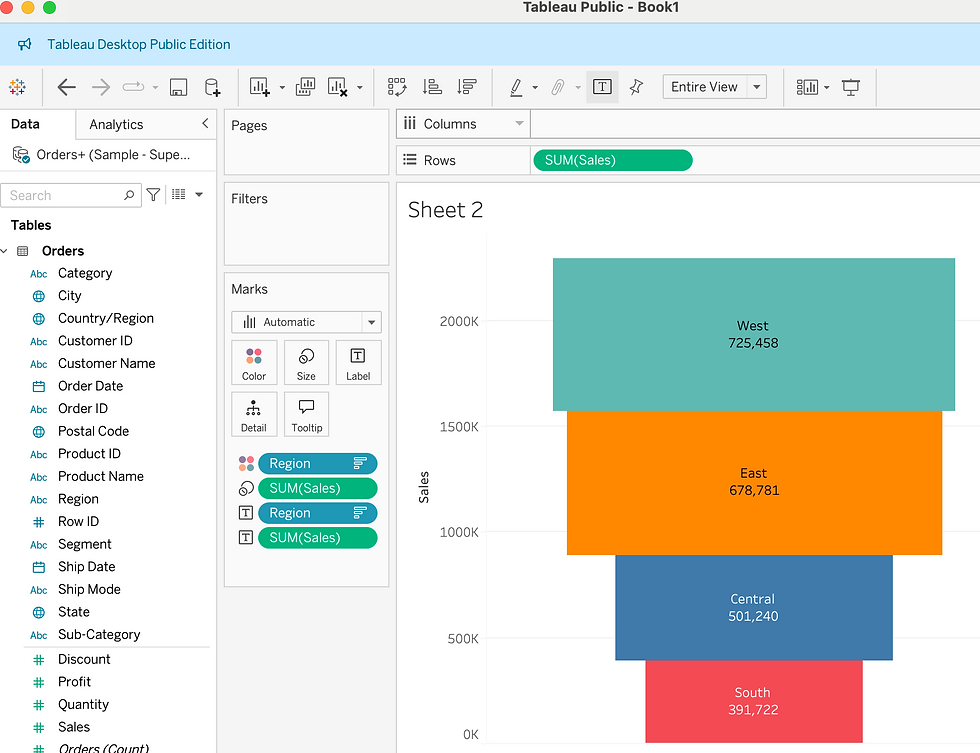
Step 11: Renamed Sheet 2 as Funnel Chart.
This is the way to get Visualization of "Region wise Sales Analysis.
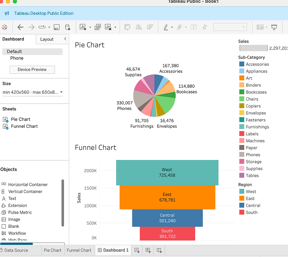
Step 12: Clicked on Dashboard 1 (2nd no. sheet from Sheet 2). Double clicked on Pie Chart & Funnel Chart displayed in the left side pane.
Further Enhancement :
We can rename dashboard - Right click & rename as per the choice relevant to data analysis. It appears as Title of Dashboard.
We can change Dashboard display by selecting or not selecting chart list in the left corner.
We can change size of Dashboard dispaly using "Size" Tab in left side.
We can remove unnecessary Legends from right side, keep only necessary legends for better display.
We can add border to different charts by using Layout format option.
Conclusion: After observing Dashboard it can be concluded that Subcategory Phone shows maximum Sales & Western region shows maximum Sales. It also shows which area needs more attention & which area needs less attention, accordingly organization can achieve meaningful outcomes for decision making & allocating its resources for ensuring process improvement leading to better growth for future.
Thank You!!


