Mastering Radial Charts in Tableau
- Subasini Clattus
- Jun 2, 2025
- 3 min read
Tableau is a leading data visualization and business intelligence platform that empowers users to transform raw data into clear, interactive dashboards. With its intuitive drag-and-drop interface, Tableau enables both technical and non-technical users to explore, analyze, and share insights with ease.
One of the more creative and visually compelling chart types you can build in Tableau—though not available by default—is the radial chart. This blog will walk you through what a radial chart is, when to use it, and how to create one step by step.
What Is a Radial Chart?
A radial chart is a circular data visualization where data points are plotted around a center point using calculated X and Y coordinates. It offers a unique alternative to bar and line charts, especially when visualizing sequential, cyclical, or categorical data.
Radial charts can reveal patterns and distributions in a visually engaging way and are often used for:
Time-based trends (e.g., hours, months)
Repeated categories
Comparing grouped data in a compact, circular layout

When to Use a Radial Chart
Radial charts are ideal for:
Cyclical or sequential data: Time intervals, processes, or steps.
Highlighting patterns or group comparisons: Useful for spotting peaks, gaps, and relationships.
Dashboard storytelling: Their circular design adds visual impact and intrigue.
Displaying multiple groups: Like categories, segments, or types.
When to Avoid a Radial Chart
Avoid radial charts when:
You need precise comparisons—bar or line charts are better for numeric clarity.
Your dataset is too large or dense, making the chart cluttered.
The data is not cyclical or sequential, which may make the chart feel forced.
Your audience prefers conventional, easy-to-read formats.
How to Build a Radial Chart in Tableau (Step-by-Step)
This guide uses a dataset with various visit types—such as Physical, Telemedicine, Follow-up, and New—to demonstrate how to build a radial chart. Here's how to do it.
Step 1: Load and Prepare the Data
Open Tableau and load your dataset (e.g., "Ambulatory Visit").
In the Data Source tab, create a union of the same sheet:
Drag the dataset onto itself to form a union.

Tableau automatically creates a new field called Table Name.
Right-click on Table Name → Create Calculated Field → name it Path
Path : IIF([Table Name] = 'AmbulatoryVisits',0,270)This creates two data points for plotting: a start point (0°) and an endpoint (270°) to generate the circular layout.
Step 2: Create Bins for Path
Right-click on Path → Create → Bins
Set bin size to 1 for evenly spaced intervals
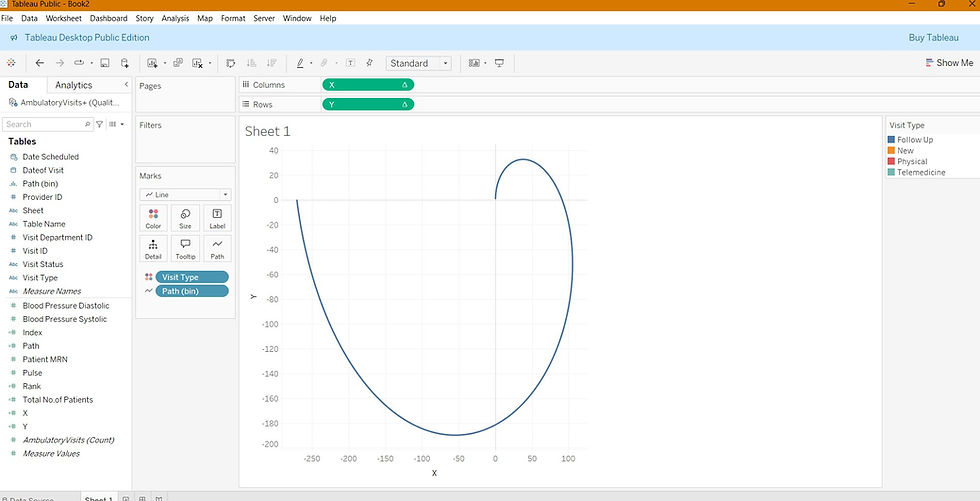
Step 3: Generate Circular Coordinates
Create a calculated field Index
Index : INDEX () -1Create calculated fields for X and Y
X : SIN(RADIANS([Index]))
Y : COS(RADIANS([Index]))
Radian function convert number from degrees to radians and sin/cos helps to return the sin/cos of the angle
Drag X to Columns and Y to Rows.
Drag Path (bin) to Rows and enable Show Missing Values.
Change Mark Type to Line.
Drag Path (bin) from Rows to Path on the Marks card.
Set Compute Using → Path (bin) for both X and Y.

A basic circular shape should now be visible—this forms the base of your radial chart.
Step 4: Layer by Visit Type
Now, let’s differentiate visit types in ambulatory visit dataset using circles of varying sizes and positions.
Drag Visit Type to Color.
Create a calculated field Total No. of Patients
Total No. of Patients : WINDOW_SUM(COUNT([Visit ID])) / 2Create a calculated field Rank
Rank : RANK_UNIQUE([Total No. of Patients], 'asc')Update the X and Y fields to multiply by rank
X : SIN(RADIANS([Index]))*[Rank]
Y : COS(RADIANS([Index]))*[Rank]
Recompute
Set Compute Using → Path (bin) for both X and Y.
Edit table calculations --> Nested calculation → for Rank, use Visit Type instead of Path, for both X and Y.

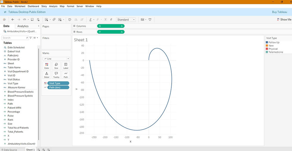
Step 5: Scale by Percentage
To make the chart more meaningful, we’ll scale the radial chart by the percentage of patients for each visit type.
Create a new calculated field Total_Patients
Total_Patients : WINDOW_SUM(COUNT([Visit ID]))/2Create calculated field Percentage
Percentage : [Total No.of Patients]/[Total_Patients]Create calculated field Size
Size : [Percentage]/WINDOW_MAX([Percentage])Update X and Y to reflect size
X : SIN(RADIANS([Index])*[Size])*[Rank]
Y : COS(RADIANS([Index])*[Size])*[Rank] 
Recompute and edit table calculations
For X and Y: Compute Using → Path (bin)
Edit table calculations --> Nested calculation
Rank: Use Visit Type
Size and Total_Patients: Use both Visit Type and Path (bin) (with Visit Type first)

Step 6: Final Touches
Drag Percentage and Visit Type to Label.
Adjust mark sizes, format labels, and remove grid lines or axes for a cleaner appearance.


Radial charts in Tableau are a creative and powerful way to visualize cyclical or grouped data in a circular format. By leveraging calculated X and Y coordinates, you can turn traditional data into striking visuals that communicate insights at a glance.
Whether you're analyzing visit types, time-based behavior, or categorical trends, radial charts can elevate your dashboards and drive better data storytelling.

