Mastering Joins & Viz Basics: Tableau + Excel Guide
Data joins form the backbone of effective data analysis, enabling you to merge disparate datasets via shared keys like IDs or dates for richer, more comprehensive insights. This blog dives into the fundamentals of joins and relationships, with hands-on guidance for implementing them in Tableau and Excel to power your visualizations. Whether you're wrangling healthcare data for sepsis analysis or prepping dashboards for a hackathon, mastering these techniques unlocks deeper storytelling through your data.
Introduction to Data Files and Simple Data Structures
Sometimes your dataset consists of a single table (sheet) containing all relevant information, such as customer details, order information, and product data combined. For these simple datasets, you usually don’t need to create joins or relationships before analysis because everything is already integrated in one sheet. This denormalized structure is ideal for quick explorations in tools like Excel or Tableau, where you can immediately drag fields to rows, columns, or marks for instant visualizations. In healthcare scenarios, think of a flat patient log with sepsis biomarkers, vitals, and outcomes all in one place—perfect for rapid dashboard prototyping during hackathons. However, as datasets grow complex, this approach can lead to redundancy, making joins essential for efficiency.
Creating Joins in Tableau

When your data lives across multiple sheets or tables—like separate ones for customers, orders, and products—you'll need joins to stitch them together for meaningful analysis.
Joins connect these tables using shared fields called keys, such as Customer ID or Product ID, acting like unique identifiers that match records across datasets.
Tableau makes this intuitive: simply drag tables from the Data pane onto the canvas, and it auto-detects matching fields to form an inner join by default—this pulls only records with matches in both tables, filtering out unmatched records for clean results.
If names don't align perfectly (e.g., "Cust_ID" vs. "CustomerID"), no problem—just click the fields and manually link them via the edit dialog.
For flexibility, click the join icon (two overlapping circles) to switch types on the fly: inner for common records, left outer to keep everything from the primary table, right outer for the secondary, or full outer to grab all data regardless. This visual approach beats Excel's formulas, letting you preview and tweak joins before building viz.
Importance of Join Types
Choosing the correct join type ensures your combined dataset reflects the analysis goals without losing or duplicating key information.
Inner Join: Returns only records with matches in both tables, perfect for focusing on confirmed relationships like orders linked to existing customers—ideal when unmatched data isn't relevant.
Left Outer Join: Keeps all records from the left (primary) table, adding matching data from the right; use this to analyze every customer, even those without orders, retaining full context from your main dataset.
Right Outer Join: Preserves all records from the right table with left matches; handy when the secondary table (e.g., products) is your focus and you want every item represented.
Full Outer Join: Captures all records from both tables, filling gaps with nulls; great for comprehensive audits but can inflate data size, so use cautiously with large healthcare logs.
Selecting the right type prevents skewed insights—e.g., an inner join might hide unlinked sepsis patients, while a left join ensures no case is overlooked.
Data Blending Across Multiple Excel Sheets
For data split across multiple Excel files or sheets—like monthly sales logs—you can blend them seamlessly in Tableau without complex imports.
Add each Excel file as a separate connection via Connect > To a File > Microsoft Excel.
Drag relevant sheets to the canvas and link them using a common key, such as Order Number or Date.
Tableau blends on-the-fly during analysis, letting you mix quarterly reports for trend spotting.
This lightweight approach skips heavy joins when datasets share aggregate fields, keeping your workflow fast for hackathon dashboards.
Handling Dirty or Complex Data
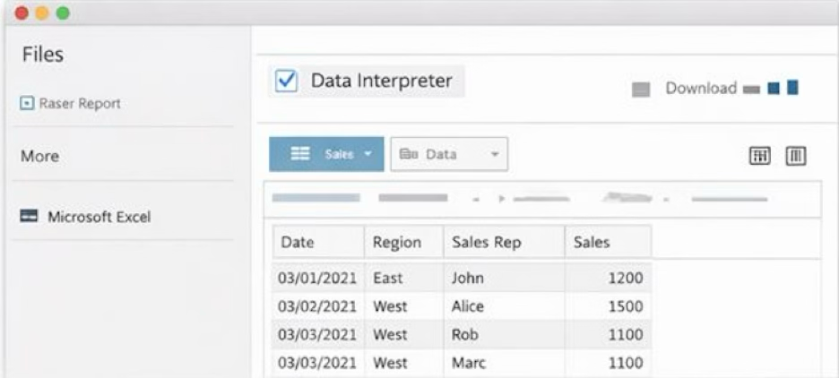
When loading Excel files into Tableau, headers often get mangled as regular rows, turning your dataset into a jumbled mess with misaligned columns and junk data.
Tableau's Data Interpreter is a lifesaver: toggle it on during import (under the Excel connection options), and it auto-detects true headers, skips footer notes or summary rows, and promotes the right data into clean columns.
For stubborn files, preview the cleaned output, tweak delimiters, or use Text Scan for CSVs—saving hours versus manual Excel scrubbing before your data visualization project.
Tableau Visualization Basics
With joins set, drag Dimensions (blue, categorical like Ship Mode) to Rows/Columns and Measures (green, numeric like Sales) to build views instantly.
Icons guide you: # for numbers (aggregated by default as SUM/AVG), ABC for text, calendar for dates (drill from Year > Quarter > Day), globe for maps.
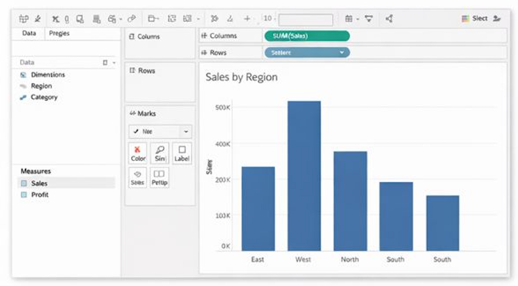
Right-click measures to toggle aggregation off for raw values, stack dimensions for layered insights (e.g., Sales by Month + Region), and swap marks (bar > line > area) via the Marks card—turning healthcare metrics into compelling hackathon stories.
Advanced Viz Tip: Dual Axes for Multi-Metric Stories
Take your charts further by blending measures on dual axes—drag a second measure (like Profit alongside Sales) to the opposite axis for normalized comparisons. In sepsis analysis, plot case counts (left axis, bars) against mortality rates (right axis, line) to reveal correlations at a glance. This technique, adjusted via the Marks card's axis syncing toggle, elevates basic views into hackathon-ready dashboards without extra tools.
Key Takeaways
Mastering joins, relationships, and basic visualizations in Tableau transforms raw data into actionable insights. Start simple with single sheets, scale to multi-table blends, and always match join types to your analysis goals.
Core Lessons: Inner joins show confirmed matches; left joins keep all primary records. Sample Superstore tests reveal how customer orders + Region unlock instant sales patterns. These skills make your dashboards and technical posts truly stand out.


