Mastering Bullet Charts in Tableau: Track Targets Like a Pro
- Neha Gupta

- Oct 15
- 2 min read
Updated: Oct 22
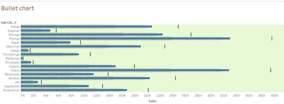
Bullet Chart
In today’s fast-paced, data-driven environment, the ability to analyze information and derive conclusions quickly is vital. It is equally important to evaluate whether we are on the right track and measure progress toward our goals. A powerful tool to achieve this is the Bullet Chart in Tableau, which we will explore in this section.
Bullet charts are one of the most powerful yet underrated visualization types in Tableau (and BI in general).
They’re ideal for comparing performance against a target, often used in dashboards to track KPIs (Key Performance Indicators) like sales, revenue, profit margin, or customer satisfaction.
For this demonstration, we are leveraging the Superstore dataset and focusing on key fields such as Sales and Sub-category (representing different items). We will set a custom target, compare the actual sales against this target, and assess how much of the target has been achieved. This approach helps us make informed decisions and take timely corrective actions. Let’s delve into the process:
Step-by-Step Guide to Create a Bullet Chart
Connect to Data and Define Target Sales
a) Open Tableau and connect to the Superstore dataset.
b) Use the Sales field and define your target sales as Sales * 1.2 (20% more than actual sales).
2. Create a Basic Chart
a) Sub-category to the Rows shelf.
b) Drag Sales to the Columns shelf.
c) Add Target Sales (calculated as Sales * 1.2) to the Rows as well.


3. Select Bullet chart from Show me section
a) Select Bullet chart from Show Me section among different charts
b) Use Tableau’s interactivity to swap reference line fields or filter data.
4. Format the Bullet Chart
a) Adjust the size and color of the bars for better readability.
b) Add shading to indicate performance ranges (e.g., Poor, Average, Good).

As observed in the above Bullet Chart, No category’s sales have reached the target sales And The reference line fields indicate how much of the target has been achieved in each respective category.
Benefits of Using Bullet Charts
Compact Design: Displays key performance metrics in a concise way.
Customizable Targets: Allows flexibility in defining and visualizing goals.
Interactivity: Enhances user understanding with filters and parameter controls.
Actionable Insights: Quickly identifies areas needing improvement.
Conclusion
Bullet charts are an excellent choice for tracking performance against targets in Tableau. By following the steps outlined above, we can create interactive and informative bullet charts that provide valuable insights. Use them to identify gaps and take data-driven actions to improve performance.
Have questions or suggestions? Feel free to share them in the comments below.
Enjoy visualizing!
References:


