Make Your Data Stand Out: Creating a Circular Bar Chart in Tableau
If you want a break from the usual bar charts and are looking to add a visual twist to your data, a circular bar chart might be just what you need. It’s eye-catching, dynamic, and gives your dashboard a fresh, modern look, perfect for storytelling with style!
Circular or radial bar charts are a creative and engaging way to visualize data, especially when you want to display a continuous flow like time, sales, or trends across months. In this blog, I’ll Walk you through how I created a dynamic and interactive Circular Bar Chart in Tableau, step-by-step, from building calculations to designing the final visualization.
About the Circular Chart:
A Circular Bar Chart is a creative twist on the regular bar chart. Instead of showing bars side by side in a straight line, the bars are arranged around a circle, making the chart more eye-catching and unique.
In this design, we have two circles: an inner circle which stays fixed and an outer circle which changes based on the sales values. This dynamic nature makes it easy to spot differences and trends visually. Unlike a normal bar chart, the circular layout also gives a feeling of flow, especially when we plot months around like a clock. Plus, by using parameters, we can easily adjust the shape, spacing, and size of the circles to explore the data in different ways.
What Makes This Chart Special?
Easy to Compare Values: Like regular bar charts, longer bars show higher values—so you can quickly see which ones stand out the most.
Looks Visually Unique: Circular charts simply look cool! Their round shape grabs attention and makes your dashboard more fun and interesting.
Can Suggest Cycles: Though not always the main goal, the circular shape can hint at patterns that repeat over time—like months in a year.
Space Efficiency: If you don’t have a lot of vertical room, a circular chart can help you fit multiple categories neatly in one view.
Whether you're looking to add a fresh design to your dashboard or just exploring new chart types, this guide will help you create your own beautiful circular bar chart!
We are going to build an interactive circular bar chart in Tableau, just like the one you see below. It visualizes monthly sales trends over several years, with bars radiating around a circle to represent each month. The height of each bar shows the sales value, and tooltips reveal the exact figures when you hover over a point.

Let's get Started!
Step 1: Connecting to the Sample Superstore Dataset:
Let's begin by connecting to the Sample Superstore dataset I downloaded from Kaggle. This dataset is widely used for practicing data visualization projects and provides a good mix of sales, people, and returns information to work with.

Step 2: Building Relationships Between Orders, People, and Returns Tables:
After importing the data into Tableau, you need to connect three key tables: Orders, People, and Returns. Establishing these relationships connections tells Tableau how this information relates, so your dashboards show a full and accurate picture of how your business is doing.

Step 3: Creating an Index Calculated Field:
After connecting the data, move to Sheet 1and create a calculated field called "Index" using the simple formula INDEX(). This function assigns a unique row number to each mark in the view. We'll use these numbers later to neatly arrange the sales figures in a circle.

Step 4: Setting Up the Inner Radius Parameter:
Next, create a Parameter named Inner Radius and set the data type to Integer and gave it an initial value of 25,000, because we are visualizing Sales data which usually has bigger values.
This parameter determines the size of the empty center space of the chart, essentially determining how far the bars begin from the middle and making the design more dynamic.


Since the final chart has two circles, an inner empty circle and outer sales bars, setting up the inner radius first was important.
Step 5: Create a Full Angle Parameter:
After setting the inner radius, the next thing is to create another parameter called Full Angle and set the data type as Integer.
Gave it a current value of 360 to represent a complete circular. This parameter will help control the overall angle for our circular layout.

Step 6: Duplicate the Dataset for Outer Circle
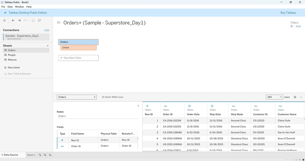
Since we wanted to build two circles (one inner and one outer), we needed to duplicate the Orders data. Here’s how you can do it:
Go to the Data Source page.
Removed any existing relationships temporarily.
Then, dragged the Orders table onto itself to create a Union (Orders + Orders).
This way, Tableau treats the dataset as two layers, which helps in plotting two different circular paths for the chart! When building circular charts with multiple layers, we use a Union because it simply stacks the same data twice, one below the other.
Step 7: Create the Angle Increment calculated field for Even Distribution
Now, it's time to calculate the spacing between each bar around the circle. Create a new calculated field called Angle Increment using this formula:
[Full Angle] / { FIXED: COUNTD(DATETRUNC('month', [Order Date])) }

It divides the total circle 360 degrees by the number of distinct months in the data. This way, each month gets evenly spaced around the circle!
Step 8: Create the Angle Calculated Field
To define the angle for each data point, create a calculated field called Angle. This field is calculated by multiplying the radians of the average of the [Angle Increment] by the [Index]. This ensures each point gets its proper angular placement in the chart.

Step 9: Add the Angle Adjustment Parameter
Next, create a parameter named Angle Adjustment, which provides flexibility in adjusting the angle. This parameter is set to an integer data type, with the current value set to 0.

Step 10: Update the Angle Calculated Field
Next, edit the Angle calculated field to include the Angle Adjustment parameter. By adding the adjustment, we can rotate the entire chart easily using the parameter control.

Step 11: Create the Radius Calculated Field
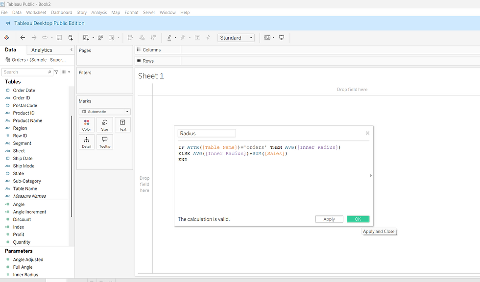
Then, create a new calculated field called Radius to define how far each point should be from the center.
This calculation sets the inner circle at a fixed radius and adds sales values to create the outer bars, making the chart dynamic and layered.
Step 12: Create the X Coordinate Calculated Field
To plot points horizontally, create a calculated field called X. This calculates the x-axis position based on the angle and radius of each point.

Step 13: Create the Y Coordinate Calculated Field
Similarly, for the vertical placement, create a calculated field named Y.

Step 14: Start Building the Chart
Now that all our calculated fields are ready, it's time to build the chart.
Drag the "X" field to Columns and the "Y" field to Rows.
Drag "Table Name" to Detail on the Marks card.
Drag "Order Date" to Detail as well.
Right-click on "Order Date," select Month, and change it to Discrete.

Step 15: Set Compute Using for X
Click on the X pill in Columns, choose Compute Using → Order Date to ensure the path of points follows the order.

Step 16: Set Compute Using for Y
Repeat the same step for Y in Rows — click on the "Y" pill and select Compute Using → Order Date.

Step 17: Visualize the Circles
At this point, you’ll notice the chart taking its shape:
The inner circle represents the base layer which is orders.
The outer circle is drawn based on the different sales values, showing variations in radius.

Step 18: Change the Marks Type and Set the Path
In the Marks card, change the mark type from Automatic to Line. Then, drag Table Name to the Path shelf. This connects the points smoothly and creates the circular flow.

Step 19: Customize the Path Style:
Click on the color legend and select any color you prefer for your lines, and in the markers option below, choose the Path Style to adjust how the line flows between points. For example, you can choose smooth or stepped lines based on your design preference.

Step 20: Drag Order Date to Color:
Finally, drag Order Date again to the Color shelf. This step adds a smooth color flow through the months, making the circular chart look more vibrant and alive.

Step 21: Swap Rows and Columns for Clockwise Flow
To make the months flow in a clockwise direction, just click the 'Swap Rows and Columns' icon. This flips the X and Y axes, rearranging the chart into a smooth circular timeline.

Step 22: Show and Use the Parameters:
Click on each of the created parameters (like Angle Adjustment, Full Angle, and Inner Radius) and select Show Parameter. The parameter controls will appear on the right side of the screen, allowing you to interactively adjust the chart.
For example, I increased the Inner Radius from 25,000 to 40,000 to create a larger inner circle — but you can explore different values based on the look you desire!
You can also drag Order Date to the Filters shelf and select specific years you want to display, making your radial chart even more dynamic and customizable.


Step 23: Final Formatting to Polish the Chart:
Now that the circular bar chart is ready, let’s make it look cleaner with a few formatting tweaks:
Increase the size of the lines by adjusting the Size slider in the Marks card.
Remove grid lines, zero lines, and axis rulers to make the chart look neater and more polished.
Uncheck "Show Header" for both the X and Y axes so the axes disappear, and the view looks neat.

Step 24: Final Touch: Add Labels and Customize Tooltip
Finally, drag Sales to the Label shelf on the Marks card to display the sales values directly on the bars. You can also click on Tooltip and edit it; keep only the information you want to show and remove the rest for a cleaner look.
And that is it — our final Circular Bar Chart is ready! You can now interact with the parameters, adjust the look, and explore different views to make your chart even more dynamic and beautiful.

We have successfully built an interactive Circular Bar Chart in Tableau. By using parameters, simple calculations, and a little formatting, we turned a basic dataset into a creative and dynamic visualization.
The best part is You can further customize the chart like adjusting angles, radius, colors, or even filtering specific years, making it truly flexible for different use cases. I hope this step-by-step guide inspires you to try new and exciting ways to visualize your data!
Thanks for reading. Happy visualizing!


