Make Interactive Dashboards Without Code in Power BI.

Updated: May 1, 2025
Introduction
Creating professional, interactive dashboards doesn't have to involve complex formulas. Power BI offers a suite of no-code features like slicers, buttons, bookmarks, and drill-throughs that helps users to build dynamic, user-friendly reports with just a few clicks.
We’ll now explore the top no-code techniques that transform dashboards from simple reports into powerful analytical tools.
Creating Dynamic interactions between visuals ensures a seamless flow of information, guiding users through a more interactive and engaging data visualization experience.
They can be done by:
1.Adding Filters and Slicers:
Filters:
Filters in Power BI are tools that allow users to refine and focus their data analysis by excluding or including specific information from a dataset.
There are several types of filters:
Report-Level Filters: Apply to the entire report, filtering all pages.
Page-Level Filters: Apply to a specific page within a report.
Visual-Level Filters: Apply to a single visual within a page.
How to Add Filters:
Let us consider Diabetes Dataset that is mentioned below. This dataset talks about the demographics, Patient history, Medical and Family history, Medications taken, Lab, Blood Pressure History and Cognitive testing data of the patients with Cerebromicrovascular Disease in Elderly with Diabetes.

Select the visual or report area you want to filter.

Drag the desired field to the Filters pane on the right.


Choose the filter type (basic, advanced, top N) and configure filter conditions, if we have numeric values or we can also do conditional formatting with advanced filtering.
We can the change in count of female and male patient count according to the above Page Level Filter.

We can drag the same field in the Filters on all pages, This will be applied to all the pages in the workbook.
Slicers:
Slicers in Power BI are interactive filters that let users select values to filter visuals on a report page. They are a visual representation of filters, allowing users to quickly interact with and change the data displayed.
Adding a Slicer:
Click on the `Slicer` icon in the Visualizations pane.
Drag a field into the `Field` well to create the slicer.

Configuring Slicers:
You can format slicers to allow single or multiple selections.
Customize the slicer appearance through the Format pane.
Types of Slicers:
Text slicers for categorical data.
Text slicers in data visualization tools like Power BI allow users to filter categorical data by entering text keywords or phrases.

NOTE: For clear understanding, I have also used Sample Superstore dataset for the later visualizations.
Date slicers for time-based data.
Date slicers in Power BI allow users to filter visuals using time-based fields — such as Order Date, Transaction Date, or Year.
They enable dynamic analysis over time — perfect for trend analysis, YTD comparisons, seasonal insights, and more.

Hierarchical slicers for data with multiple levels.
As you add each field into the slicer, Power BI will automatically treat it as a hierarchy (you'll see indented levels in the slicer).

We can Sync a Slicer in Power BI:
1. Enable Sync Slicers (if not already enabled):
If you're using a custom visual, ensure the supportsSynchronizingFilterState option is set to true
2. Select the Slicer and Go to View:
In your report, select the slicer you want to sync.
Navigate to the "View" tab in the ribbon.
Click on "Sync Slicers".
3. Choose Pages to Sync:
A pane will appear on the right, listing the pages in your report.
Check the boxes next to the pages you want the slicer to affect.

2.Using Drill-Through and Drill-Down Features
Utilizing drill-through and drill-down features allows for deeper exploration of information, providing a more comprehensive analysis. Implementing tooltips for additional insights offers users a quick peek into details that may not be immediately obvious.
Drill-Through:
Drill through in Power BI allows users to navigate from a summary report page to a more detailed page, revealing specific data points or related information. This feature is particularly useful when users want to explore the underlying data for a selected item in a visual.
Enabling Drill-Through:
In the Fields pane, drag the desired field to the `Drill-through` filters section.
Add a back button to navigate back to the main report (use `Insert > Buttons > Back`).
Using Drill-Through:
Right-click on a data point in the summary report and select the drill-through option to view detailed data.

Drill-Down:
Drill-down allows users to explore data at different levels of detail within a visualization, moving from a general view to a more specific one. It's a feature that reveals deeper insights by revealing lower-level data when clicking on specific data points within a visual.
Enabling Drill-Down:
Select a visual that supports hierarchies (e.g., bar chart, line chart, Funnel chart).
Click on the `Drill Down` button in the top-right corner of the visual.
Now we can see the visual by clicking on data points to drill down into more detailed levels.
In the visual below, we clicked on the Drill Down option in the Sum Of Quantity by Segment Funnel chart and this gave us the deeper level insight about the respective Order IDs.

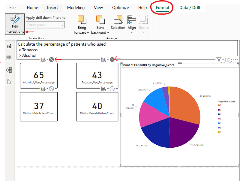
What is Cross-Filtering and how can we not have it?
When a user selects a data point in one visual, other visuals on the page update to reflect the selection.
To not have the visuals interacting with each other in a page, we can configure interactions by selecting a visual and clicking on the `Format` tab, then choose `Edit Interactions`.
Then clicking on the circle at each selected visual.
3.Bookmarks:
Bookmarks capture the current state of a report, including filter selections, drill positions, and visibility of visuals.
Use bookmarks to create custom navigation, storytelling, or toggle between different views.
Access bookmarks via `View > Bookmarks Pane`, then `Add` bookmarks, name them as Bookmark1 and Bookmark2 for example and manage their properties whenever we click on the bookmarks.

4.Buttons and Actions:
Buttons provide interactive elements that trigger actions, such as
changing data,
applying filters, or
navigating to other pages
Use buttons to trigger actions like navigating to a bookmark, page, or URL.
Add buttons from the `Insert` tab.
Configure button actions in the Format pane under the `Action` section.

Now we can go to next page by clicking Ctrl and next arrow button.
We can also include a button and add a action of landing on that particular page.
Conclusion:
By mastering these no-code techniques, we can build dashboards that not only look great, but also help in decision-making through simple, guided interactivity. We can deliver polished, professional results fast.
So, Start exploring these features in Power BI one click at a time.
Happy Exploring!


