Information is Ta"bleautiful"
Updated: Jan 15

I never imagined Information can be beautiful and yet very helpful when people who don't have idea of numbers and who don’t typically rely on data to make decisions. With Tableau, information becomes truly powerful when visual design and analytical clarity work together to reveal insights that might otherwise stay hidden in the data. When dashboards are crafted with intention — from thoughtful color choices to meaningful chart selection — even complex clinical or operational metrics become instantly understandable. Effective Tableau design isn’t decoration; it’s a functional layer that reduces cognitive load and guides the viewer’s eye toward the patterns that matter most. By encouraging curiosity through interactive filters, tooltips, and drill‑downs, a well‑built Tableau dashboard transforms raw data into a compelling story that users can explore, remember, and act on with confidence.
As a member of the Sepsis Analytics Project team, I'm excited to share a series of visuals that are not only clinically informative but also visually engaging. These dashboards and charts are designed to highlight key patterns in patient data—such as biomarker severity, age group distributions, and trigger hour elevations—using color-coded elements that enhance clarity without compromising analytical depth. By blending thoughtful design with meaningful metrics, our goal is to make complex clinical insights more accessible, memorable, and impactful for both healthcare professionals and data-driven decision makers.

This visual known as "Bubble chart" titled "Elevated Multiple Biomarkers (SIRS Severity)" visualizes the distribution of patients across different biomarker ranges, all classified under SEVERITY 4, indicating high systemic inflammatory response. Each bubble represents a specific biomarker range (e.g., 21–30, 41–50, 61–70), with size and color reflecting the relative frequency or clinical weight of that range. The consistent severity label suggests these patients exhibit critical physiological instability regardless of the exact biomarker level, emphasizing the need for urgent monitoring. This visual helps clinicians quickly identify which biomarker bands are most populated and potentially linked to peak SIRS burden.

This visual Mirrored horizontal bar chart or Butterfly chart titled "SIRS Patient Count By Age Group" explains the distribution of Systemic Inflammatory Response Syndrome (SIRS) cases across various age cohorts, with each age group split into two comparative segments. The highest patient counts are observed in the 61–70, 71–80, and 51–60 age ranges, suggesting a concentration of SIRS burden among older adults. The dual-sided layout likely represents gender, hospital sites, or cohort comparisons, allowing for quick visual assessment of disparities or similarities. As age increases beyond 80, patient counts begin to taper, while younger age groups show relatively lower incidence.
This visualization supports targeted resource planning and highlights age-related vulnerability in SIRS populations.
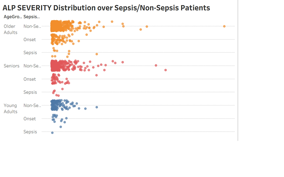
This Scatter plot titled "ALP SEVERITY Distribution over Sepsis/Non-Sepsis Patients" maps individual patient ALP levels across three age groups—Young Adults, Seniors, and Older Adults—while distinguishing between Non-Sepsis, Onset, and Sepsis statuses. Each dot represents a patient, with horizontal placement indicating ALP severity and vertical grouping reflecting both age and sepsis classification. The color-coded scheme (blue for Young Adults, red for Seniors, orange for Older Adults) enhances visual segmentation, making it easy to compare severity trends across cohorts. Notably, the chart reveals a higher concentration of patients in the Non-Sepsis and Onset categories, suggesting that elevated ALP levels may emerge early in the inflammatory process before full sepsis develops. This visualization supports early detection strategies and age-specific clinical monitoring.
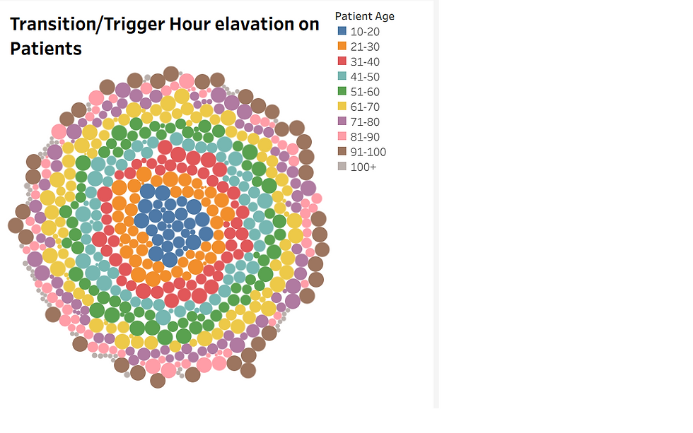
This Concentric Bubble chart or radial bubble chart visualizes patient-level age distribution in relation to transition or trigger hour elevation, using a concentric layout to highlight temporal clustering. Each bubble represents an individual patient, color-coded by age group—from dark orange for ages 10–20 to brown for 100+. The circular arrangement suggests that certain age groups may be more prone to transitions at specific hours, potentially indicating age-sensitive clinical triggers or workflow bottlenecks. This design enables rapid pattern recognition across age bands and supports exploratory analysis of time-based transitions in patient care.
It is clumsy yet we can pull the report by applying filters with SIRS Severity level and Trigger/Transition hours.
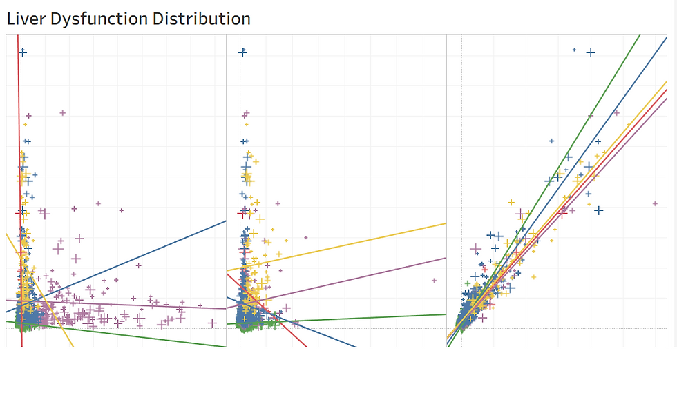
This Scatter plot titled "Liver Dysfunction Distribution" presents a multi-panel view of patient-level data, with each panel showcasing colored plus signs representing individual data points. The panels likely correspond to different clinical variables or patient subgroups. Superimposed regression lines in green, yellow, red, blue, and purple indicate directional trends and strength of association between liver dysfunction indicators and other metrics. In the first two panels, data points are densely clustered near the origin, suggesting limited variability or a weak correlation. In contrast, the third panel shows a wider spread, implying stronger or more diverse relationships. Correlation in this context refers to how changes in one variable (e.g., liver enzyme levels) relate to changes in another (e.g., severity score or time of onset). Positive correlation means both variables increase together, while negative correlation implies one decreases as the other rises. The slope and tightness of each regression line help quantify this relationship—steeper, tighter lines suggest stronger correlation, while flatter or scattered lines indicate weaker or no correlation. This visualization aids in identifying which clinical factors are most predictive of liver dysfunction severity.
Likewise there are plenty of visuals Bar charts, Area Charts, custom images inserted visuals are eye-feast and plays key role while decision making.
Thank you for stopping by and reading my blog. I hope you found it helpful and worth your time. Happy charting and may your data clean and your insights shine and have a Happy story telling.
" HAPPY CHARTING"


