How to Create a Visually Appealing Donut Chart 🍩 in Tableau: A Comprehensive Guide
Introduction
Donut charts are a visually appealing way to represent part-to-whole relationships in data. Tableau is the most popular interactive data visualization tool nowadays, providing various charts to explore our data easily and effectively. However, it does not have a built-in donut chart option; we can create one using a combination of pie charts and dual-axis techniques.
Donut chart using dual-axis techniques
We can create a basic pie chart by adding the dimension we want to ‘slice’ the pie by to the Color shelf, changing the mark type to pie chart, and adding our measure to the Angle shelf.

Create an axis for this pie chart to sit on, double-click on the Rows shelf, and type MIN(0). This will add an axis to the display.

Create a second instance of the axis by again double-clicking on Rows and typing MIN(0). After this, we will have two pie charts displayed and two MIN(0) marks cards.

Make the chart a dual axis and synchronize the axes. This will layer the two pie charts on top of each other.
Remove Measure Names from the All Marks card. This has been automatically added. Then on the second MIN(0) marks card, change the mark type to circle, remove all the pills from the marks card shelf, and change the colour to white. Adjust the Size of both mark cards so the pie chart (the first card) is bigger than the circle. After this, we will have a donut.

We can remove all gridlines, zero lines, axis rulers, and row/column dividers, as well as hide the axis headers. The centre of a donut chart is often used to add further information; this may be a title to describe what the chart shows or a key KPI that the donut visual supplements. Add the relevant information to the Label shelf of the second marks card (the circle mark) and align the middle centre.

Donut chart using Map Layers techniques
We can also use the map layer techniques to build a donut chart. This method allows us to add more layers than just the ‘pie chart' and ‘circle’ layers. We can also disable layers so they are not inadvertently clickable.
Building the first map layer
We must use a field with a geographic data type to use map layers. We need to make one because we’re not using one in this chart. Create a new calculated field.
Zero
MAKEPOINT(0,0)
Double-click this field, and it will automatically add the point centrally onto a map with Longitude and Latitude fields automatically generated, too.

Add the field we intend to ‘slice’ your pie with (in this case Segment) to Color and adjust the colours.
Change the mark type to a pie chart and add your measure (in this case, Sales) to an angle. Increase the size as much as possible.
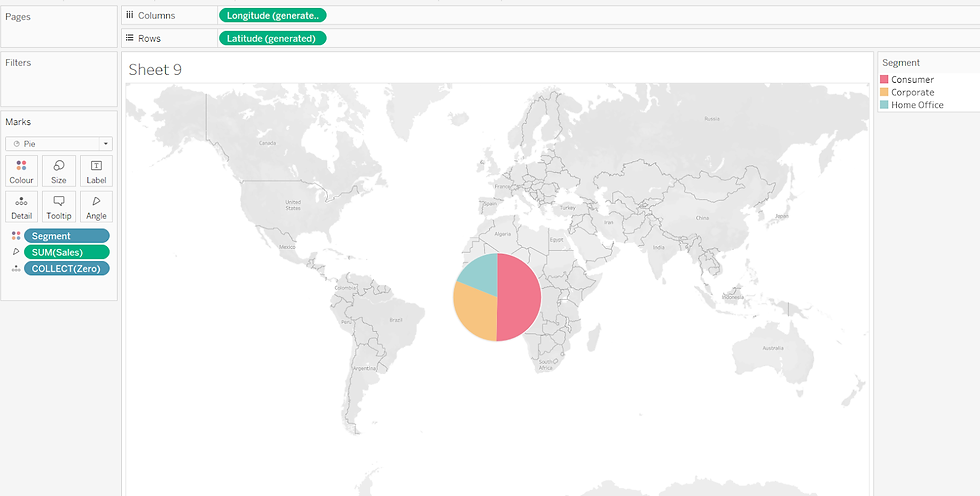
To increase the size further beyond that possible with the slider on the Size shelf, use Ctrl-Shift-B (Windows) or Cmd-Shift-B (Mac) to increase the size (Ctrl-B / Cmd-B to reduce).

Building the second map layer
Drag Zero onto the map canvas and drop it over the Add a Marks Layer section that displays. This will add a second marks card called Zero(2)

Rename the marks card labelled Zero to Pie Chart, and rename the marks card called Zero(2) to Centre Circle as this will make it easier to manage the layers (and these instructions).
Change the mark type of the Centre Circle marks card to circle. Set the color to be white and increase the
size so it is smaller than the outer pie chart, but leaves a suitable amount displayed.

Finally, remove the background map (from the Map menu, select Background Maps > None). This will display the chart with traditional axes.

Extension
In the image below, concentric circles have created a double-ring donut by using 4 map layers, where each new layer is sized smaller than the previous.
Both the outer and inner sectioned layers are split by the same dimension, so the outer white ring is purely for visual effect.

In this example, a double ring has also been created, but the visual displays a more ‘hierarchical’ effect.
The inner donut is split by a dimension (in this case Category), and the outer donut is then split by
the next dimension in its hierarchy (in this case Sub-Category). Colors from the same hue are then used to ‘link’ the two dimensions together.

In this next example, the map layers are being used to create the double ring, and to also label some of the layers. In this case the dimensions splitting the rings are not directly hierarchical like the example above but the concept still works, to show the breakdown of survivors of the Titanic by class.

Finally, in this example, two map layers are used to give the appearance of a ‘partially eaten’ or ‘broken’ donut.

This works best for a boolean true/false or yes/no type split. One value of the dimension splitting the pie (in this case the False option) is coloured white (or the same as the background), and then a central circle is layered on top. This concept can be further expanded to visually reconnect the broken ends with a thin line, adding another circle layer set to 0% opacity but with a coloured border. The ‘colour’ of the dimension previously coloured white in the example above, now needs
Instead, use a transparent white colour (see here for further details on what this is and how to set it up).

Conclusion
Donut charts add visual polish and help with storytelling, but they should be used judiciously and supplemented with more accurate charts when needed.


