How to Create a Funnel Chart: A Step-by-Step Guide to Visualizing Your Data Flow
Funnel Chart:
A funnel chart is a visualization tool that shows how products or customers move through different stages of a process. The chart has a funnel shape, with a wide top that narrows toward the bottom, representing a decrease in numbers at each stage. Funnel charts help identify where losses or drop-offs happen in business processes, making it easier to spot areas for improvement.
When and Where to Use a Funnel Chart
A funnel chart is used to check the flow of a product through different stages. They are widely used in various fields:
Hospital: Tracking how many patients come in, get checked, receive treatment, and then go home.
Sales: Monitoring how many people hear about a product, show interest, try it, and finally buy it.
HR: Following the journey from job advertisement to application, interviews, and hiring.
Students: Observing how many students ask for information, apply, get accepted, and graduate.
These charts help highlight where losses or drop-offs occur clearly, enabling focused efforts to fix bottlenecks and improve outcomes.
Creating a Region-Wise Sales Funnel Chart
A funnel chart shows how sales numbers drop at each stage in different regions. It starts wide with many potential leads and narrows down to actual sales, making it simple to see which regions perform well or need attention. This clear visual helps identify where sales drop off so businesses can improve their strategies region by region. Now, let's start creating a funnel chart in Tableau for region-wise sales.
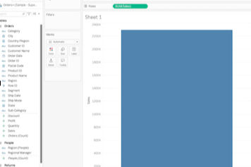
1.Put sales in the row to view total sales.
2.Add region to color to create a segmented bar chart.

3.Assign sales to size, so the size changes with sales volume.

4.Sort the chart in descending order to create the funnel shape.

5.Add region into labels and sales into labels for clarity.

6.Use filters to focus on positive sales values by choosing a sales range and enabling the filter display.

Key Insight:
By adjusting the sales value range in the funnel chart, we can observe how sales vary across regions. For example, when considering sales between 0 and 22,638, the Western region appears on top due to high sales volume. However, as we change the sales range, the leading region shifts, revealing which regions have the highest or lowest sales within different sales value segments. This dynamic filtering helps identify regional sales strengths and patterns clearly.

Limitations of Funnel Charts
While funnel charts are useful, they have some limits:
Best for simple, straight processes; complex or looping processes don’t fit well.
Funnel shape can sometimes exaggerate early drop-offs visually.
Shows where drop-offs happen, but not why. Further analysis is needed.
Harder to read if too many stages (more than 6).
Better for proportions and rates than exact numbers.
Not great for comparing groups side-by-side.
Conclusion
Funnel charts are a simple but powerful way to see how things move through different stages, whether it’s customers buying a product, patients going through treatments, or students making it to graduation. They help us spot where most people drop off so we know what to fix. By filtering and adjusting sales ranges in the funnel, you can clearly see which regions are doing well and which need attention. Using these charts makes it easier to understand your data and make smarter decisions. Give it a try with your own data, and you might be surprised by the insights you find!


