How to create a Dendrograms chart in Tabelau

Hello everyone, welcome to my blog. In this blog, let us explore more about Dendrogram charts.
Dendrograms are powerful visualizations for showing hierarchical relationships, similarity between groups, or cluster patterns of your data. While Tableau doesn’t offer a built‑in dendrogram chart type, you can create one using a combination of path scaffolding, table calculations, and careful formatting.
This blog walks through beginners through the end-to-end process of data to readable dendrogram in Tableau.
This blog analyzes a dataset focusing on SIRS patients by Trigger Hour. The Trigger Bin is created to categorize patients.
Why Choose a Dendrogram?
A dendrogram is chosen because it helps you see how data items are related and grouped together in a simple visual way.
It is useful because:
· It shows which items are similar and which are different
· You do not need to decide the number of groups in advance
· It helps you find natural groupings in the data
· It makes it easy to spot outliers
· It is helpful for exploring data, not just analyzing numbers
Simply choose dendrogram when you want a clear picture of how things are connected and grouped.
Data Set:
Data Set : Link
Steps to Create Dendrogram:
Step1:
Tableau needs a path structure to draw the connecting lines. This means your data must include path.
First, we need to connect the above-mentioned dataset into the data source. Then create an Excel sheet named “Path” with two values. Set the column name as “Path”.

Step2:
Add the excel sheet in tableau. Open the dataset, then drag Path.csv into the workspace.
Click the dataset and select open as shown below picture.

Step 3:
When prompted to join both datasets, create a join column and enter 1 as the join key for both files as shown below picture.

Step 4:
After joining the dataset with the CSV file, both datasets will be visible. Next, create path bin by right clicking path and set size of bin as 1 as mentioned in the below pictures.

Step 5:
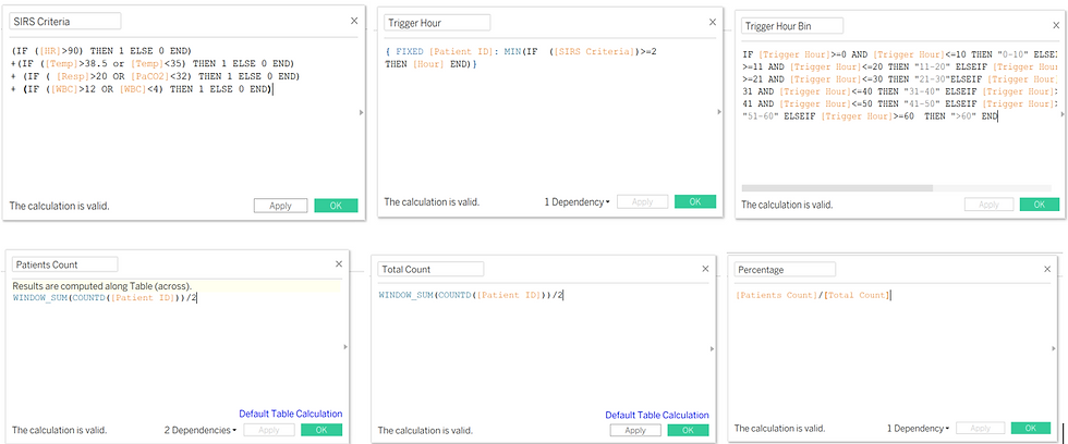
I am going to display Trigger hour bin and SIRS patients’ percentage on the dendrogram. I have created required calculated fields for my insights.
SIRS Criteria
Trigger Hour
Trigger Hour Bin
Patients Count
Total Count
Percentage
Step 6:
Next, Create calculation field of dendrograms,
Sigmoid
A sigmoid is a shaped mathematical curve. In dendrograms, especially radial or curved dendrograms.
Create a calculated field like this, 1/(1+EXP(-[X]))

Rank
A dendrogram is built from levels of hierarchy. Each merger happens at a certain height or distance. Rank simply refers to the order or level of these mergers. In dendrogram Index() works as a rank.

X axis and Y axis:
Define the X-axis as (INDEX()-1)* 0.12) - 6 and the Y-axis as [Sigmoid] ([Rank] - (WINDOW_MAX([Rank]) + 1) / 2) / 100.

Percentage Adjusted and Size:
Define percentage adjusted as [Percentage]/WINDOW_MAX([Percentage]) and Size as IF [X]>=6 AND [X]<=6+(10*[Percentage Adujsted])THEN 1 ELSE 0 END

Step 7:
Drag the X-axis into Columns and the Y-axis into Rows. Right-click on the X-axis and Y-axis, then set their computation as Path (bin).

Step 8:
Next, edit the table calculation for the Y-axis, setting the X-axis as a specific dimension using Path (bin). Then, specify the Y-axis as Path (bin) & Trigger Hour Bin, the Rank as Trigger Hour Bin, and the Patient Count as Path (bin) for accurate visualization.
Set Marks to Line, then drag Path (bin) onto Path and Trigger Hour Bin onto Colors for visualization as shown below picture.


Step 9:
Drag the Size field into Size, then modify and edit the table calculation. Set the X-axis as a specific dimension using Path (bin). Next, define Percentage Adjusted with Path (bin) & Trigger Hour Bin, Patients Count using Path (bin), and Total Count with Path (bin) & Trigger Hour Bin to ensure accurate visualization., for accurate visualization.
Drag Percentage and Trigger Hour Bin into the Label field to display them on the visualization as below pictures.

Step 10:
Next, Adjust the formatting by increasing the size, making the heading bold, and enlarging the font. Also, set the count to display as percentage with single decimal values, and remove headers and grid lines by using format. With these final touches, the dendrogram chart is complete as shown below picture.

Limitations of Dendrogram:
· Readability issue with large datasets.
· Label overlaps disturbs the tree structure.
· Different metrics can produce very different trees from the same data.
Conclusion:
Overall, dendrogram charts provide a powerful way to visualize hierarchical relationships within complex datasets. It is used in multiple industries like data science, biology, marketing, or machine learning, to transform abstract relationships into meaningful visual insights. When interpreted thoughtfully and paired with quality data, dendrogram charts can be an invaluable tool for exploring structure, validating assumptions, and communicating results with clarity and impact.
In essence, a dendrogram chart is a powerful exploratory tool for understanding data structure and similarity, best used when hierarchical relationships are important. Thank you for taking the time to read about Dendrogram in my blog.


