Healthcare in Motion: Visualizing Trends in Ambulatory and Emergency Care
Ambulatory care is very important in modern healthcare system, before meeting the doctor nearby, the system that helps the patients to get into the clinic. Using Tableau, analysis is made on dataset of ambulatory visit. Three important components are consider here in patient care: speed, reliability and volume of complete visits.
Introduction
The Spark: When we see the Healthcare system, it is not only giving treatment but also to understand about the flow of patients.
The Focus: Using Tableau analysis we analyse patterns in which the care is made from patient's normal routine to emergency situations.
Ambulatory Care in Today's Modern Landscape
Insight: The data shows - Follow-ups (336) and Telemedicine (284)
The main Story: The highlight is that there is a shift towards modern digital healthcare. Ambulatory visits in Telemedicine shows 30% which shows a significant move in remote area.
'No Show' Ambulatory visit
Insight: Totally there are 950 ambulatory visits in the data. Out of which 154 were "No Shows" and 60 ambulatory visits were cancelled.
The main Story: No-Show rate of 16% becomes a major challenge because the hospital need to decide to set better scheduling and reminders using this data.
The Pulse - Emergency Department
Insight: The main reasons for ED visits - 1.Fever (234 cases) 2. Pneumonia (201), and 3. Stomach Ache (186).
The main Story: Analysing the importance of these visits, data with Acuity Level 1 is the repeated one, which shows more number of high priority cases.
Based on Patient Demographics
Data Insight: Based on patient's diversity-65% White and 35% Black/African-American patients.
The main Story: Make plan on equitable access to handle care in different demographics.
Tableau Analysis
To analyse The Reliability Gap: Tracking "No-Show" Trends
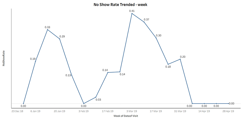
In healthcare resources one of the most important significant drain is the "No-Show". Because when a patient misses an appointment it creates a vacancy slot which can be used by other patients. It may helped someone else. In this analysis No-Show Rate is Trended by week. From this visualisation over a period of time, in some period there is spike in missing appointments.
The Visualisation Insight:
The Spike in No-Show Rate alerts the administrators to fix it as a Red flag. This Red flag indicates a requirement for automated reminders. Or arranging a shift towards Telemedicine options.
2. Improving Speed to Care
How long should a patient have to wait after they decide to take an appointment?
When a patients realize that they need a medical help, that is the moment the true access for care starts. When the patient decides to meet the doctor either the appointment is booked or not the waiting starts from there.
We need to analyse Average Waiting Time. When the Average Waiting Time increases, it not only creates frustration for the patients but also there is a chance of escalating minor problem to major problem. Waiting for longer time may leads to missing appointments. Patients may loss their trust in the healthcare system.
By tracking the waiting time, coordinators of healthcare system have powerful way to access. It show how well the staffs meet the needs of the patients. On working on reducing the waiting time the satisfaction, outcomes and also overall quality of the healthcare increases.
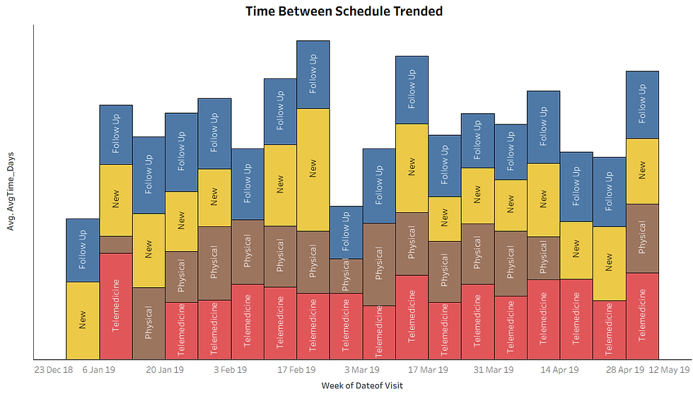
Between Schedule and Appointment (days) -to measure "scheduling lag"
The Trend: By analysing this trend we can find whether the clinic is falling behind or not. The rising trend indicates the need for high provider capacity which leads to increase in waiting period for patients.
Completed Visits-Trended By Weeks
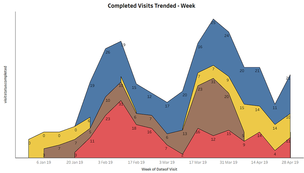
To analyse the main operation of the clinic the complete visits are isolated.
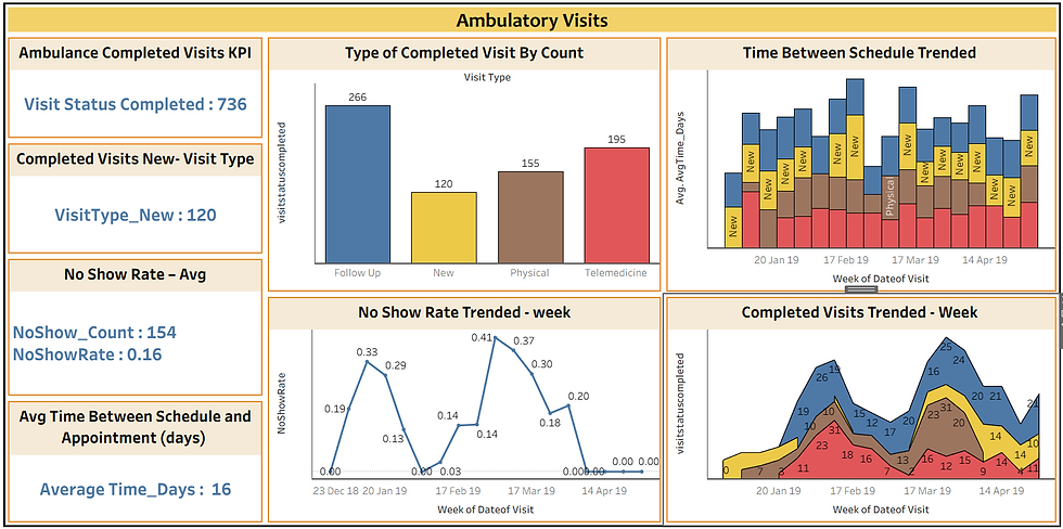
KPIs : The Ambulance Completed Visits KPI - a high-level view of throughput.
By analysing, completed visits by week we have an idea that which services drive patient volume and revenue consistently. This also shows when demand peaks for example during seasonal surge or back to school months how the patients behaviour changes.
These behavioural changes are the challenges for operational planning. By analysing the domination in each week, the healthcare system can provide nursing support, physician and digital resources accordingly. Instead of working in reactive way management can plan before it is overcrowded in a proactive manner. So that the clinically efficiency can be improved.
4.Dashboard On the Ambulatory Visits
Building this "Snapshot on Ambulatory Visits" using Tableau helps the healthcare management act Proactive rather than reactive.
Conclusion
For improving the patient's experience of care, there are operational metrics need to be improved by the healthcare management. Because every hour of waiting by the patients matters. By tracking the allocation, appointments, no show pattern and completed visits, the management of the healthcare can identify the problem and also they can provide where the care is more needed.
By using Tableau Analysis we made lot of visualisation so that the management can work in proactive manner rather than reactive. These insights results in responsive way and it is patient-oriented system. The management which is ready to care for patients not only care when the patients arrive but from the time the patients decides to seek help.


