Good Data vs Poor Data: Why Data Quality Matters in Analytics

Charts and dashboards can look very attractive and easy to understand, but they are only as accurate as the data used to create them. When the data behind a chart is clean and correct, the chart shows the true picture of business performance. However, if the data is missing, incorrect, or inconsistent, the chart will reflect those problems. Even a well-designed visualization may present misleading results.
The blog demonstrates why data quality matters by comparing poor-quality data and high-quality data using a simple sales use case.

Common Indicators of Poor Data
Missing Values
Example: Out of 100 sales transactions, 10 rows have the sales amount left blank.
Why it’s a problem: Total revenue appears lower than it actually is, leading to incorrect sales performance analysis.
Inconsistent Formats
Example: Order dates are stored as 01/05/2026, 2026-05-01, and May 1, 2026 in the same dataset.
Why it’s a problem: The system cannot correctly group sales by date or month, causing inaccurate time-based analysis.
Duplicate Records
Example: The same order ID appears twice in the dataset, counting the same sale two times.
Why it’s a problem: Revenue and order counts are inflated, leading to misleading KPIs.
Incorrect Data Types
Example: Sales amounts are recorded as "110k" instead of 110000.
Why it’s a problem: The value is treated as text, not a number, so it cannot be included in totals or averages.
Conflicting Information
Example: One report shows total monthly sales as $500,000, while another report shows $450,000 for the same month.
Why it’s a problem: Stakeholders lose trust because they cannot determine which number is correct.
Key Characteristics of Good Data
Accurate – Correctly Reflects Real-World Values
Good Data Example: A store sells 10 laptops in a day, and the dataset records 10 laptops sold.
Poor Data Example: The dataset records 8 or 15 laptops sold due to manual entry errors.
Why it's a problem: Inaccurate data leads to incorrect inventory planning and unreliable revenue estimates.
Complete – Contains Required Information with Minimal Missing Data
Good Data Example: A customer dataset includes age, location, and purchase amount for nearly all customers.
Poor Data Example: Many records are missing age or purchase amount.
Why it's a problem: Missing key information makes segmentation and trend analysis unreliable.
Consistent – Uses the Same Definitions and Formats Everywhere
Good Data Example: The region is always labeled as East across all datasets.
Poor Data Example: The same region appears as E, East, and east_region.
Why it's a problem: Inconsistent labels split totals and produce incorrect insights.
Valid – Follows Logical Rules and Acceptable Ranges
Good Data Example: Customer age values fall within a realistic range of 0 to 120.
Poor Data Example: The dataset contains impossible values such as -5 or 300.
Why it's a problem: Invalid values distort averages, charts, and analytical conclusions.
Timely – Relevant to the Decision Timeframe
Good Data Example: Using this month’s sales data to plan next month’s marketing budget.
Poor Data Example: Using last year’s sales data to make current pricing decisions.
Why it's a problem: Outdated data leads to decisions that no longer reflect current conditions.
To understand the real impact of data quality, let us examine a practical business scenario. The following use case demonstrates how the same data, when presented with different quality levels, can lead to very different insights. This comparison highlights why data quality is essential before making any business decisions.
Business Question
Which region should receive increased marketing investment next quarter?
Use Case 1: Poor-Quality Data
Data Set Explanation:
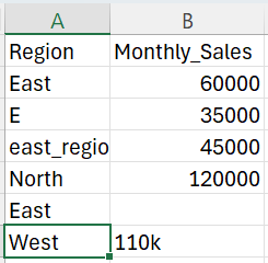
The data set contains poor-quality sales data. Regions are labeled inconsistently (East, E, east_region), some sales values are missing, and formats are inconsistent. Although the file looks usable, it does not accurately represent real business performance.
The chart below is created using the poor-quality data set. Tableau displays each version of the same region separately and cannot combine incorrect values, causing the bars to appear broken. As a result, the chart does not reflect true regional performance and can lead to wrong conclusions.

Because the chart is misleading, marketing investment is reduced for the East region, even though it is actually performing well. As a result, poor data quality causes wrong decisions and missed business opportunities.
Use Case 2: High-Quality Data
Data Set Explanation:

The dataset contains high-quality data with consistent region names and correctly formatted sales values, and all records are complete with no missing or duplicate entries.
The below bar chart created from the high-quality data set. It correctly aggregates sales by region. East clearly appears as the top-performing region, while South is the lowest.

With clean, high-quality data, regional performance differences are clear and reflect real sales trends, enabling confident, data-driven decisions such as increasing marketing investment in the East region while focusing improvement strategies on the South.
Conclusion
Good data is the base of accurate analytics and trustworthy insights. When data is complete and consistent, charts clearly show real business performance. Poor data can produce misleading charts and incorrect conclusions, which may lead to poor decisions and lost opportunities. Ultimately, the success of analytics relies more on data quality than on tools or visual design.
In the next blog, we will focus on transforming poor-quality data into high-quality data using practical data cleaning techniques.


