Getting Started with Tableau -From Zero to Insight
- Geetha Rajendran
- Sep 30, 2025
- 3 min read

Hi Everyone!!!
Welcome to my very first Blog. I wanted to share my knowledge about Tableau and how we visualize our data in the real world via Tableau.
Basically, Tableau is a data visualization and business intelligence (BI) tool that helps people see and understand their data. Instead of analyzing numbers in raw spreadsheets, Tableau allows you to create interactive charts, dashboards, and reports that make trends and patterns easy to spot.
In this blog, I’ll walk you through the step-by-step process of importing datasets into Tableau and explain the key terms that are essential for creating effective visualizations.”
Step 1:
Open the Tableau Public. On the Right side we can see Connect with all types of File. If we have a .CSV file then click on Text file or excel means click on Microsoft Excel and so on.

If we have more then one sheet to join for our visualization we need to use join with the common column
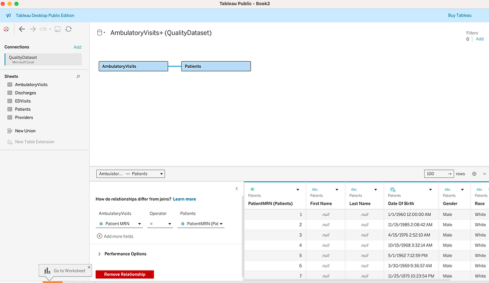
Then we will get to see both the Tables in our sheet

Step 2:
Knowing the key Terms we use in creating the visualization
1. Dimension : Qualitative data (descriptive, categorical).Examples: Region, Country, Customer Name, Product Category, Order Date.
Purpose: Slice and dice the data → create groups, categories, labels.
They don’t usually get aggregated (summed or averaged).
In a Tableau sheet:
If you drag a dimension into Rows/Columns, it creates headers, labels, or groups.
If you drag it into Filters, it lets you filter by category.
Dimensions split data into parts so that measures (numerical values like Sales, Profit, Quantity) can be calculated for each part.
2.Measure: Sales (a number you can sum or average) a Quantitative data
Purpose: Values that can be aggregated (SUM, AVG, COUNT, MIN, MAX).
Measures usually create numbers, axes, or charts.
3.Mark: A visual element (bar, dot, shape) representing data on a view.
Things we use in the Marks:
Tooltip : Control what text appears when you hover over a mark.
Text: You can drag measures/dimensions here to control what text shows up on marks.
Shape: Change the shape of marks (only works in scatter plots, maps, etc.).
Detail: Add extra information to marks without showing it visually.
Size: Control how big or small the marks are.
Color: Change the color of marks (bars, circles, lines, etc.).
4.Filter: Limits the data shown in your view.
5.Group: A Group lets you combine similar dimension members into one category.Group works only on Dimensions not on Measures.
6.Bin:A Bin is like creating “buckets” for numerical data.It’s usually created from Measures.
7.Parameter:A Parameter is a user input control box or slider that lets the viewer change a value dynamically.
8.Calculated Field: A new field created using formulas to derive additional data.
Lets see in detail about
SUM - Adds up values of a measure
RUNNING_SUM - Adds progressively (like a bank account balance growing).
WINDOW_SUM - more flexible, you control the exact window range (can look backwards, forwards, or across the entire partition).
Example :WINDOW_SUM(expression, [start, end])
start, end (optional) → define the window (the range of rows to include) 0 = current row-1 = one row before1 = one row afterNULL = unbounded (all rows)
Step 3:
After analyzing our data, creating all the calculated Fields then we need to choose which chart will be suitable for our visualization.
Chart Type | When to Use |
Bar Chart | Compare categories |
Line Chart | Show trends over time |
Pie Chart | Show part-to-whole proportions |
Scatter Plot | Show relationship between two measures |
Area Chart | Show cumulative trends |
Histogram | Show distribution of a measure |
Map | Visualize data geographically |
Text Table | Display detailed numbers |
Tree Map | Show proportion of categories to total |
Heat Map | Compare values using color intensity |
I have tried some Advanced charts like SunBurst Chart, Coxcomb chart, Dendrogram Chart,Butterfly Chart.
Step 4:
After completing our chart with all proper formatting and adding filters, legends, and tooltips we can publish our work.
I have attached my tableau public link where I have tried all the charts.https://public.tableau.com/app/profile/geetha.rajendran/vizzes
Tableau is a powerful tool that transforms raw data into meaningful insights through interactive visualizations. By understanding key terms like dimensions, measures, marks, filters, and calculated fields, anyone can start building effective dashboards. With practice, you can move from basic charts to advanced visualizations that bring stories out of your data.
Keep exploring, experimenting with different charts, and sharing your work. Every dataset is an opportunity to uncover patterns and insights.
Happy learning and happy visualizing! Thanks all !