From Data to Insights: A Beginner's Guide to Tableau
Introduction
In this blog, we will explore the foundational concepts of Tableau, learn about different type of charts available and create a visualization using a sample superstore dataset.
What is Tableau?
Tableau is a powerful data visualization tool used to analyze data and present it in an easily understandable format. It helps users to turn the raw data into meaningful insights using charts, graphs and dashboards. It is easy to use and do not require advanced programming skills. It is widely used in business, education and research because of its ability to handle large datasets and create interactive dashboards.
Tableau has a different range of products such as Tableau Desktop, Tableau Server, Tableau Cloud, Tableau Public, Tableau Desktop Public and Tableau Mobile. For my Tableau project, I used Tableau Desktop to create the visualizations and Tableau public to share the visualizations which is a public instance of Tableau cloud.
Importance of Tableau
We all know that it is difficult to analyze the data in the form of large tables, but we can easily understand it if the data is converted into some type of chart, graph or a dashboard. Tableau helps users to understand data easily through visualizations. Using visualizations, we can easily identify the trends, patterns and insights. Based on which we can make better informed decisions.
Tableau can accept many kinds of datasets from different sources. It works with file-based datasets, Relational databases, online and cloud data sources and different types of data like Structured data, Real time data, Spatial format data, Time-series data, Geographical data, Sales and Marketing data, Survey and customer data.
Foundational concepts useful for creating data visualizations
Dimensions: Qualitative, categorical data such as Category, Region, Customer Name. It tells Tableau how to divide the chart. It determines the level of details.
Measures: Quantitative, numerical data that can be aggregated such as Sales, Profit, Quantity. It tells Tableau what to calculate. It determines the value of the details.
Data Types: Common data types are String, Number, Date, Date & Time, Boolean. Choosing correct data types is important for accurate analysis and visualizations.
Marks Card: Used to select color, size, label, detail and shape of marks. Helpful in customizing data points in a chart.
Shelves: Rows and Columns, Filters, Marks and Pages. These define the structure of the visualization and control how the data is visually represented.
Filters: Used to create/display a subset of data. Extract, Data Source, Context are some of the filter types.
Aggregation: It aggregates measures like SUM, AVG, MIN, MAX.
Calculated Fields: These are created using formulas. Used to calculate the metrics like Profit ratio.
Hierarchies: Defines related dimensions such as Country, State and City. Useful for drill down and roll up analysis.
Groups: Used to combine dimensions.
Sets: Subsets of data can be dynamic or fixed.
Parameters: Dynamic input values. Used with calculated fields.
Table calculations: These are performed on the result set like Percent of Total.
Level Of Detail (LOD) Expressions: Used to perform advanced business calculations. To calculate the values at a different granularity.
Dual Axis: Combine two measures with a different scale on one chart. Used for comparing metrics like sales and profit.
Dashboard: Combines multiple worksheets to a single interactive view. It is helpful for users to analyze, compare and monitor key metrics.
Story: Useful to create a narrative using multiple visualizations.
Different types of charts in Tableau
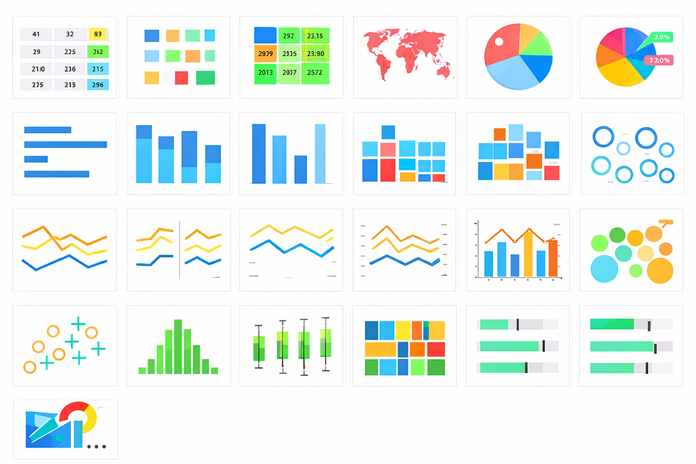
Text Table, Heat map, Highlight Table, Map, Filled Map, Pie, Funnel, Horizontal Bar, Stacked Bar, Side-by-side Bar, Tree map, Circle, Side-by-side Circle, Line (Continuous, Discrete), Dual Line, Area (Continuous, Discrete), Bar Line, Scatter, Histogram, Box-and-Whisker, Gantt, Bullet Graph, Packed bubbles are different types of charts available in Tableau. We can also add a custom type viz (visualization) through the Tableau Exchange.
Let us create a visualization using sample superstore dataset that was provided as a part of my Tableau training. It is a retail dataset that represents operations of a fictional superstore. It contains detailed information about orders, customers, products and shipping that is useful for data analysis and visualization. The dataset includes fields such as Order ID, Order Date, Ship Date, Ship Mode, Customer ID, Customer Number, Segment, Region, City, State, Postal Code, Product ID, Category, Sub-category, Product Name, Sales, Profit, Discount and Quantity. These variables are helpful to analyze the business performance across different dimensions.
Please make sure to download and install Tableau Desktop on your system before proceeding to the next steps.
Example question: Let us create a Segmented Bar Chart for Category wise sales, Segmented by Ship mode.
Step 1 -
To create a new file, Open Tableau Desktop File -> New
Step 2 -
Open the sample dataset and follow the path File -> Open -> Select the sample dataset -> Open
Step 3 -
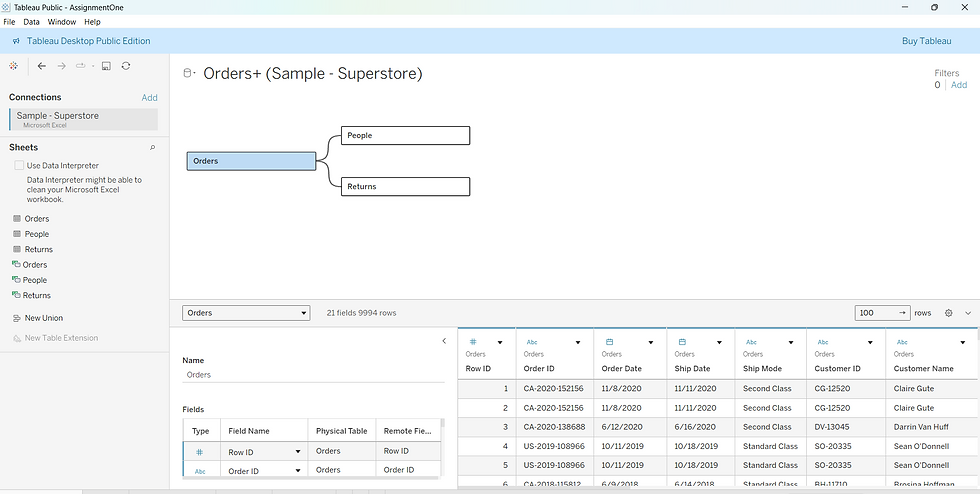
We have to create a connection between the tables. For this Drag and Drop the required tables to create the connection. Now we can start working on our dashboard.
Step 4 -
Select Sheet 1
Our goal is to create a visualization for the question - Segmented Bar Chart for Category wise sales, Segmented by Ship mode
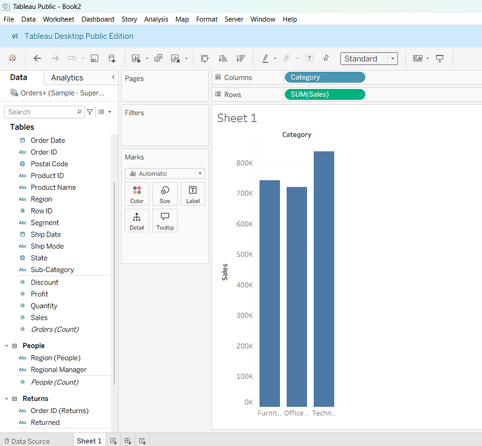
Here we take Category and Sales into consideration. Category is a Dimension and Sales is a Measure.
Select and drag Category column onto Columns, Sales column onto Rows.
Step 5 -
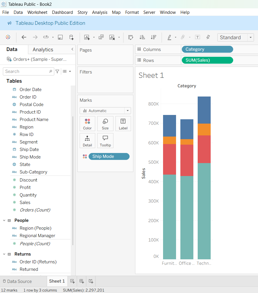
Create the segment using Ship Mode
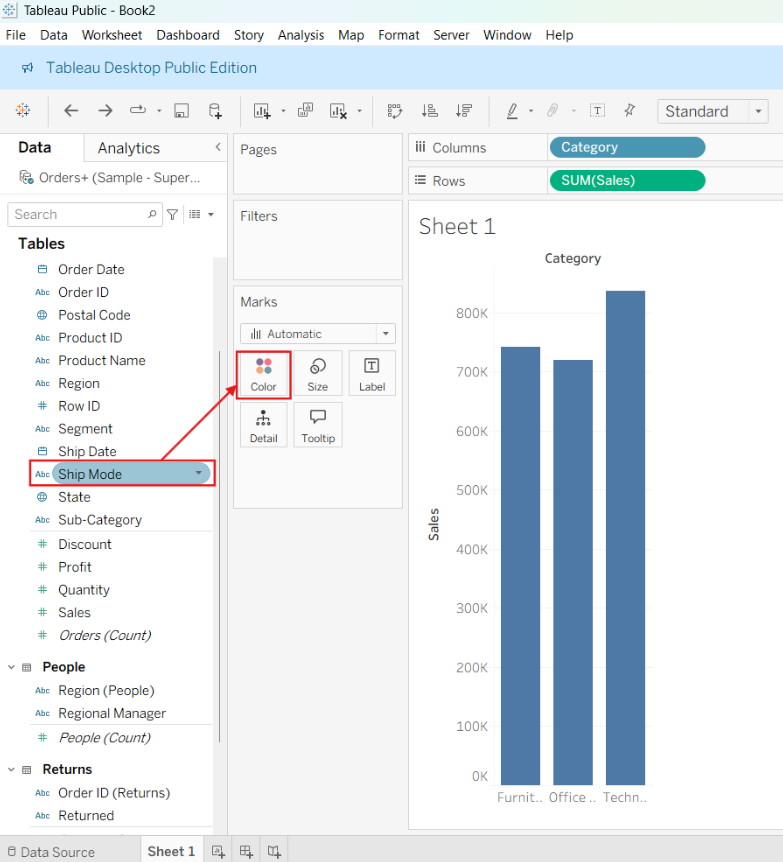
After segmenting the chart looks like this
Step 6 -
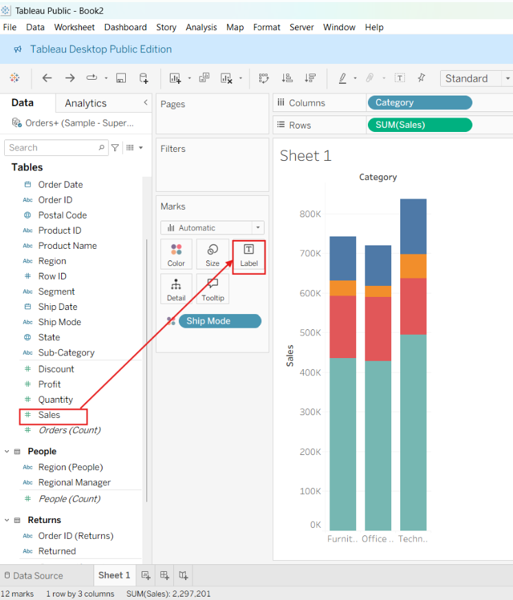
Drag Sales to Label so that just by looking at the chart we can know the insights.
Step 7 -
Add the title and save it.
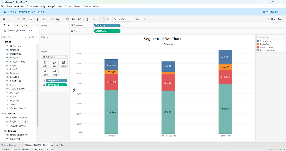
Now just by looking at the above visualization we can observe that the Technology category has the highest number of total sales among all the categories. Standard class shipping contributes the largest number of sales in every category. This indicates that customers prefer standard shipping over other ship modes. To conclude, overall sales are driven primarily by Technology products and Standard shipping.
I hope this blog helped you gain a basic understanding of Tableau and learn how to create a simple visualization.


