DONUT CHART IN TABLEAU

FROM PIE TO DONUT, VISUALIZING DATA BETTER IN TABLEAU
Before getting into details let us first understand
WHAT IS DONUT CHART?
A DONUT CHART is nothing but a variation of pie chart with a blank center which makes it look like a donut .
It is often used to show proportions or parts of a whole while providing space for additional information in the middle . It is a visually appealing way to represent data . while tableau doesn't offer a built in DONUT CHART option, but creating one is quite straight forward using a few tricks.
WHEN TO USE DONUT CHART?
DONUT CHARTS are a great way to visualize data when:
Displaying part-to-whole relationships.
Adding context or label inside the center .
comparing a few categories (Ideally less than 5).
HERE IS A STEP BY STEP GUIDE FOR YOU TO BUILD A VISUALLY APPEALING DONUT CHART IN TABLEAU:
For this example we'll be using SAMPLE SUPERSTORE Data set from tableau and visualize Region Wise returns in percentage.
STEP 1: SETUP THE DATA
CONNECT TO YOUR DATA SOURCE : Open tableau and connect to the data set (Sample superstore dataset).
CREATE A DUMMY FIELD: The next step is to create a dummy field in rows by typing in '0' and duplicating it.

STEP 2: BUILD THE BASE PIE CHART
Change the mark type to PIE
In the Marks card , click the drop down for the first SUM(0) and select PIE.
Change the mark type to circle
In the Marks card , click the drop down for second SUM(0) and select CIRCLE.
STEP3: CREATE A CALCULATED FIELD
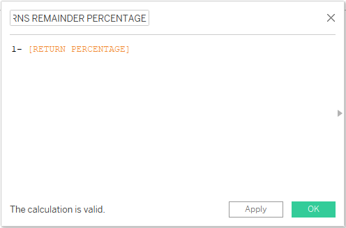
Here we are making a returns percentage donut chart so we need to create two calculated field one to calculate return percentage and other for not returned percentage .
RETURN PERCENTAGE calculated field: COUNT([Returned]) / COUNT([Order ID])
RETURNS REMAINDER PERCENTAGE calculated field : 1 - [RETURN PERCENTAGE]

STEP4: START BUILDING THE DONUT CHART
Put Measure Names in color and Measure values in angle in the PIE CHART and delete everything except AGG(RETURN PERCENTAGE) , AGG(RETURNS REMAINDER PERCENTAGE) from Measure values.
Now increase the size of pie chart and turn to entire view .
Right click on the second axis (SUM(0) ) in rows and select the Dual Axis.
Adjust the size of pie and circle chart as per your requirement.
Drag the RETURN PERCENTAGE to label in circle chart and Format it as in pics below.


STEP5: CUSTOMIZE AND FORMAT
Hide Headers:
Right-click on the axes and uncheck Show Header.
Remove Gridlines and Borders:
Navigate to Format and set Grid lines, Zero lines and Borders to None.
STEP 6: FINAL TOUCHES
Adjust colors: use the color card to assign distinct color to circle chart , pie chart.
Drag the dimension Region to the columns section and you will get 4 donut charts as per each region showing the return percentage.

TIPS FOR EFFECTIVE AND IMPACTFUL DONUT CHARTS:
CATEGORIES: Ensure that the number of categories in the donut chart is limited to 3-5
CENTRAL SPACE: Utilize the center of the donut to display key metrics or summaries.
CONSISTENCY: Ensure color schemes and labels are consistent across your dashboard for a cohesive look.
By following these steps, you can create an informative and visually appealing donut chart in tableau, enhancing your data storytelling capabilities.


