DASHBOARD WITHOUT INSIGHTS ARE JUST DECORATIONS
We all love to build dashboards with more attractive charts using colours that “pop” and try to include as much data as possible on one page. Wait, take a pause. before you adding one more chart into your dashboard ask yourself a question, is your dashboard actually helping someone to make a decision?
Ask yourself, are you trying to impress anyone else using this dashboard, do you think fancy colours will bring more money to your business?
Imagine that you have spent months of effort preparing a dashboard to identify the business problem. But after all this, your dashboard is not delivering anything to the stakeholders to take action. Believe me, you are in a critical spot.
The Thought of this blog is started from my own experience. I wanted to show how dashboards with actionable insights help users make better data driven decisions rather than a sleek dashboard with little or no insight.
When your Manger ask “ So .. what action should we take now?”
This is the exact point where the real problem begins…
To understand this better, I have taken a simple sales data set that contains data for sales, profit, discounts, region and so on. I built two dashboards using the exact same sales dataset. Same numbers. Same business problem. Completely different experience.
Business Problem:
The business problem is that Sales numbers are looking healthy, but profits started declining after March, that raised a few important questions.
Which region was underperforming?
Which product fails to generate profit?
Was discounting affecting profit?
More importantly, what action should the business actually take next?
Scenario 1: Decoration Dashboard
Let us walk through this dashboard and try to get the answers to all the business problems.

What kind of data -driven decision could you make through this dashboard in the first few seconds? I think instead of decisions you get more confused. Attractive purple colour, several KPIs, multiple charts, colourful visuals, everything is fine but from this, nobody can understand what the business problem is? Each and every chart is fighting for attention, none of them explaining the real issue.
Why Beautiful Dashboards Commonly Fail?
1) Data overload without clarity:
When we are trying to show everything at one page, it will create only noise instead of clarity. A dashboard is for simplifying complex data, not for confusing it.
Here I have been forced to include all the charts together on one page to provide too much information at the same time. Actually, instead of helping to make decisions, they are cluttering it.
2) Lack of a clear business problem:
Most of the displayed numbers are in beautiful cards but they never answer why these numbers matter. If the dashboard cannot explain a business problem that a business is trying to solve, all these visuals are just decoration, nothing more.
3) Visual cluttering:
Each and every chart with a different font, different colours, will cause confusion.
For Example, here Red colour is used for both positive and negative value that will make users misinterpret the data and the Rainbow colours are used for the Donut chart that has too much information.
4)Lack of storytelling:
For Example , here each chart is arranged randomly, a table with lots of information is coming first, which is not related to the next chart.
If you are not following a flow for connecting the charts, it will be like different kinds of charts on one screen, but visually they are disconnected. First, it should show what happened. Then, it should help users understand where the issue is. After that, it should explain why it may be happening. Finally, it should guide users toward action.
5)Too much importance on appearance, too little on insight
The Dashboard becomes useless when users spend more time understanding the visuals than understanding the business problem.
Which chart should users focus on first? Every chart looks important, but none of them explain the real issue clearly. This is where data overload slowly turns into confusion.
A few extra charts. More KPI cards. Additional colours and filters. These may look like small design choices, but inside a real business environment, they can completely change how users read data and make decisions.
So we can go back to the first question "Then ..What exactly should we do now?"
Look at the scenario 2 dashboard, this will answer all your doubts.
Scenario 2: Action-Oriented Dashboard
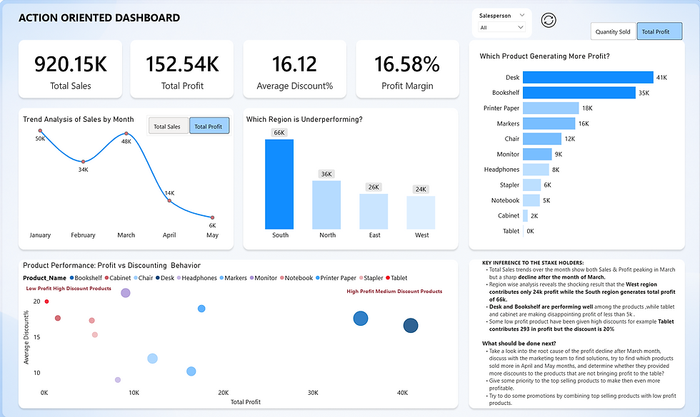
Here is the action-oriented dashboard. This dashboard gives you a cleaner, easier and more focused experience than the first dashboard. Each and every chart, arrangements of the charts, selection of the chart, KPI cards , everything seems to be perfect. why? Because here we are discussing a business problem, we are trying to find the real issue behind the problem. We used the same data but a different approach.
Every chart has a purpose; nothing is unusual or confused, instead of making the users search through multiple visuals to understand what is the problem, here this approach tried to solve the problem step by step. That small changes changed the entire experience, isn't it?
To make our dashboard more action-oriented, we should take care of some important matters.
What Turned the Dashboard from Decorative to Action-Oriented?
1) Simplicity instead of clutter:
Simple charts with a clean visual are the key. Once we removed unnecessary charts from the first dashboard, the second one became more focused on visuals that focus only on the real issue. So avoid too many charts on one page.
2) A clear business problem:
Our business question is why profit is declining even though sales remained strong? That single question drives the dashboard. So, focus on the business problem.
3) Better storytelling flow:
In this dashboard, first we addressed what is happening. Then it guided us toward where the issue happened and why it's happening. Instead of placing charts here and there, it is trying to tell a clear story.
4) Choose charts with a purpose
Choose each and every chart with a purpose for a monthly trend analysis Line chart is the best option, you can see the Donut chart selection in the first dashboard, if you have too much information, go for a table wise analysis instead of Donut chart, like wise each chart serves a different purpose.
5) Focus on decision-making:
Instead of filling spaces with charts, we should focus on decision making. Users should get insights from the dashboard by solving the business problem, that will automatically direct them to take appropriate action.
6) Reduced visual noise:
Small choices in colour made a huge difference. Use consistent colours across the dashboard stick to the three colour rule. Enough spacing between visuals. Dashboard is more neater and easier to read.
Conclusion:
From these studies, I finally understood that we can make an action-oriented dashboard by taking care of certain important things. The goal is not to show everything; the goal is to make what is really needed. Nobody will remember a dashboard because it looked beautiful, they remember only how it helped them to understand something important, so now it’s your decision would you rather build a dashboard that looks decorative or the one that helps people take-action?


